Branding & Packaging for Noes by White Studios
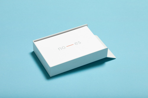
The name does the work. Noes reads as “no” and “es” — Norway and España — and the mark sets a dash between the halves, grey letters held by a warm orange line.
White Studios built the identity on that pair of opposites. The colour follows: a white card against cold blue in one shot, the same card against warm orange in the next.
The back stays plain — a name, a role, a phone number, a domain — with the dash repeated as a small rule.