Branding for Piàno Piàno by Weidemüller
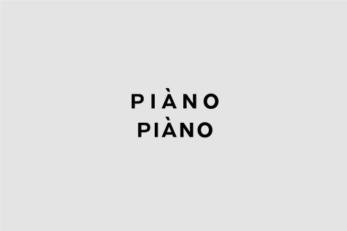
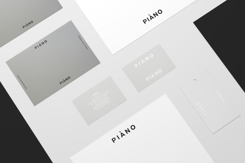
Weidemüller sets the name in two stacked lines of heavy uppercase sans: PIÀNO over PIÀNO, black on light grey, letterspaced, centred in an empty field.
A grave accent sits over the A in each word. The accent bends the name toward the Italian it borrows from: slowly, slowly.
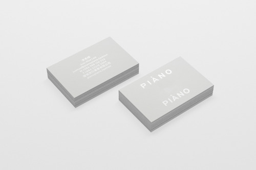
The business cards keep the restraint. Grey stock, one face carrying the wordmark in white at the upper left and again at the lower right, the other a small block of centred text.