Twice
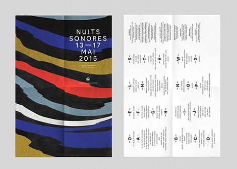
Two pieces, one system. The first is a festival programme cover: horizontal bands in black, blue, red, white and ochre, torn at the edges and shifting down the page. White capitals sit on the black at the top — NUITS SONORES, 13—17 MAI 2015. The white page beside it carries four columns of small black type, letters running down the margin.
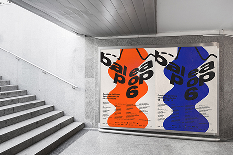
The second is a poster seen from a stairwell: a wavy organic mass, orange on one print and blue on the next, with black display type over it. Twice keeps the colour flat and the shape loose, and lets the paper do the rest.