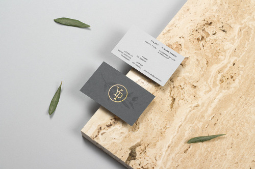
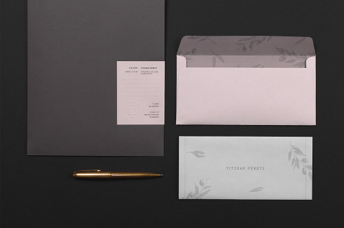
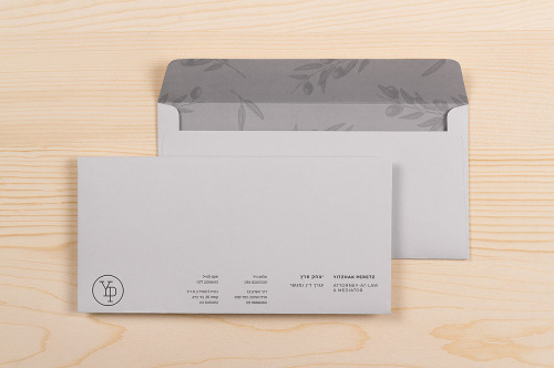
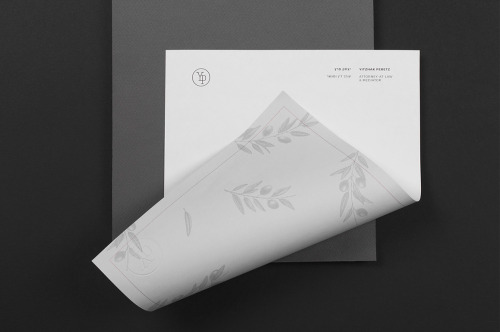
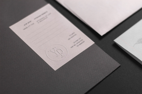
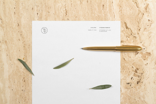
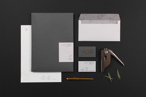
“As a cornerstone for the identity system, Max created a seal out of Yitzhak’s initials, which reflects his focus on family and community. The olive branch illustrations refer to agriculture, Jewish heritage as well as peace, while the color palette is a reminder of solid construction materials and plays on the notion that not everything is simply black and white. Blind emboss and copper foil details add notes of sophistication and contrast to the stationery set.”
Max Pirsky is a graphic designer based in Sofia, Bulgaria. He is focused on graphic design, branding, typography, print design and is obsessed with custom lettering, good food, and general weirdness.