
creanet
creanet is Jose Moreno's multidisciplinary design studio in Málaga, Spain, taking on assignments worldwide.
Archive
83 curated projects in graphic design.
creanet is Jose Moreno's multidisciplinary design studio in Málaga, Spain, taking on assignments worldwide.

Kouga Hirano's 1973 theatre poster for 'Sayonara Max'.
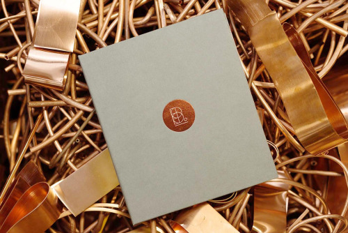
Transformer, an Auckland studio founded in 2002 by Nigel and Anita Smith, designed the book Buckley's Heroes.
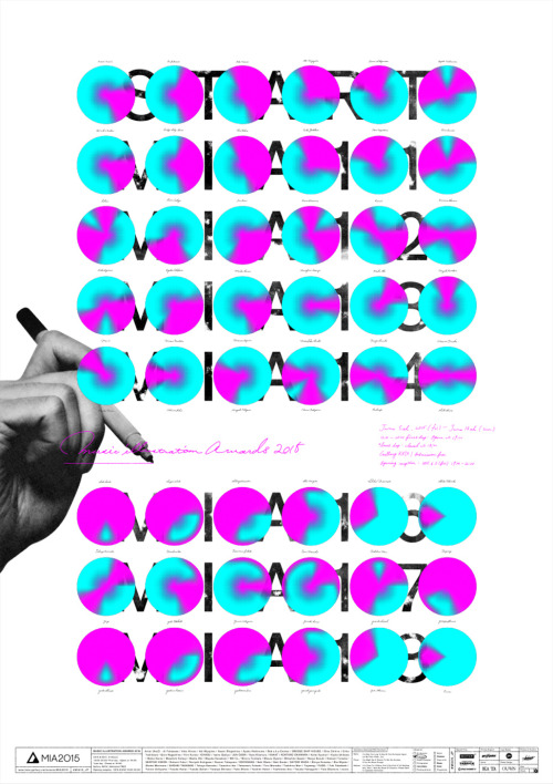
Atsushi Ishiguro's 2015 poster for the Music Illustration Awards, made with OUWN.
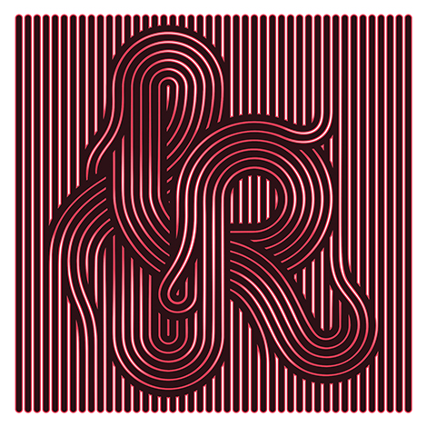
Jordan Metcalf is a Cape Town designer, illustrator and artist working in type-focused design and lettering.
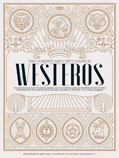
Tyler Deeb is a self-taught Louisville designer whose typography and illustration work has appeared in Entertainment Weekly and Fast Company.
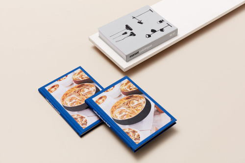
Folch's publication for Reflections on Light pairs deep blue covers with a grey volume drawn in black line.
Querida, the Barcelona studio, designed a compact first-year book for Paloma Wool that treats the label's first twelve months as worth archiving.
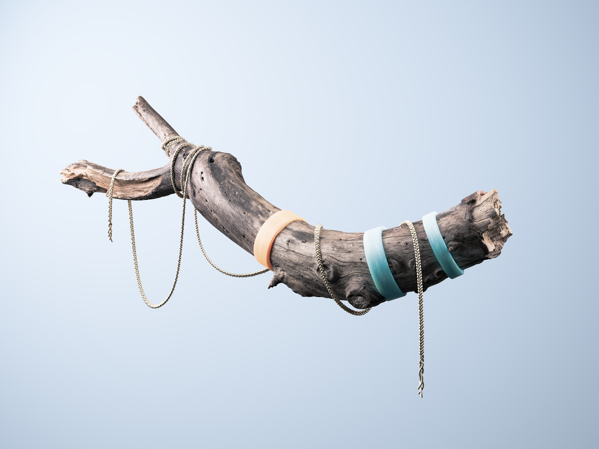
Driftwood, gold chains and a soap bubble, staged as still lifes by Madrid art director Juanma Mota.
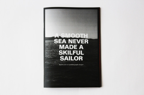
A book by Taylor Evans pairs a black-and-white seascape cover with a blunt list of options inside.
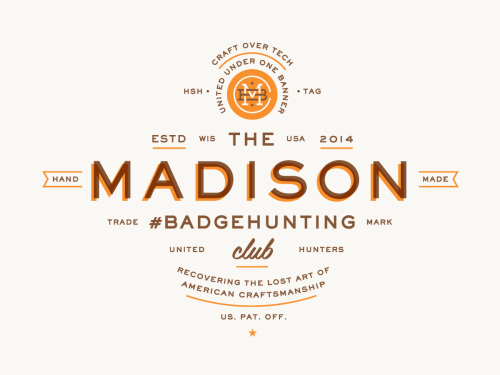
Allan Peters' Badgehunting Clubs: a Rhode Island anchor badge on orange and a Los Angeles mark in cream on pale blue.
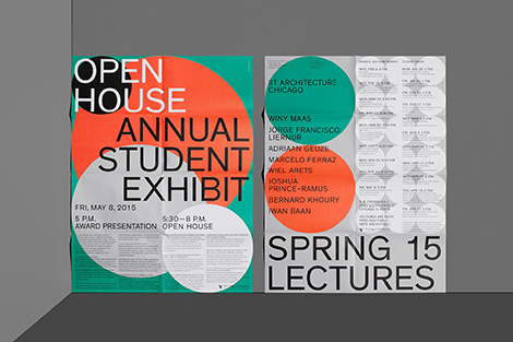
Mainstudio's posters and MARK covers set flat colour and heavy type against dense programme text.
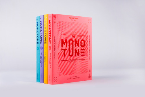
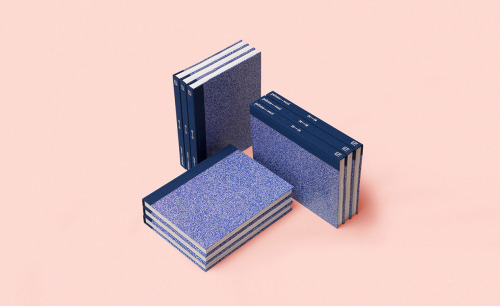
Palette No.7 is viction:ary's seventh volume, collecting monotone work and issuing the same book in four cover colours.
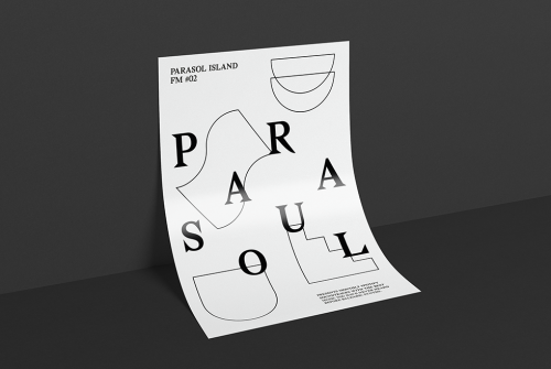
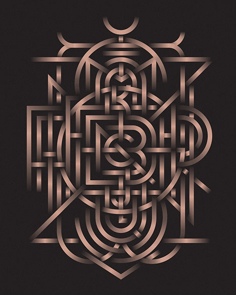
Düsseldorf designer Dominik Bubel works across typography, moving image and illustration, from a scattered poster to a geometric monogram.
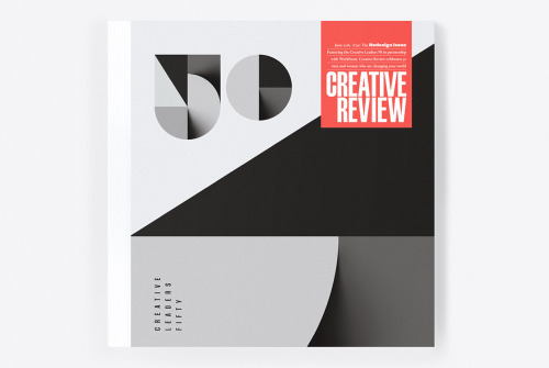
Sawdust's 2016 redesign of Creative Review puts a large black 50 on the cover and carries an identity for Creative Leaders 50.
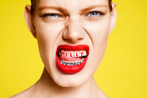
Sagmeister & Walsh rebranded MILLY's advertising with a campaign built on stark typography and saturated colour.
Violaine & Jérémy set the Théâtre des Bouffes du Nord season in dark type over a colour wash, and draw Napoleon as NAPOLEONLAND in pencil.
Michael Spitz prints the numerals 0 to 9, each in a different cut, in orange and grey on cream, and sets LARGE COFFEE 12 & LITTLE on yellow.
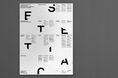
Matteo Colella sets display letters across ruled grids and gives booklets minimal covers for the cultural institutions he designs for.
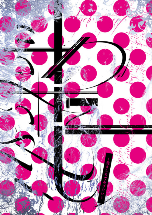
Takao Neko's 2015 theatre poster for 'Watashi', made with Civil Tokyo.
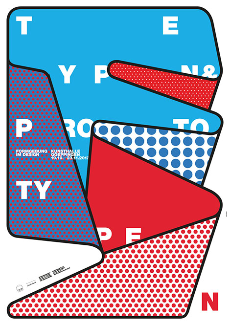
burkhardthauke overlaps cyan, red and white shapes under black outlines, cutting large white letters apart so no word lands whole.
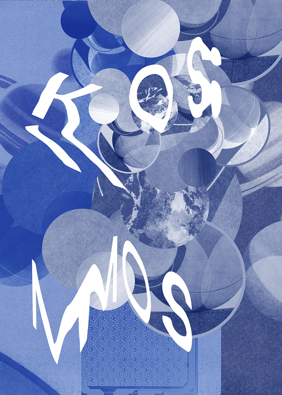
Pineum's Warsaw posters play with photographic imagery, type and colour, sitting between the gallery and the street.
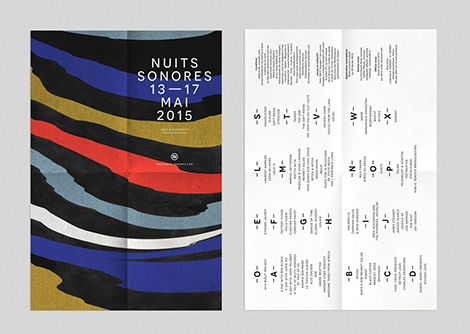
A Nuits Sonores 2015 programme cover of torn colour bands, and a poster whose organic mass shifts from orange to blue.
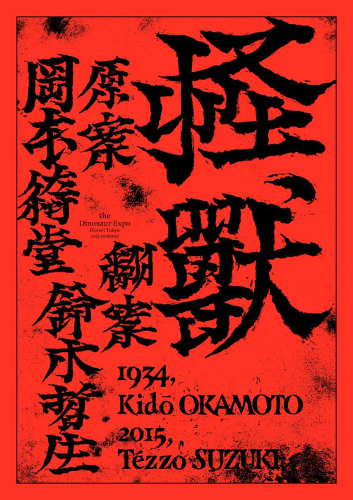
Tezzo Suzuki's 2015 poster for The Dinosaur Expo.
Loading