
Interview by:
Marcelo Guidoli
Artworks by:
Juan Carlos Pagan
MG: We have been trying to get together for a month. You seem super busy. What are you working on at the moment?
JCP: I’m working on different things, but they all seem to be related in some way. I do my client-based projects, which tend to be mostly identity work and ad campaigns. I’m also spending a lot of time on my personal work in my art studio. Painting and drawing.
MG: I didn’t know that you paint.
JCP: Yes, I paint weird geometrical stuff that relates to my graphic design work. I just made a mural for McCann & Ericsson that came out really well. I need the final work to be very precise and also have a human feel to it. First I make a simple sketch, then I digitize it, and then I project that image on the wall in order to finish it by hand. Starting with your hands, then going digital and reintroducing the human aspect at the end. I find that process fun.
MG: So, In many cases personal work feeds the professional work.
JCP: I feel that my personal and professional work are so close to each other that the majority of people don’t see the distinction, which I actually like. Because more and more it gives me the opportunity to get hired to do my personal work. So I’m trying to keep them close together.
MG: This makes me think about the idea of style. You seem to have a very defined one. Is there a place for style in graphic design?
JCP: There is definitely an aesthetic that I’m drawn to. I think I have been very influenced by Sol LeWitt and Lance Wyman. They both made design systems based on line work and op art. Merging ideas of lines and typography. I’m a byproduct of that, And yes, there is place for everything.
MG: Your work is very illustrative, so do you consider yourself an illustrator?
JCP: It is certainly typographically illustrative. I like to play and to push the boundaries of typography with illustration, to see what these letterforms can look like.

MG: I see a trend going on with typography. There is a very expressive way to work with typography–a kind of extroversion. It makes me think of the work of Herb Lubalin.
JCP: He is another great influence on my work, especially when I was in college. He was able to tell a story through typography. So it made me think that you can attach any story or idea to letterforms to create something new. For example, what if you mix the playfulness of the text on the book cover design (by Lubalin) for Beards, which was very telegraphic and beautiful, and mix it with Op art. What will happen? It is not telegraphic anymore. It is something new. And I think that there is some of that going on right now. I’m not the only one doing it. There are other contemporary designers doing something similar. I’m not working in a bubble. It is impossible not to be influenced by our surroundings. At the same time, I just put my twist on things and build on the narrative. I want to make beautiful work that has a sense of originality.
MG: How does a designer/artist survive in an advertising environment that is in great part corporate?
JCP: Well, a lot of my work is not easily consumable. It is made for a very specific audience that appreciates certain kinds of things. I’m fully aware of that. That being said, I think that it is possible to make beautiful work in the context of advertising, which makes the world a little less ugly, and more interesting and beautiful. I’m just trying to help and never impose my work and style onto any client.
MG: Having worked in advertising for many years, I’ve come across many people who are just walking around very upset because of the constraints, environments, politics, and hours on the job. Could you talk about that?
JCP: I understand that frustration, but I think the people who get upset about the creative environment are putting themselves through that pain. You have to own your work and how it is made, who you are making it for, and the context in which you are sharing it. Sometimes I get frustrated like everybody else, but at the end of the day if I did a good job and my clients are happy, I’m happy too. Then I can go to my studio and make whatever art I want to make. I don’t have to share that with anyone if I don’t want. That balance makes me happy. Working at an agency shouldn’t be your sole outlet for creativity.
MG: From a commercial job to your studio, you seem to be working all the time.
JCP: I do. I live in my studio. It is a live and work environment. I’m also in a relationship (we live in the studio) with a producer who understands the creative process. She is very supportive and understanding when she loses me to a project from time to time.
MG: Let’s talk more about your actual work. What jobs are you the most proud of?
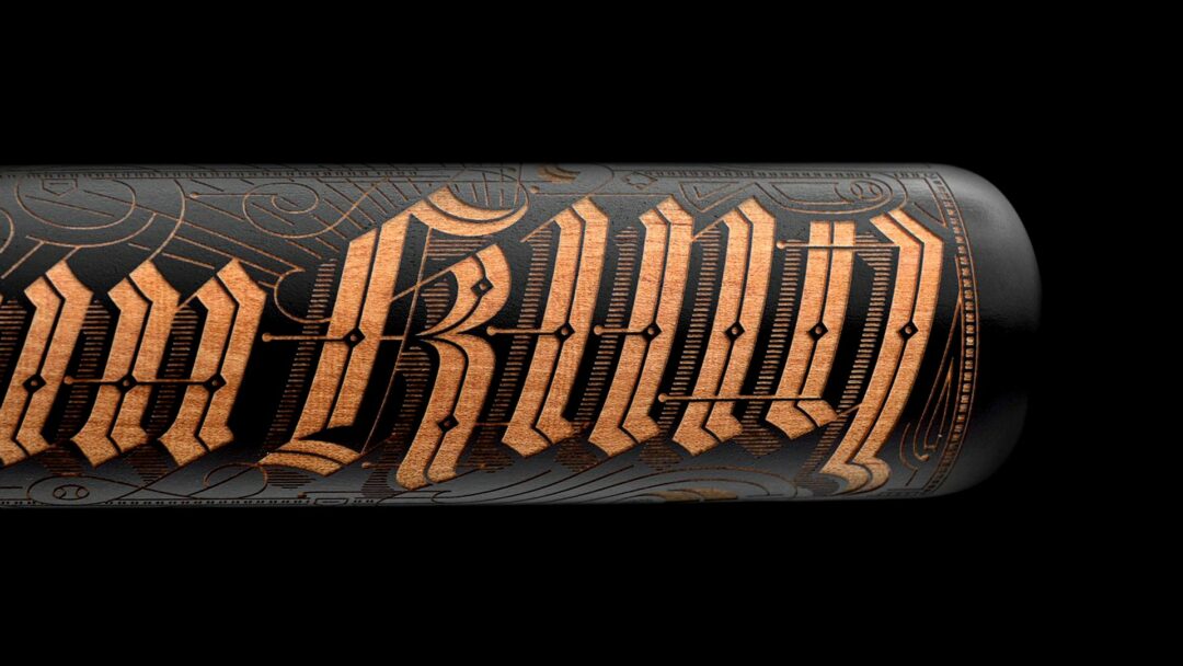
JCP: That is actually a good question. When I have to give talks I always bring the same ten projects with me, which show different aspects of the way that I approach work. They all emphasize one core idea–which is, whatever it is that you are working on: the identity for Pinterest, the bat for Nike, or the cover of Variety magazine, they all have craftsmanship. My work tends to feel like I worked really hard on it.
MG: It feels like you are building the pyramids every time.
JCP: Right. During the process I like it to hurt a little bit when I’m doing it. I need to build the mountain and then claim it. I set up crazy parameters and then I start to push the limits. The work that I’m really proud of demonstrates that–like the Variety mag cover. It was a super fun project to work on. Also the Nike bat that I did with Kevin Cantrell. That was one of the purest, most fun collaborations I have ever had. We are both typographer-designers and very different aesthetically. We approached that project like you would an improv group. Like you have to say yes and keep adding on. I would design something, send it to him, and he would keep adding to it. It was always additive.
MG: What about The Drinkable Book that you designed? I loved that concept.
JCP: That was an advertising project. I didn’t want to make it ornate or over the top because it would take away from the purpose that it was serving. The project wasn't about decoration, it was about the utilitarian nature of what those pages did, and it was quite beautiful. We worked with a scientist who was merging super nano particles with paper to make anti-microbial filters. This was a case where aesthetic design needed to take a back seat.
MG: Yes, the idea of under design for the sake of the idea.
JCP: Right. I get a lot of questions about that because aesthetically it doesn’t fit with the rest of my work, but I’m ok with that. I’m very proud of all my work but The Drinkable Book is probably the most important piece I have ever worked on.
MG: Going back to the idea of collaboration–you seem to enjoy collaborations a lot, and you have a lot of talented friends. Is it a very natural way to work for you?
JCP: That is how "Sunday Afternoon" started. The whole thing started with the idea of collaboration. I wanted to create an environment where my friends and I had an opportunity to work together. What would it look like? Maybe like an artists representation agency or design studio. A place where people come together and get paid to work on a project together. Inspire and challenge each other. A lot of creative people yearn for it. I grew up hearing stories about Andy Warhol's Factory and all these places where people shared ideas and collaborated. The byproduct of that were these art movements and these ideas that permeated through young people and culture.

MG: How much of your time do you spend doing font design and how much pursuing your artistic projects?
JCP: I don’t do as much typeface design as I used to. I’ll do it for clients when it is rolled into a larger branding project and they want a custom font. I was fascinated with type design in my undergraduate studies, and then I went to study type design with Pablo Medina in the Dominican Republic. Back in the US I studied with James Montalbano. I designed two typefaces during those years and that enabled me to do my postgraduate studies at Cooper Union in type design.
MG: How was that?
JCP: It was wonderful. At that time in my life I really wanted to get a really deep knowledge of the history of type design, theories, and different ways to create letterform systems for people to use. I tend to go all in on things, so that is all that I did for a couple years, and I really enjoy what I made. That is where I met Lucas Sharp and got to work with him. I ended up meeting a lot of people, but you grow and evolve and your wants and needs change, so I don’t do that kind of work anymore. I would say that I spend most of my time now between client work and personal typography, illustration, and painting work.
MG: Where do you think that the field of typography is headed? What is there in the future?
JCP: That is really a good question. I think about it all the time. Before the internet there were these really big design movements. Now with the web you see fragments, like multiple movements happening at the same time. You have some people like Jessica Hische doing beautiful ornate typography in print, and then you have DIA studio doing beautiful clean, modern, thoughtful work, and they are all happening together, and I’m part of it. There is no one overarching design movement right now. That behavior is going to continue for a while.
MG: In this environment in which anything goes, with so many technological possibilities and so much access to information out there, people are literally making typography out of anything.
JCP: Well, In my portfolio I have some weird photographic typography made out of Christmas lights and dollar bills. There is room for everything, but it needs to be approached with sensitivity and thoughtfulness. Things are happening so fast these days that a lot of people don’t do their due diligence.
MG: Could you describe your process?
JCP: The ideation aspect is analogue, but I’m quickly into the machine. Then for the more illustrative work that I do I work back and forth between Illustrator and Photoshop. If I can’t accomplish something in one program, I move to the other and so on. For the more illustrative work that I do, if I work on a font, I use font lab.
MG: Could you talk about how you were artistically influenced in your childhood? Were you surrounded by art?
JCP: I grew up in Queens. My family wasn’t particularly artistic, although my uncle was a draftsman. He would draw and that fascinated me. I used to try to copy his drawings. He was a big influence. I thought that he was a superhero. I don’t think that I would have picked up a pencil as a kid if I hadn’t seen the things that he did. Also I read a lot of comic books.
I was into drawing and art during my adolescence, but once I got into high school I felt I was better at physical activities. I was very fast and I could throw the ball very well. I joined the wrestling team, the track team, and the football team. I was still making and drawing things after sports. But high school was a time for me to rebel, to play sports and to read a lot of philosophy. I started off reading the pre-Socratics. I even tried to convince my family to send me to Germany so I can study Nietzsche and Kierkegaard in the original language.
MG: What are you reading now?
JCP: I just finished a book called Zen and the Art of Motorcycle Maintenance. It's a really good book. It is about a relationship between a father and son, using the keeping up of the motorcycle as a metaphor for how to approach life.
MG: To conclude, could you name some of your favorite iconic images in graphic design?
JCP: Lance Wyman's 1968 Olympic design identity. I think that still to this day that is one of the single greatest graphic design systems. I feel like I rip him off every time I design. I’m open about it. I’m just trying to be that good just once. Another one that comes to my mind is Saul Bass. Any of his corporate identities. All the logos that he did are still some of the best identities ever created. Most of his work still looks fresh today. Herb Lubalin's Beards book cover is another one. A very whimsical piece of design.
MG: What is your advice for a kid who wants to get into this overcrowded graphic design field today, where everyone who has a computer thinks that they can be a graphic designer?
JCP: I think that you are right. It is overcrowded and a lot of people think that they can do it, and as much as I want to be negative about that, the only way to start something is to be an amateur and to suck for a long time before you do something that you are proud of. I’m sucking most of the time–that is the way I build these mountains that I need to climb, so I can stop sucking. Plato said that there is no learning without emotion. In order to learn we need to feel we need to work at it.