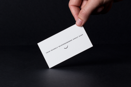
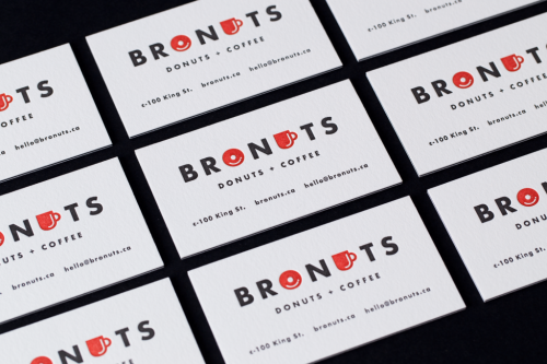
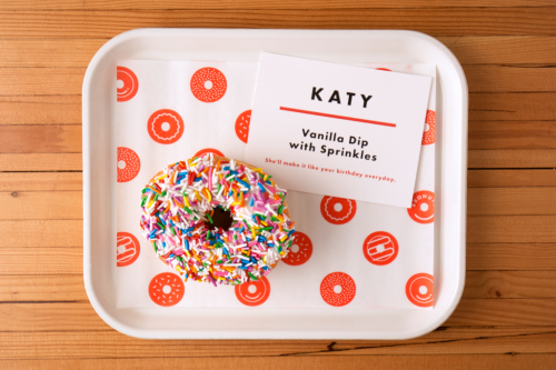
Branding for Bronuts by One Plus One
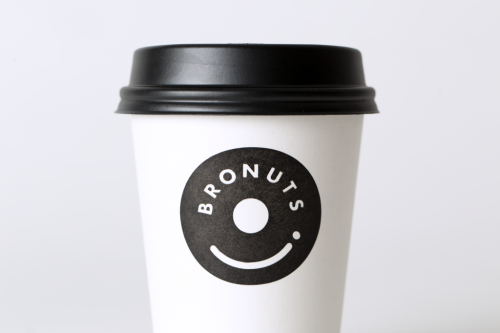
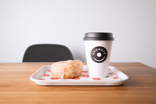
One Plus One builds the Bronuts mark from the two words inside the name. A black disc, a white hole, a curved line for a smile: the shape reads as a doughnut and as the top of a takeaway coffee cup at the same time.
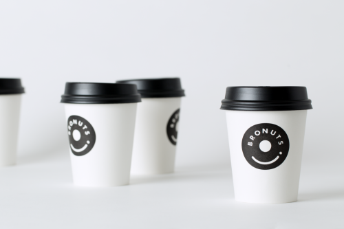
Set on white cups with black lids, the logo needs nothing else. Type runs around the top arc, BRONUTS spaced to the curve, with a single dot closing the smile. Nothing on the cup competes with it.