
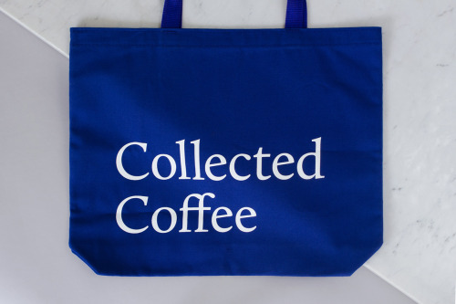
Collected Coffee Branding by Fivethousand Fingers
Fivethousand Fingers designed the Collected Coffee identity, a white and navy system that names a single farm.
15 editorial projects from Canada.
Fivethousand Fingers designed the Collected Coffee identity, a white and navy system that names a single farm.

Recent work from Toronto illustrator Sam Island.
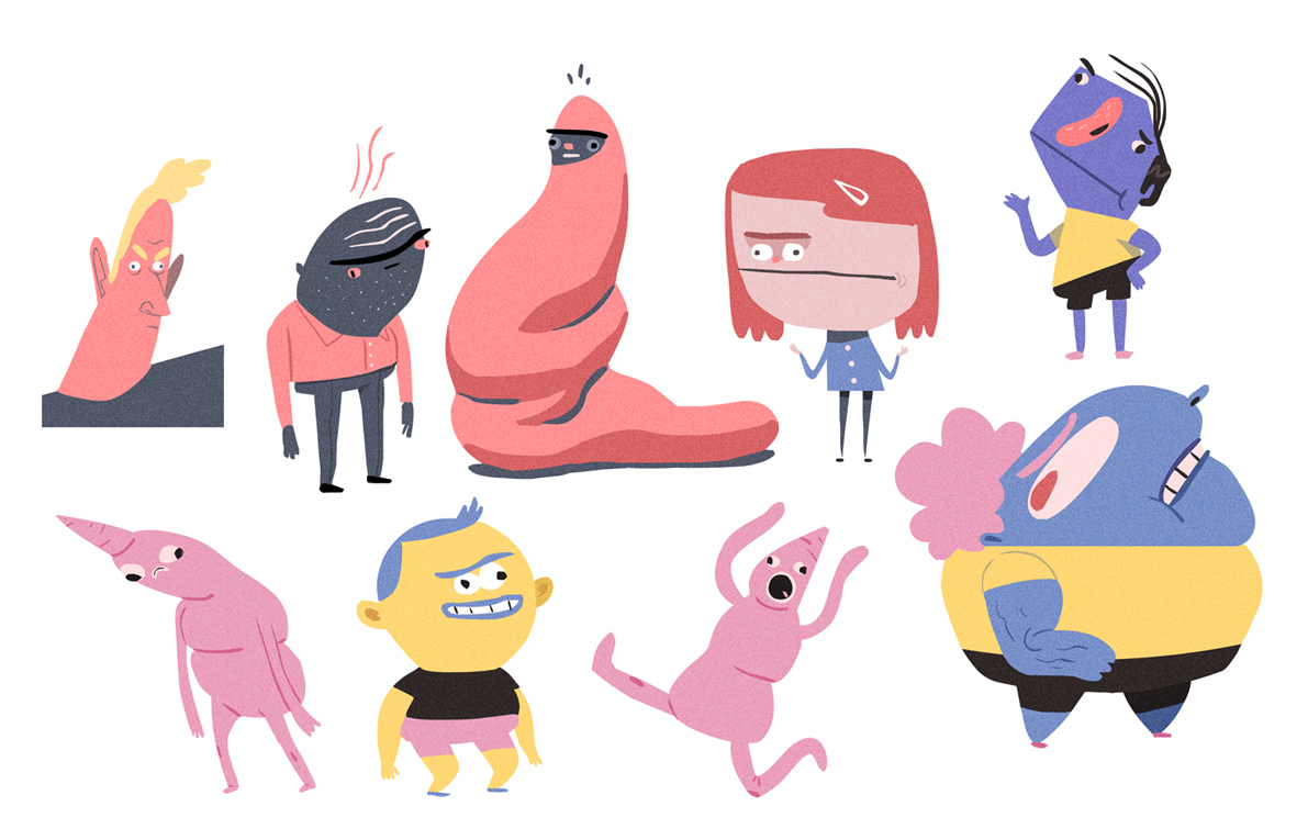
Noam Sussman designs funny-looking characters, from flat-coloured crowds to loose pencil studies.
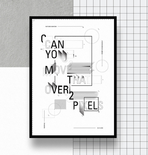
Jiani Lu's typographic series turns design frustrations into framed prints, from stacked capitals to A S A P against halftone dots and rules.
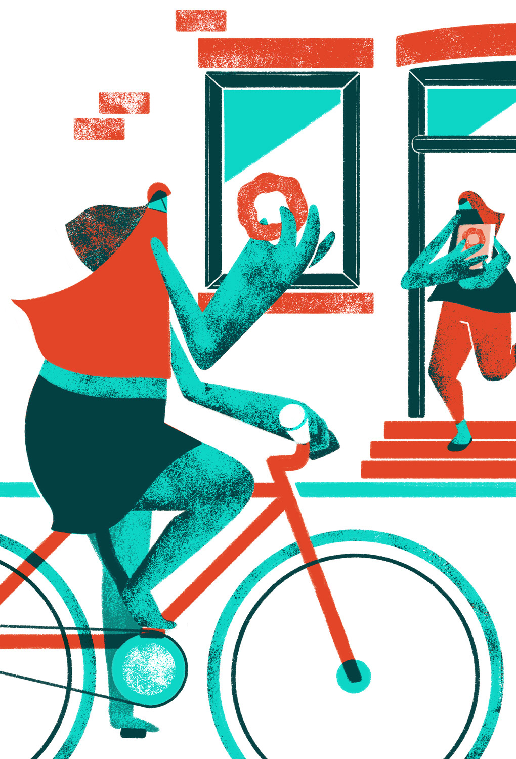
Amélie Tourangeau's Dear Montreal postcards draw the city in vermilion, turquoise and deep green, from a cyclist to a café terrace.
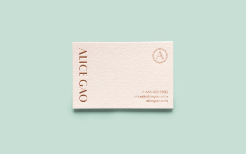
Tung sets Alice Gao's name vertically in copper foil on a blush card, with a dotted ring around her initial and contact lines in the corner.
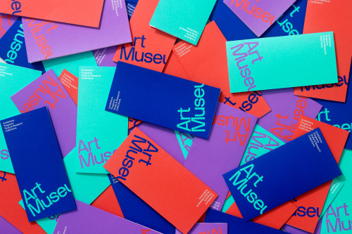
Underline Studio's identity for the Art Museum in Toronto: cropped type on cards in orange, teal, purple and blue.
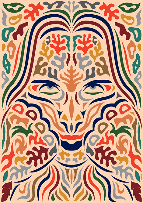
Siggi Odds builds a bearded portrait from coloured strokes under gold capitals, and a symmetrical mask from repeated leaf forms in cream and red.
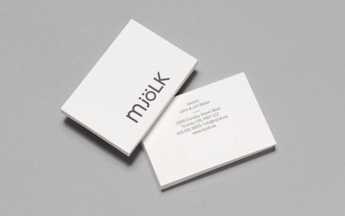
Tung keeps Mjölk's mixed-case wordmark and reshapes it — lowercase m, j and ö against capital L and K, set charcoal on white card.
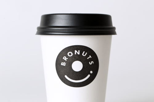
One Plus One's Bronuts mark reads as a doughnut and a takeaway coffee cup at once, printed black on white cups.

Underline Studio gave Toronto still life photographer Jodi Pudge a wordmark, a circle-held monogram and a black and orange stationery system.
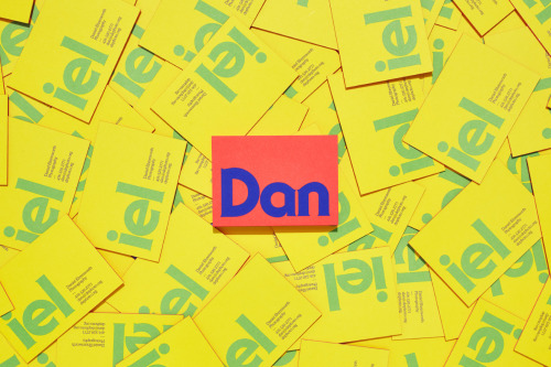
Underline Studio's identity for Daniel Ehrenworth splits his name across yellow cards and one coral card, in a loud 1970s palette.
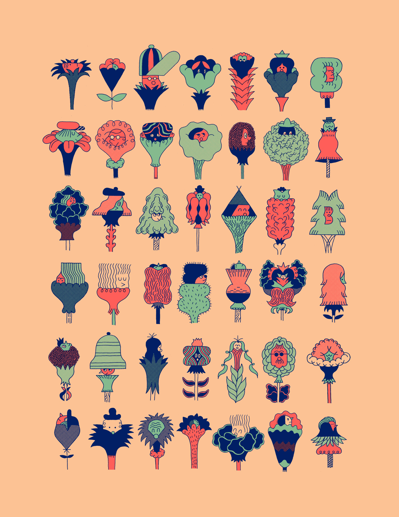
Recent work from Quebec City illustrator Mathieu Labrecque.

Canadian designer and illustrator Tom Froese revels in colour and finds humour in everyday life.
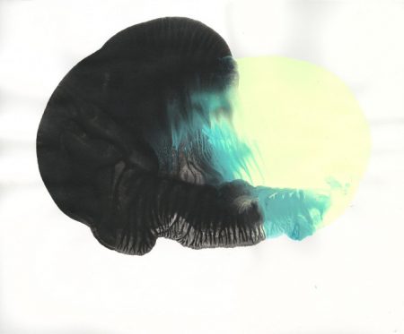
Stephen Di Donato's planetary posters, researched from NASA missions and patterned after science-fiction magazines of the eighties.