A Collection of Typographic Posters and Type Experiments
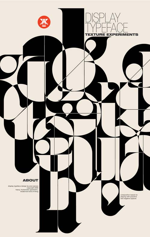
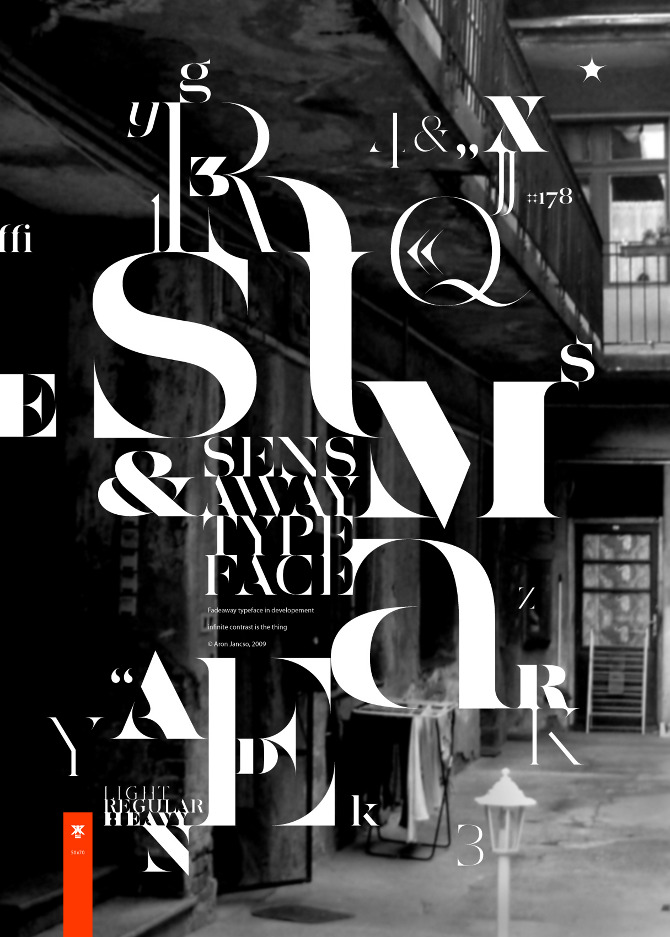
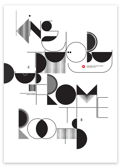
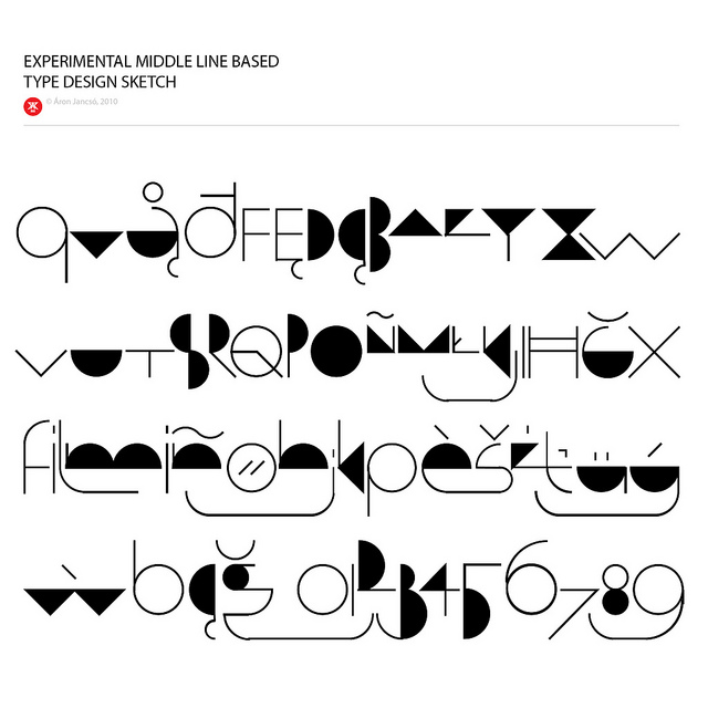
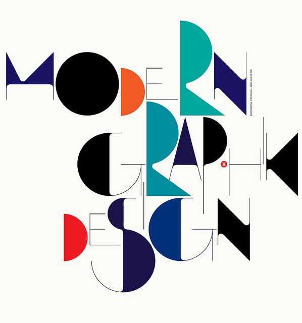
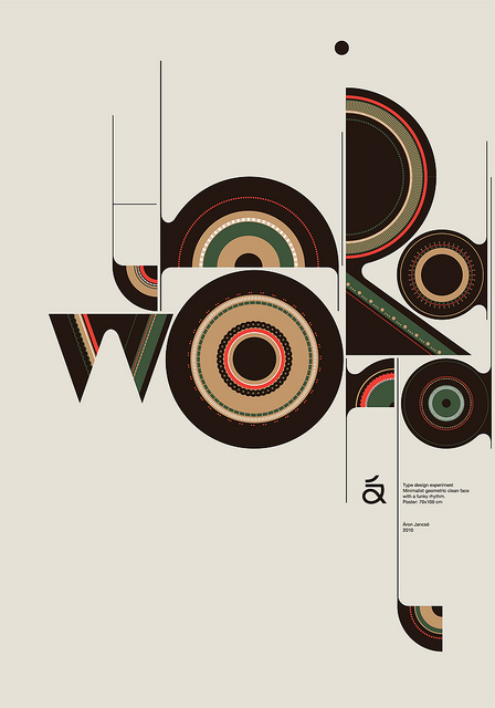
This set is a reminder of how much of graphic design has been argued out in type. Eleven posters and type experiments are collected here, and the credits printed inside the images read like a small international roll-call: a 2010 middle-line type-design sketch by Armin Jančić; a 2009 specimen poster for the Sensaway typeface by Joan Janés; a display typeface by Armin Schnee; Mehmet Gozetlik‘s Modern Graphic Design, built entirely from circles, semicircles and triangles; a 2010 poster by the Iranian designer Reza Abedini; and the Théâtre Vidy-Lausanne 2010–11 season identity from Integral Ruedi Baur in Paris.
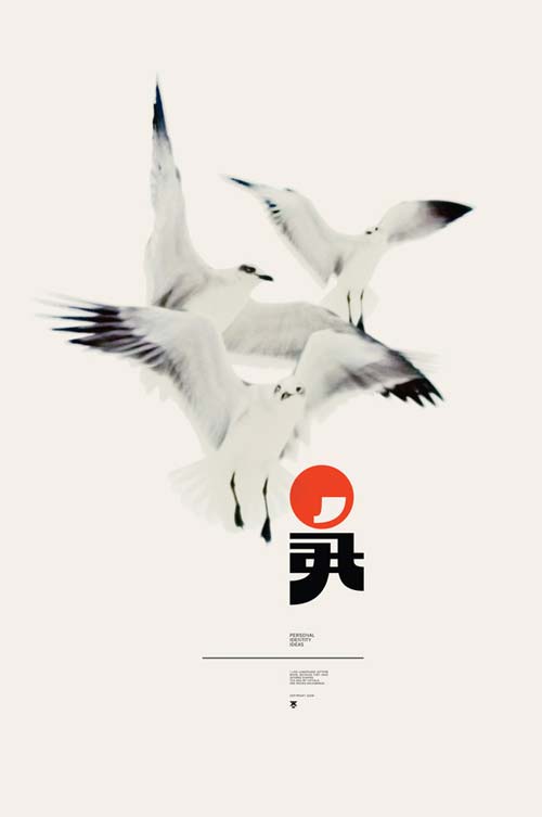
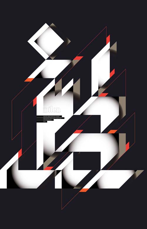
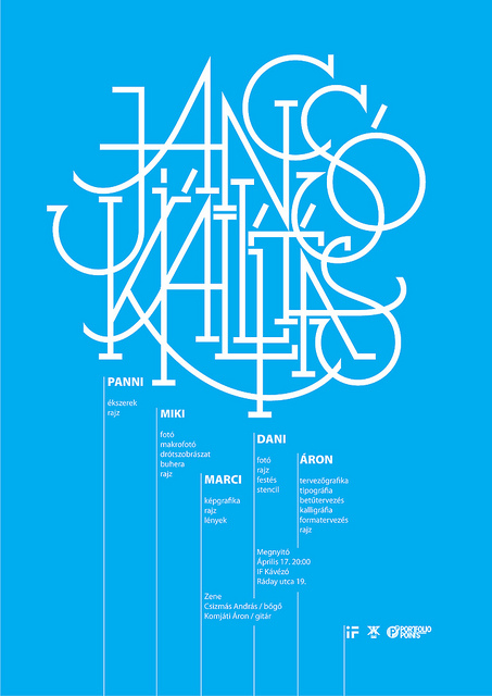
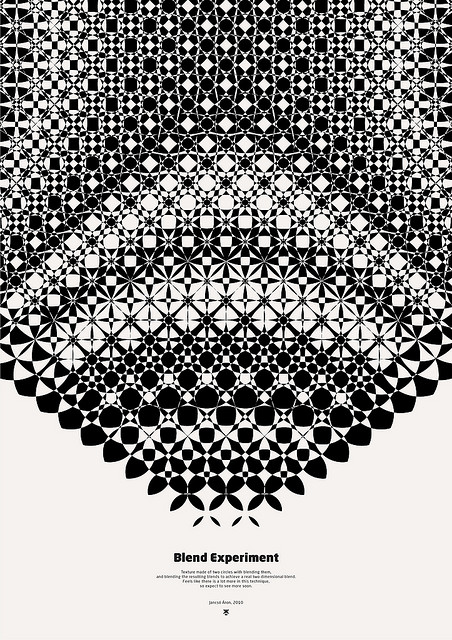
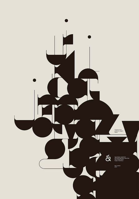
What holds the selection together is method rather than style. Almost every piece builds its letterforms out of a system — a middle line, a triangular grid, a kit of geometric parts — and then lets the system do the designing. A few, like the NUMBER poster series and the seagull composition, are experiments in positive and negative space rather than typefaces at all.
It is a useful corrective to the idea that typography is a matter of choosing a font. Here it is closer to engineering, and the results are strangers and more interesting than a specimen sheet would ever be.