
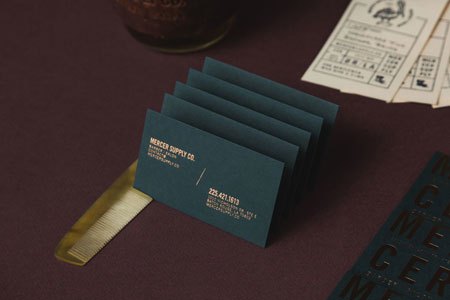
New identity for Mercer Supply Co by Peck & Company
Peck & Company gave Mercer Supply Co. a typographic barber identity that leans hard on its letterforms rather than on the usual barber tropes.
Archive
29 curated projects in typography.
Peck & Company gave Mercer Supply Co. a typographic barber identity that leans hard on its letterforms rather than on the usual barber tropes.
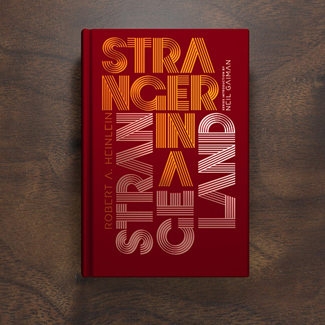
Alex Trochut's Penguin Books Galaxy Series covers let striped and outlined type carry Heinlein and Gibson.

Erman Yilmaz threads white type through looping gradient ribbons, then sets outlined capitals over dense grey waves.
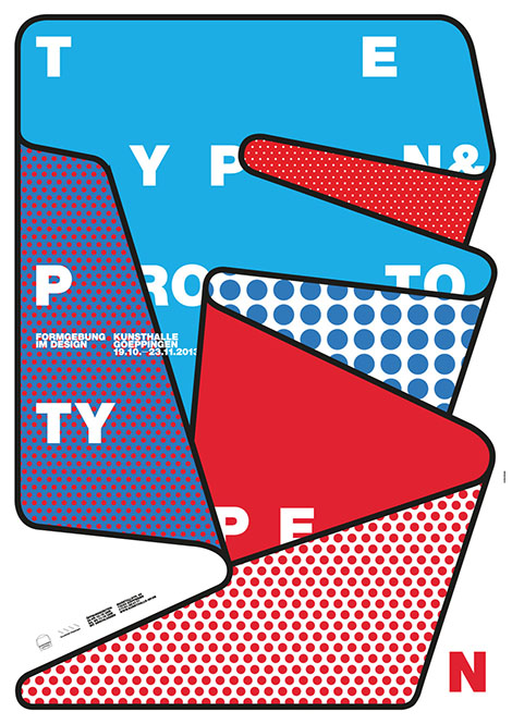
burkhardthauke overlaps cyan, red and white shapes under black outlines, cutting large white letters apart so no word lands whole.

Meg Hitchcock glues thousands of individual letters from religious texts into drawings that dissolve the words into pure form.
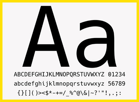
Hack is a free, open-source typeface made for source code, drawn by more than 60 contributors. The specimen shows four cuts and the glyphs programmers use.
Design Facts collects design trivia — Frutiger's three years on Univers, Glaser's National Medal of Arts — under a two-line serif wordmark.
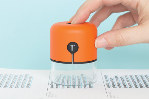
Fiona O'Leary's Spector is a hand-held orange device with a white T emblem and a clear base, lowered onto printed columns of type.

James Lewis lettered this in white on kraft paper with a paint marker, and left the pen in shot — calligraphic flourish, honest medium.

Mirko Camia's Alphamix turns letters into objects: a candle A with a lit wick, a glass B filled with faceted orange shapes.

Peter Fischli and David Weiss's ten-point list stands fifty feet tall over Houston and Mott Streets, installed with the Public Art Fund.

Playtype, the Copenhagen type foundry, took over ARAM in London with a pop-up of posters, mugs and stationery — Scandinavian type as objects.
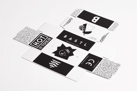
Anymade Studio's identity for Bastl Instruments is black type on white labels, each instrument given its own lockup.

Mark Richardson of Superfried made a poster series of single uppercase letters, each manipulated with modern shapes and blackletter traces.
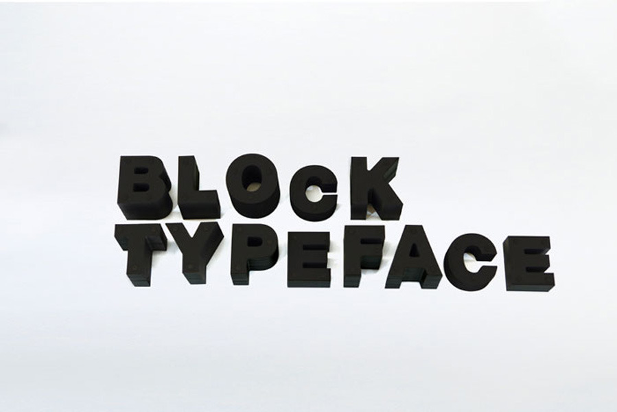
A typeface cut from stacked paper sheets by Japan's Daikoku Design Institute.
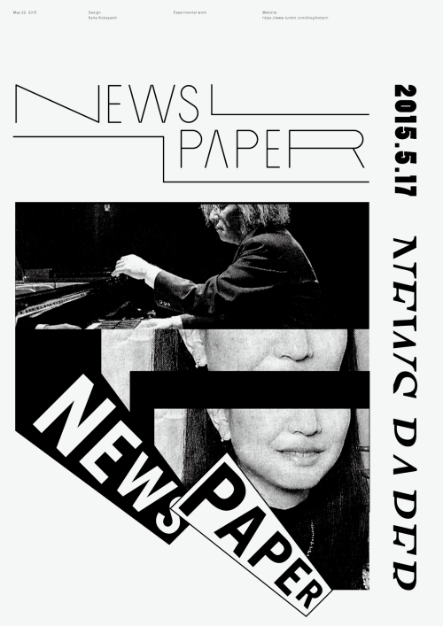
Seita Kobayashi's 2015 poster 'News Paper' — typography doing the work of a headline.

Daniel Barkle's typography posters turn Arial, Bebas and other sans serifs into black sheets where each letter is drawn as wireframe structure.
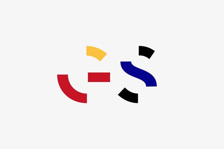
Epiforma gives Get Set Festival a broken-letter identity: arcs and blocks in red, yellow and blue, reused across the posters and rebuilt into the title.
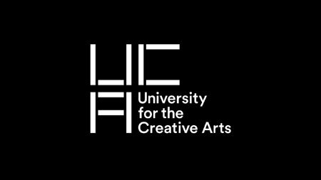
Spin's identity for the University for the Creative Arts is a block-built UCA monogram that turns from letterform into pattern.

Valérie Hugo drew an illustrated alphabet in ink, building each letter from flora and fauna: a dahlia, curling leaves, a toucan on a B.

Australian photographer Tim Jones commissioned a typographic identity built on a compact T, J and P monogram.

Neil Stevens builds the word Electronica from isometric blocks wired like circuit diagrams: orange and blue on black, then yellow on red.

A feature-length documentary about the Linotype, the type casting machine Thomas Edison called the Eighth Wonder of the World.

Art director Hampus Jageland's work pairs a black-and-white hooded portrait with a reversed-out A and the words GANG OF FOUR.
Loading