Branding for Operator 25 Cafe by Pop & Pac
Operator 25 is a Melbourne cafe. Pop & Pac, also Melbourne, was asked to refresh the brand and the room it sits in.
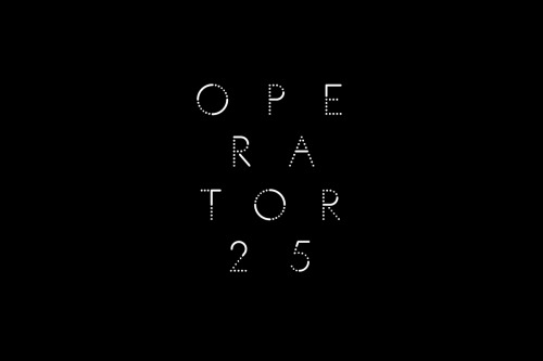
The new graphic treatment borrows from telephone exchange switchboards: cords and connection holes. The lettering is built from points, each letter a trail of dots, as if the name were being routed.
Outside, the sign is a round lightbox with a one-line drawing of a cup and saucer, and the name running around the rim. Two elements, one light source, and it reads from down the street.