
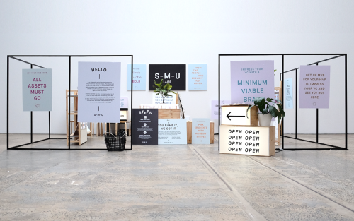
For The People: Branding for Start-Me-Up Labs
For The People branded Start-Me-Up Labs with light boxes, steel frames and posters for a start-up with no brand budget.
Archive
64 curated projects tagged in graphic design.
For The People branded Start-Me-Up Labs with light boxes, steel frames and posters for a start-up with no brand budget.
Rivertown Lodge's identity by Ro&Co skips hotel clichés and builds from classic camping textures — tent canvas, enamel dishware, woodland patterns.
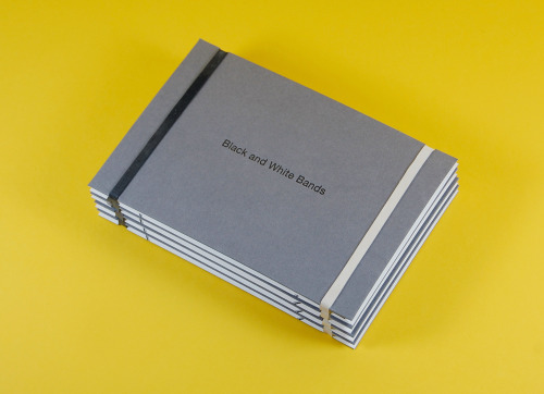
Kerr Vernon is an independent Glasgow design studio at The Whisky Bond, founder-led, showing its Black & White Bands project.
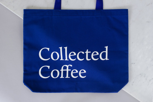
Fivethousand Fingers designed the Collected Coffee identity, a white and navy system that names a single farm.
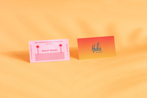
Parametro Studio's HULA branding puts a script wordmark and palm tree motif on matchboxes in pink and yellow.

New York-based Pagan, talks about his craft, influences, and love for typography.

Pop & Pac built The Penny Drop's café identity from a single pun: pennies falling from the tax office above.
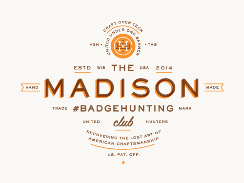
Allan Peters' Badgehunting Clubs: a Rhode Island anchor badge on orange and a Los Angeles mark in cream on pale blue.
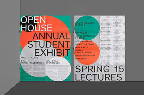
Mainstudio's posters and MARK covers set flat colour and heavy type against dense programme text.
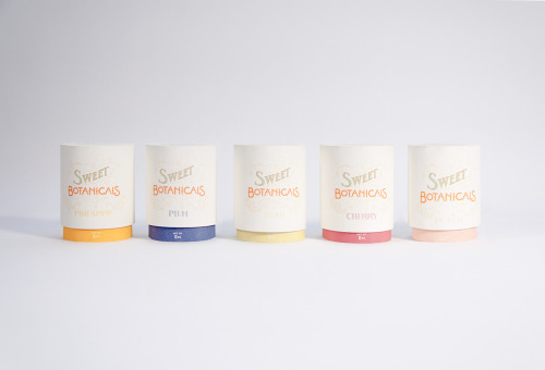
Sweet Botanicals is Patrick Chen's packaging project: five tins, hand-drawn lettering, Victorian florals and one colour per flavour.
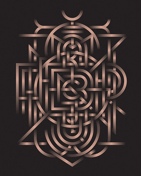
Michael Spitz prints the numerals 0 to 9, each in a different cut, in orange and grey on cream, and sets LARGE COFFEE 12 & LITTLE on yellow.
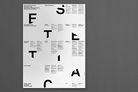
Matteo Colella sets display letters across ruled grids and gives booklets minimal covers for the cultural institutions he designs for.
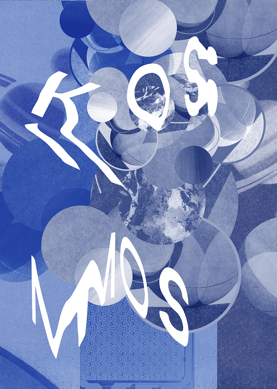
Pineum's Warsaw posters play with photographic imagery, type and colour, sitting between the gallery and the street.
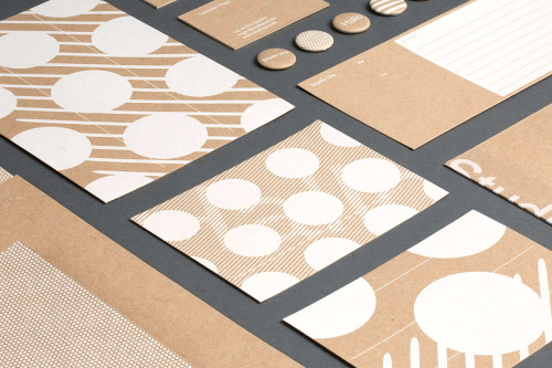
Studio Una, based in Germany, aimed for flexible, high-quality stationery with a pleasant touch, in various printed materials.
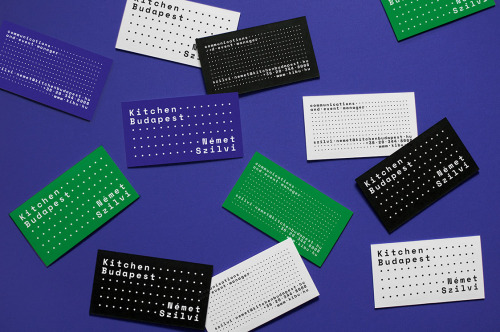
Eniko Deri and Nora Demeczky run de_form, a Budapest studio known for art direction, branding and editorial design.

Ortolan refined rather than replaced Kennedy Nolan's identity, contrasting a bold mark with delicate typography.
Design Facts collects design trivia — Frutiger's three years on Univers, Glaser's National Medal of Arts — under a two-line serif wordmark.

Stuart Tolley’s MIN surveys the return of simplicity to graphic design, from its pale blue cover to the work inside.

Akatre built Lancôme's 'Énergie de Vie' press kit around their own typeface Marie Louise — a box, a book, and no safe choices.
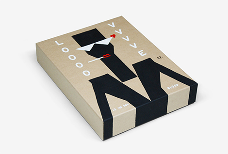
Damien Poulain's LOVE cover cuts white letters and red marks into black slabs, and his paper work builds characters from flat blue shapes.

Yi-Hsuan Li used illustration to make Su Beng's 'First Class of Taiwan History' a book people would actually pick up.
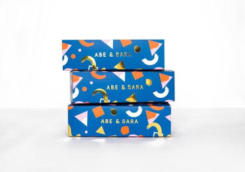
Faber & Lo gives Abe & Sara's sunglasses blue boxes with gold foil lettering and a pattern of triangles, circles and crescents.
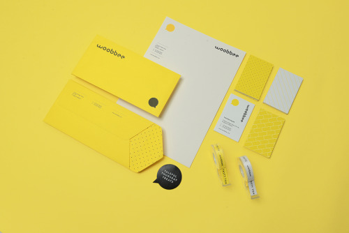
Sciencewerk's rebrand for Woobbee sets a lowercase wordmark and yellow bubble on off-white cards, patterned stationery and bright envelopes.

Aloof's book for Gloria Cortina refuses the design monograph as brand exercise — circling the work rather than illustrating it.
Loading