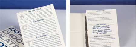
Chocolate Grotesque
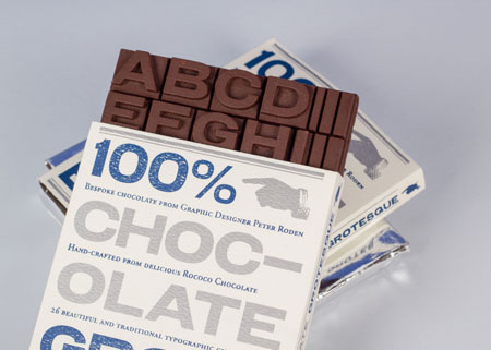
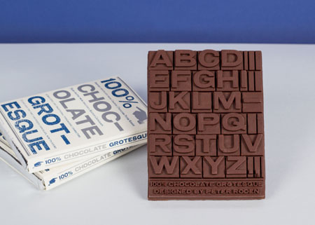
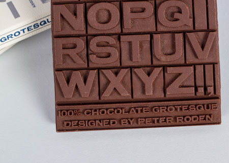
Peter Roden made a typeface out of chocolate. The bar is moulded as capital letters, A to H visible in two rows of four, the wrapper covering what comes next.
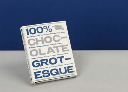
The pack is white with blue type and reads like a specimen sheet: 100% at the top, the name split across lines as CHOC-OLATE and GROT-ESQUE, and Roden credited as graphic designer underneath.
In the first photograph the bar stands open among two wrapped copies. In the second the box is alone on a grey surface against blue. The pun is the whole idea, and the packaging never explains it.