

Boulevard Brewing Company
Carpenter Collective's brief for The Boulevard Beer Hall extended past the walls and into the tabletop itself.
Archive
68 curated projects tagged in identity.
Carpenter Collective's brief for The Boulevard Beer Hall extended past the walls and into the tabletop itself.

Studio Brave repositioned CNK Catering around three words, "Creating memorable moments", carried through the photography, stationery and print.
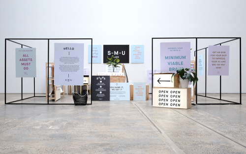
For The People branded Start-Me-Up Labs with light boxes, steel frames and posters for a start-up with no brand budget.
Rivertown Lodge's identity by Ro&Co skips hotel clichés and builds from classic camping textures — tent canvas, enamel dishware, woodland patterns.
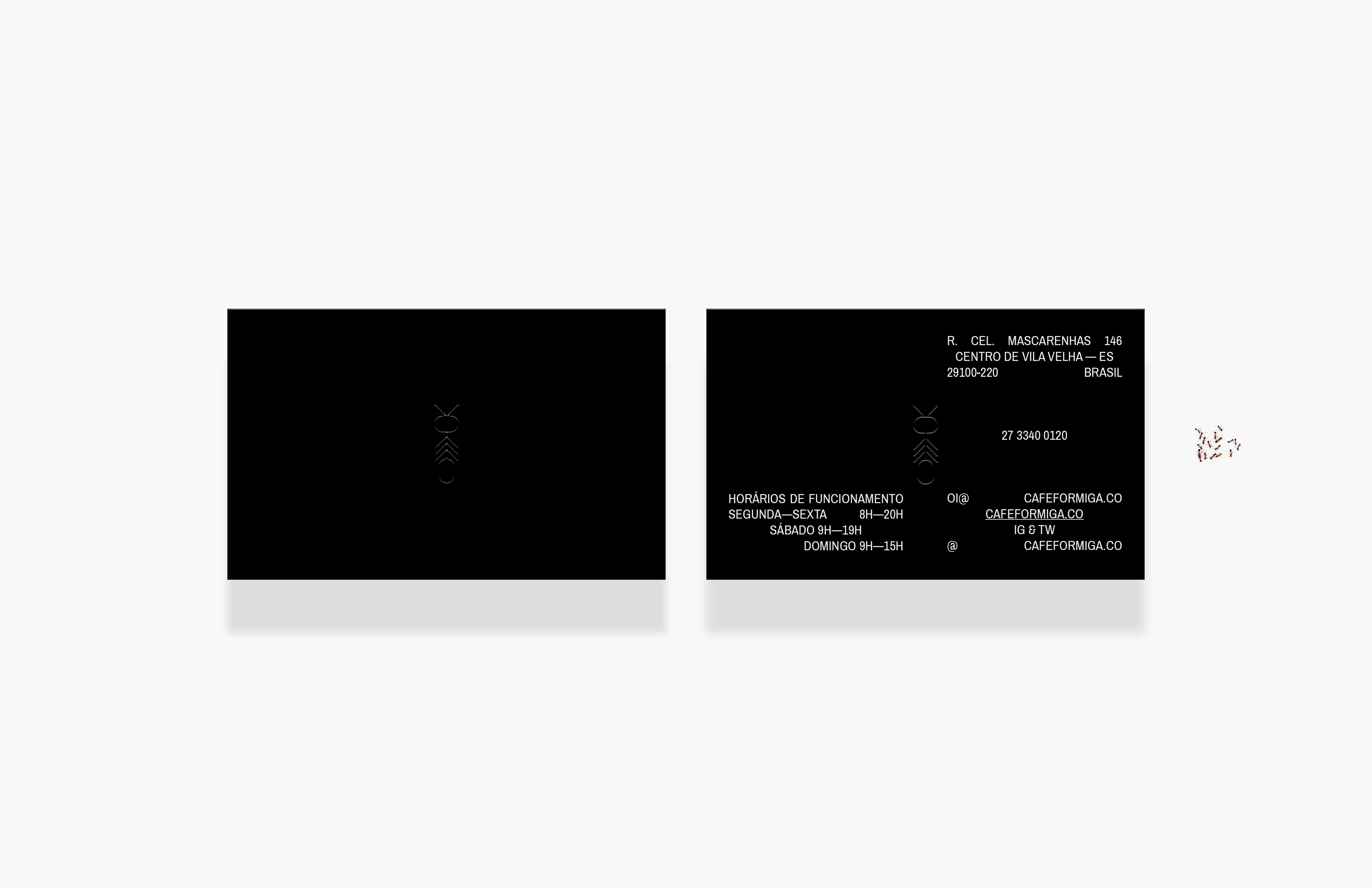
Café Formiga is named for the Portuguese word for ant, a pun on the joke that ants are good for sight.

Made, the freelance office founded by Ivan Pedroza, works across branding, print and digital design.
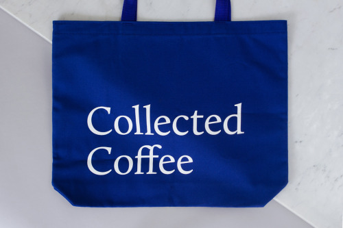
Fivethousand Fingers designed the Collected Coffee identity, a white and navy system that names a single farm.

Franklyn is a creative studio applying a boutique approach to branding and swag for global brands and startups.

Pop & Pac built The Penny Drop's café identity from a single pun: pennies falling from the tax office above.
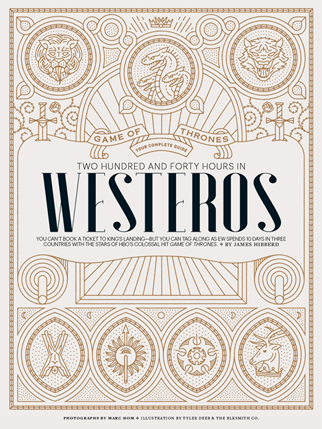
Tyler Deeb is a self-taught Louisville designer whose typography and illustration work has appeared in Entertainment Weekly and Fast Company.
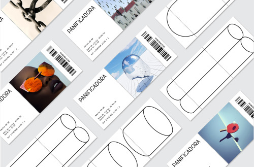
Eva and Marta Yarza imagined the identity Vigo's ruined Panificadora might carry if it were reborn as a centre for arts, culture and youth.
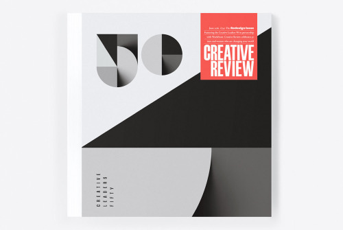
Sawdust's 2016 redesign of Creative Review puts a large black 50 on the cover and carries an identity for Creative Leaders 50.
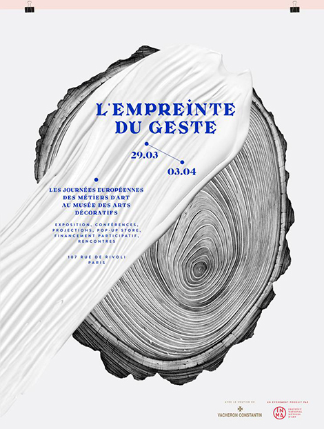
Violaine & Jérémy set the Théâtre des Bouffes du Nord season in dark type over a colour wash, and draw Napoleon as NAPOLEONLAND in pencil.

Facultative Works grew out of a simple idea — only make the experimental projects — into a studio working across illustration, identity, sound and…

Ortolan refined rather than replaced Kennedy Nolan's identity, contrasting a bold mark with delicate typography.
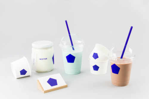
Brief gives Mister a blue pentagon on white cups, jars and a coaster, plus a pair of cards in blue and white.
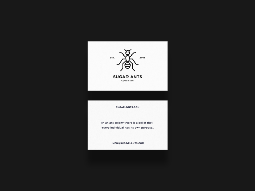
ONNO centres Sugar Ants on a line-drawn ant and prints a hamster in a wheel across a white t-shirt.
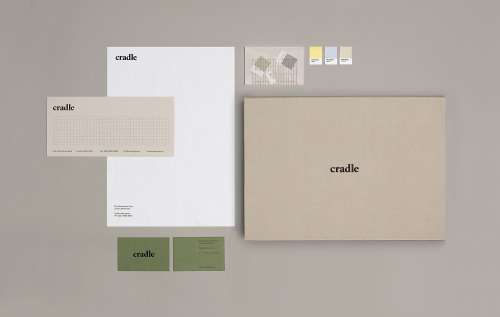
Matthew Hancock marks Cradle with a lowercase wordmark and carries it across letterheads, sage cards and colour chips.
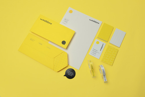
Sciencewerk's rebrand for Woobbee sets a lowercase wordmark and yellow bubble on off-white cards, patterned stationery and bright envelopes.
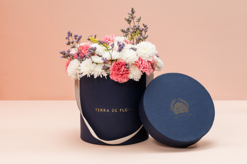
Parámetro Studio wraps Terra de Flora in a navy hat box with gold foil lettering, cream ribbon and cut flowers, plus sage green and navy cards.
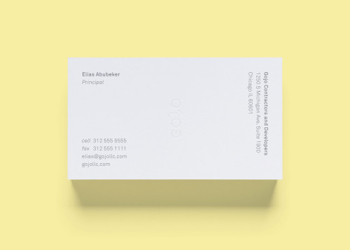
STUDIOYONIS brands Gojo with white and yellow business cards, a ghosted wordmark and type that stays quietly out of the way.

La Tortillería and sister agency Curioso built the identity for Seven Point, a Chicago medical-cannabis dispensary where regulation shapes design.

Bruch—Idee & Form put the content at the centre of Quer Kommuniziert's identity, letting arranged and emphasised text become the visual style.

Mariano Fiore's identity for Lumar in A Coruña leans on the name's history — the original coffee shop held the same corner from 1959 to 1993.
Loading