Bruch Studio: New Branding for the Armstark Office
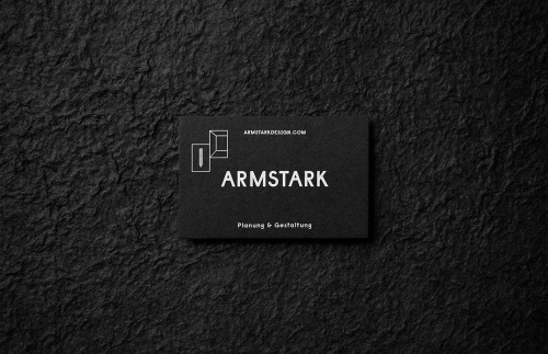
Bruch – Idee & Form started from the tagline. Armstark’s black card, photographed on rough dark plaster, carries a white outline mark — two folded panels, one upright, one leaning — above the name in wide capitals and Planung & Gestaltung beneath.
The brochure is white and monochrome. The same folded form is printed over a heavy black A, covering the apex so only the letter’s leg and crossbar show through.
Planning and design drawn as one object: two panels that fold, and a letter folded into them.