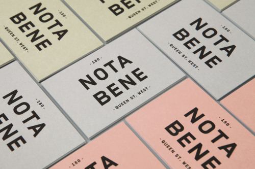
Nota Bene Branding by Blok Design
Menus for Nota Bene, printed across pale yellow, grey and pink stock. The name runs in two lines of heavy black caps, with the street number and address set small beneath it. The block repeats unchanged on every card; only the paper moves.
The second view is one cream card, folded and turned, the name printed at an angle across a white brush mark. Blok, a Toronto studio, built the identity for a chef relaunching his restaurant.