Identity for The University for the Creative Arts by Spin
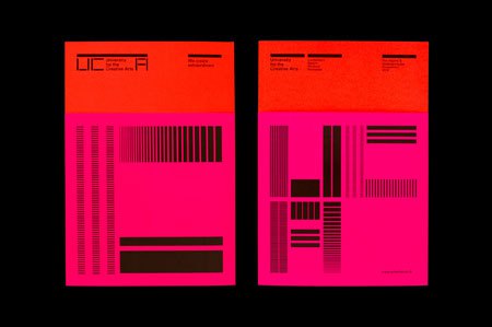
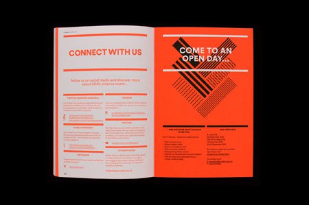
Spin built the University for the Creative Arts monogram from blocks. The U, C and A are cut from the same thick verticals and horizontals, and the letters lean into each other’s space. The full name sits beside the mark in a plain sans.
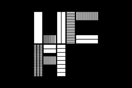
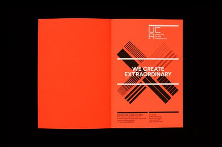
The second view shows what those blocks can do. Fill them with fine horizontal rules, or leave them solid, and the same mark becomes a texture.