
TLS
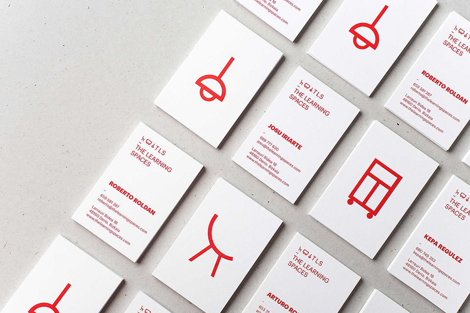
The Learning Spaces shapes rooms around teaching methods, and needed an identity that could carry across its materials.
Archive
10 curated projects tagged in logo.
The Learning Spaces shapes rooms around teaching methods, and needed an identity that could carry across its materials.
Allan Peters' Badgehunting Clubs: a Rhode Island anchor badge on orange and a Los Angeles mark in cream on pale blue.

James Lewis lettered this in white on kraft paper with a paint marker, and left the pen in shot — calligraphic flourish, honest medium.

Eskimo Design built Caffè Pagani's new logo on the observation that roasting coffee is a process of circles.
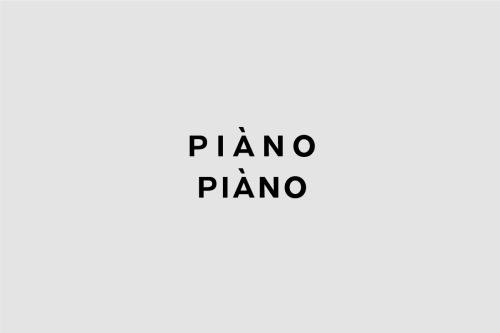
Weidemüller's Piàno Piàno identity stacks the name twice in heavy uppercase sans, black on grey, from print down to business cards.
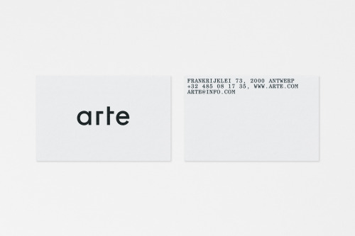
Vrints-Kolsteren sets 'arte' in lowercase black geometric type on white cards, with the Antwerp address block set uppercase on the reverse.
The Kitchen's identity puts a small apple over letterspaced capitals and wavy teal lines, then repeats the mark across mint tubs stacked in a pyramid.
Perky Bros gives Forgotten Boardwalk a Victorian wordmark and pink-on-metal cans, each carrying a single illustration.
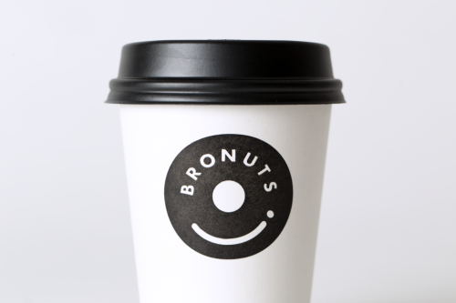
One Plus One's Bronuts mark reads as a doughnut and a takeaway coffee cup at once, printed black on white cups.
Spin's identity for the University for the Creative Arts is a block-built UCA monogram that turns from letterform into pattern.