
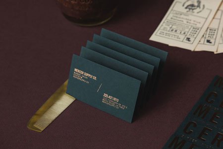
New identity for Mercer Supply Co by Peck & Company
Peck & Company gave Mercer Supply Co. a typographic barber identity that leans hard on its letterforms rather than on the usual barber tropes.
Archive
10 editorial projects tagged in corporate identity.
Peck & Company gave Mercer Supply Co. a typographic barber identity that leans hard on its letterforms rather than on the usual barber tropes.
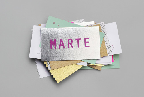
Bienal Comunicación, founded in Merida in 2006, built the Marte Estudio cards from foil, coloured stock and printed texture.
Two Times Elliott built the Even Odds identity around the name in a wide sans serif, carried onto pale grey business cards.
Bunch gives Globetouch a rounded sans-serif wordmark, set white on blue and, on the black card, white over a grid of white dots.
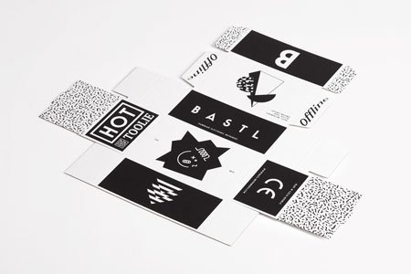
Anymade Studio's identity for Bastl Instruments is black type on white labels, each instrument given its own lockup.
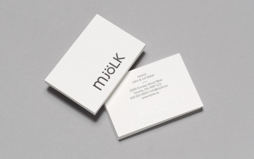
Tung keeps Mjölk's mixed-case wordmark and reshapes it — lowercase m, j and ö against capital L and K, set charcoal on white card.
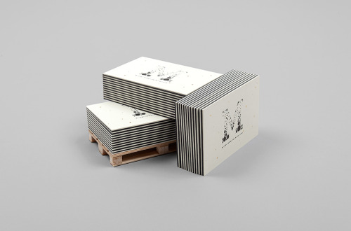
Murmure's business card carries its own argument: good design is for good clients, set in heavy lowercase on thick charcoal stock.
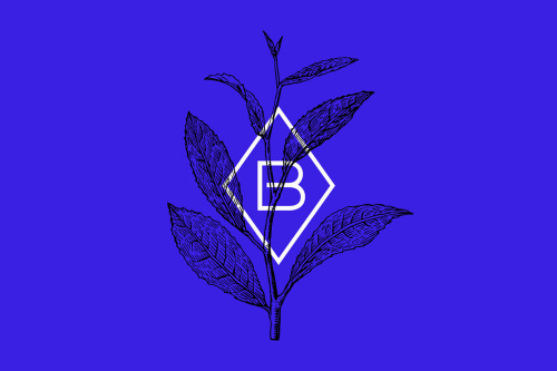
Warsaw studio Dmowski & Co. built Blanca Tea from a wide-spaced wordmark and a diamond B monogram set over a drawn tea branch on cobalt.

Practee, a dental practice, takes its identity from Mayra Monobe: pastel cards, a tooth mark and one line of copy per card.

Fabio Ongarato Design built a black-on-white identity for Urban Attitude, the Melbourne novelty gift store with a long-standing cult following.