Mjölk Visual Identity by Tung
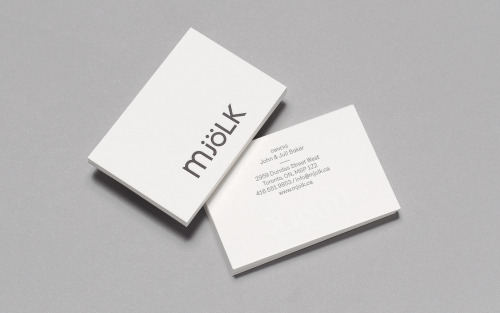
Mjölk’s wordmark keeps what people already knew. Tung held the mixed case — lowercase m, j and ö against capital L and K — and adjusted the letter shapes instead of replacing the mark.
The front of the card sets the name alone, charcoal on white. Everything else moves to the back: names, address, phone and the shop’s domain in small type.
Up close the mark sits pressed into heavy textured stock, the umlaut over the o doing the identifying work. The change is small; the familiarity stays.