AURA: Yvonne Moser’s Gemstone Water Packaging
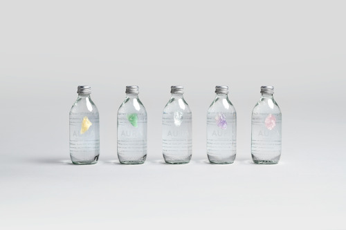
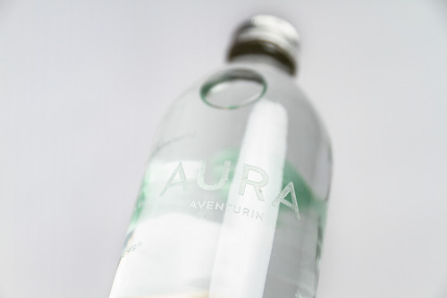
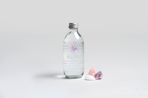
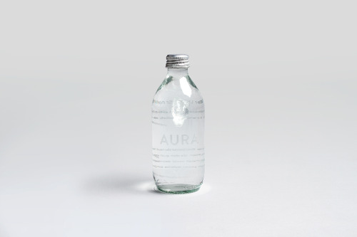
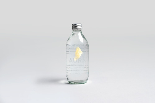
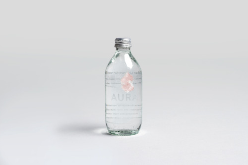
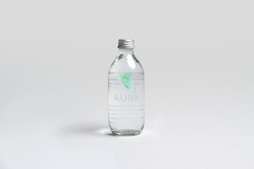
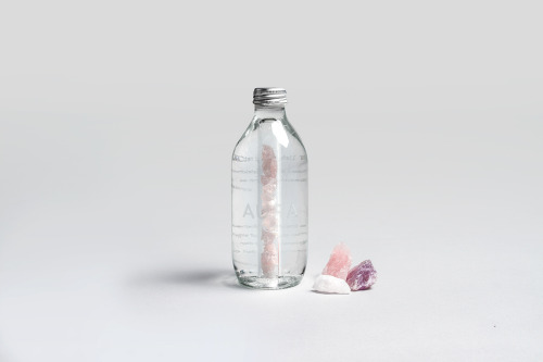
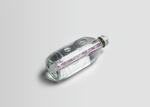
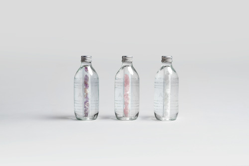
Bottled water is a category that mostly sells landscape photography, so Yvonne Moser’s packaging for AURA takes a different route: the point of difference sits visibly inside the bottle. Five variants, each holding a different gemstone suspended in the water, with the label printed directly onto the glass rather than wrapped around it.
The brand’s premise is that AURA is purified through deep rock layers and carries a high energetic oscillation, with the stones releasing that energy into the spring water. Whether or not you buy the claim, the design is a sharp piece of product thinking: the colour-coded stones do the work of five separate label systems, and clear glass with silver caps reads as clinical and premium at once. Moser, a graphic designer in Würzburg, works across typography, packaging and branding — and this is all three exercised at once.
More: the AURA project on Behance · Yvonne Moser.