

Boulevard Brewing Company
Carpenter Collective's brief for The Boulevard Beer Hall extended past the walls and into the tabletop itself.
Archive
47 curated projects tagged in Typography.
Carpenter Collective's brief for The Boulevard Beer Hall extended past the walls and into the tabletop itself.
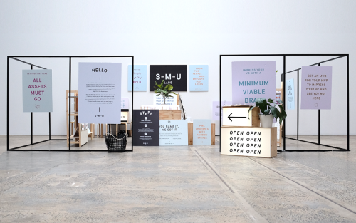
For The People branded Start-Me-Up Labs with light boxes, steel frames and posters for a start-up with no brand budget.
Rivertown Lodge's identity by Ro&Co skips hotel clichés and builds from classic camping textures — tent canvas, enamel dishware, woodland patterns.
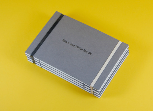
Kerr Vernon is an independent Glasgow design studio at The Whisky Bond, founder-led, showing its Black & White Bands project.
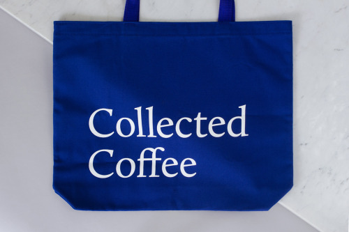
Fivethousand Fingers designed the Collected Coffee identity, a white and navy system that names a single farm.
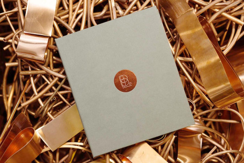
Transformer, an Auckland studio founded in 2002 by Nigel and Anita Smith, designed the book Buckley's Heroes.
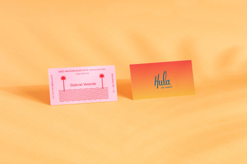
Parametro Studio's HULA branding puts a script wordmark and palm tree motif on matchboxes in pink and yellow.

Pop & Pac built The Penny Drop's café identity from a single pun: pennies falling from the tax office above.
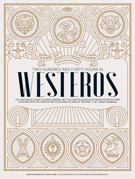
Tyler Deeb is a self-taught Louisville designer whose typography and illustration work has appeared in Entertainment Weekly and Fast Company.
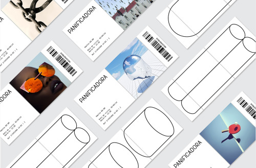
Eva and Marta Yarza imagined the identity Vigo's ruined Panificadora might carry if it were reborn as a centre for arts, culture and youth.
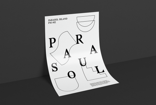
Düsseldorf designer Dominik Bubel works across typography, moving image and illustration, from a scattered poster to a geometric monogram.
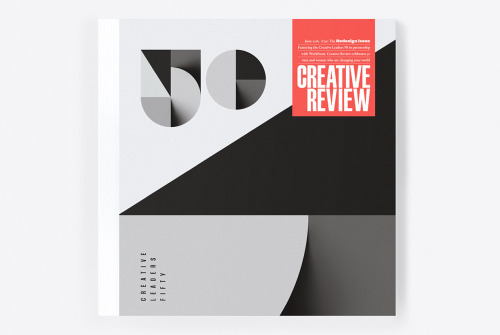
Sawdust's 2016 redesign of Creative Review puts a large black 50 on the cover and carries an identity for Creative Leaders 50.
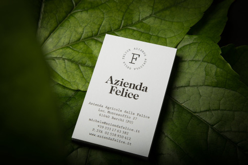
Paul Leichtfried branded Azienda Felice, an organic vineyard in the Marches, with two hand-drawn characters on a white label.
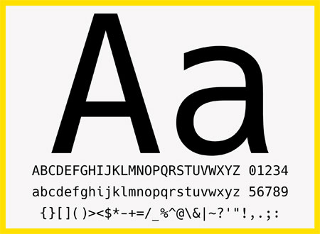
Hack is a free, open-source typeface made for source code, drawn by more than 60 contributors. The specimen shows four cuts and the glyphs programmers use.
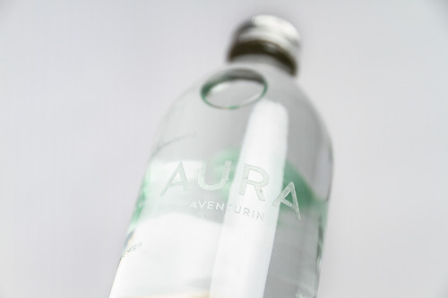
Yvonne Moser's AURA water packaging suspends a different gemstone in each bottle and prints the label directly onto the glass.

Ortolan refined rather than replaced Kennedy Nolan's identity, contrasting a bold mark with delicate typography.
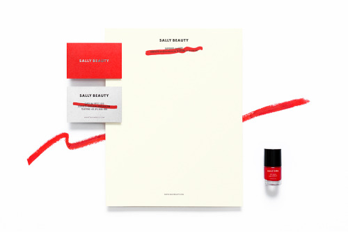
Anagrama rebuilds Sally Beauty in one colour at a time: red bags, red and white cards, a silver name and a dry brushstroke across the small print.
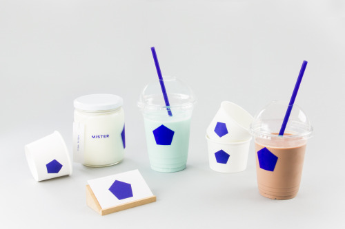
Brief gives Mister a blue pentagon on white cups, jars and a coaster, plus a pair of cards in blue and white.
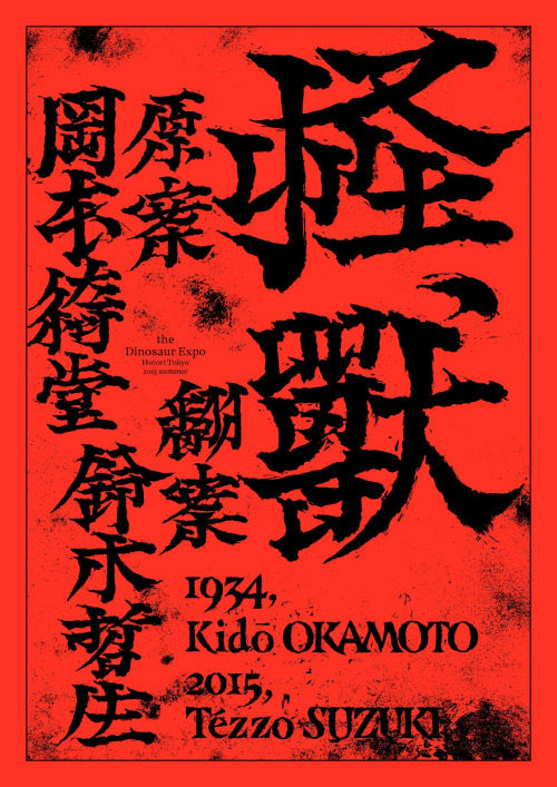
Tezzo Suzuki's 2015 poster for The Dinosaur Expo.

Stuart Tolley’s MIN surveys the return of simplicity to graphic design, from its pale blue cover to the work inside.
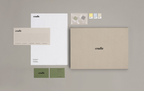
Matthew Hancock marks Cradle with a lowercase wordmark and carries it across letterheads, sage cards and colour chips.

Akatre built Lancôme's 'Énergie de Vie' press kit around their own typeface Marie Louise — a box, a book, and no safe choices.

Yi-Hsuan Li used illustration to make Su Beng's 'First Class of Taiwan History' a book people would actually pick up.
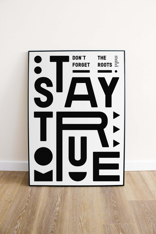
Marco Oggian's Quote(s) of the week: STAY TRUE stacked in black glyphs on white, and ALWAYS REMEMBER THAT YOU ARE SPECIAL in white on black.
Loading