
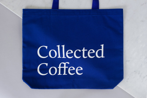
Collected Coffee Branding by Fivethousand Fingers
Fivethousand Fingers designed the Collected Coffee identity, a white and navy system that names a single farm.
Archive
33 curated projects tagged in packaging.
Fivethousand Fingers designed the Collected Coffee identity, a white and navy system that names a single farm.
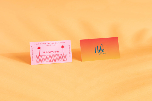
Parametro Studio's HULA branding puts a script wordmark and palm tree motif on matchboxes in pink and yellow.

Mary Rabun's Birchbox gift cards repeat one dotted pattern around a small diamond, coloured differently across the set.
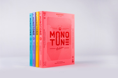
Palette No.7 is viction:ary's seventh volume, collecting monotone work and issuing the same book in four cover colours.

Estudio Menta wraps Savon Stories soap in paper printed with hand-drawn leaves and cut fruit.
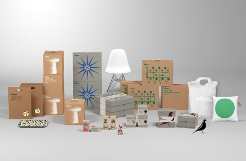
BVD's packaging for Vitra: kraft cartons with drawn product outlines, the wordmark kept small, and a blue starburst or green pattern.
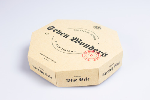
An octagonal box of Seven Wonders cheese opens into eight individually printed wedges.
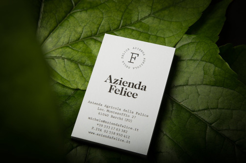
Paul Leichtfried branded Azienda Felice, an organic vineyard in the Marches, with two hand-drawn characters on a white label.
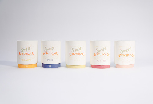
Sweet Botanicals is Patrick Chen's packaging project: five tins, hand-drawn lettering, Victorian florals and one colour per flavour.
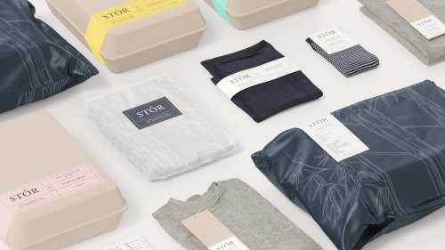
Socio Design built STÓR a grid-based labelling system, printed on unbleached recycled card and shared across every menswear staple.
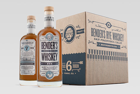
Carl Bender's studio Okay builds distinct brands from client stories, including packaging for Bender's Whiskey Co. on Treasure Island.
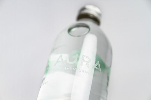
Yvonne Moser's AURA water packaging suspends a different gemstone in each bottle and prints the label directly onto the glass.
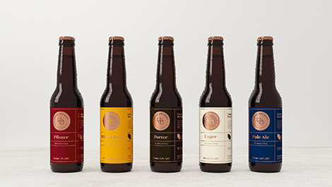
makebardo gives five beer bottles one label structure, five colours and a copper medallion on each.
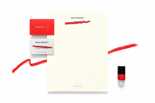
Anagrama rebuilds Sally Beauty in one colour at a time: red bags, red and white cards, a silver name and a dry brushstroke across the small print.
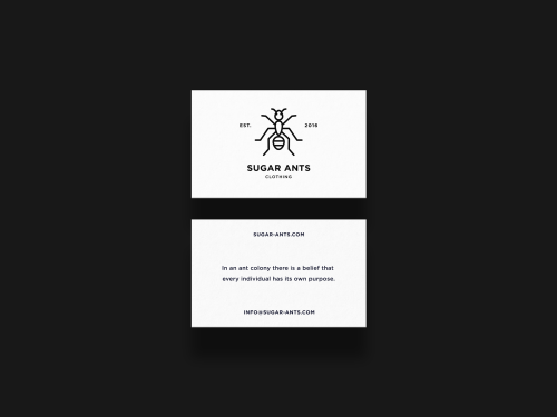
ONNO centres Sugar Ants on a line-drawn ant and prints a hamster in a wheel across a white t-shirt.
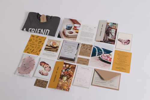
Passport's identity for Friends of Ham pairs kraft stationery and hand-drawn charcuterie illustrations with menus, postcards and a grey t-shirt.

La Tortillería and sister agency Curioso built the identity for Seven Point, a Chicago medical-cannabis dispensary where regulation shapes design.

Eskimo Design built Caffè Pagani's new logo on the observation that roasting coffee is a process of circles.

Hanna Sköld and Sara Knipström's self-initiated update to Dunkin' Donuts — geometric colour-blocking and a simplified wordmark for Scandinavia.
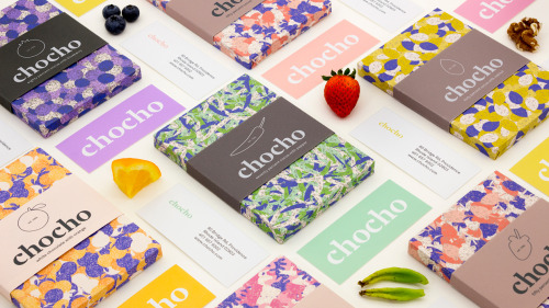
Hee Jae Kim's Chocho chocolate bars are wrapped in fruit-print paper and banded with a lowercase wordmark over solid colour.

Seven Stills wanted to escape the traditional whiskey look — so Evan Tolleson bridged craft beer and quality spirits instead.
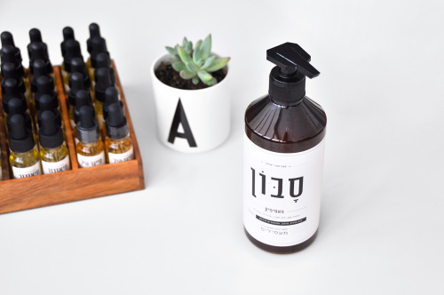
Doron Baduach packaged Maapilim's handmade products: white labels with Hebrew lettering on amber glass, and vials in a wooden rack.
The Kitchen's identity puts a small apple over letterspaced capitals and wavy teal lines, then repeats the mark across mint tubs stacked in a pyramid.
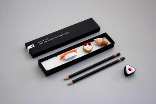
Helen Vo's self-promotional mailer pairs miniature food models and black pencils with a box printed 'JUST IN CASE YOUR EMPLOYEE STEALS YOUR LUNCH'.
Loading