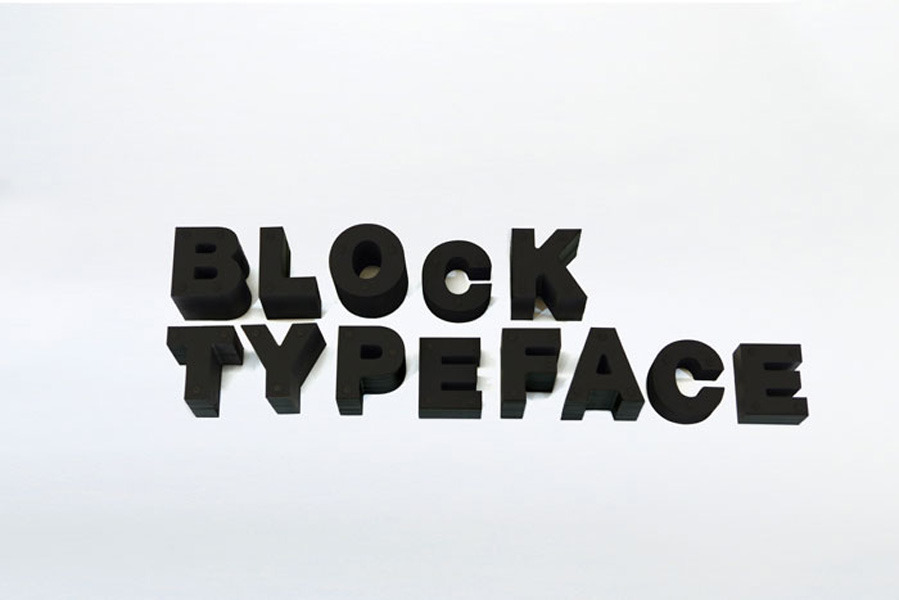
Daikoku Design Institute’s ‘Block’ Typeface
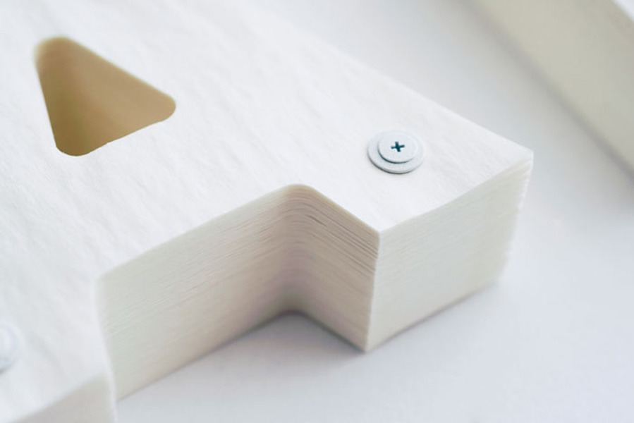
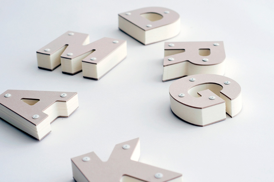
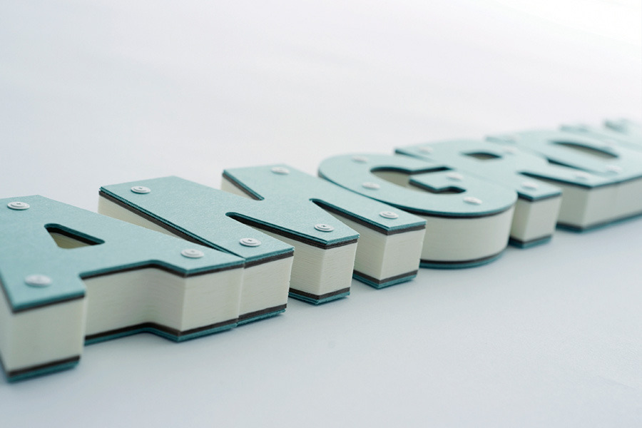
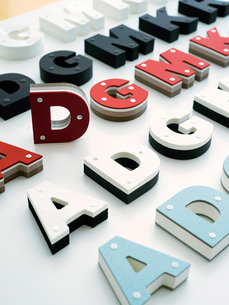
Daikoku Design Institute’s Block typeface is made the hard way: letterforms assembled from stacked sheets of paper, which gives each character the stepped, contoured profile of a topographic map.
It is typography as sculpture, and it makes an argument that gets lost in software — that a letter is a physical object with depth, weight and a shadow, whatever the screen tells you.