Events & More Branding by Andrés Requena
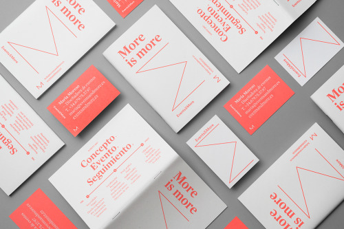
Andrés Requena, working from Barcelona, built the visual identity and print materials for Maria Moreso around one word: more.
White and coral cards fill the flat lay. Each cover carries the phrase ‘More is more’ and a thin coral line drawn into an angular M. Coral cards reverse the scheme, setting name, phone, email and address in white. One white card and one coral card sit alone on grey, the mark and the contact block shown by themselves.
More by Andrés Requena is on Behance.