
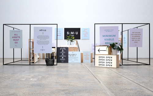
For The People: Branding for Start-Me-Up Labs
For The People branded Start-Me-Up Labs with light boxes, steel frames and posters for a start-up with no brand budget.
Archive
63 curated projects tagged in visual identity.
For The People branded Start-Me-Up Labs with light boxes, steel frames and posters for a start-up with no brand budget.
Rivertown Lodge's identity by Ro&Co skips hotel clichés and builds from classic camping textures — tent canvas, enamel dishware, woodland patterns.
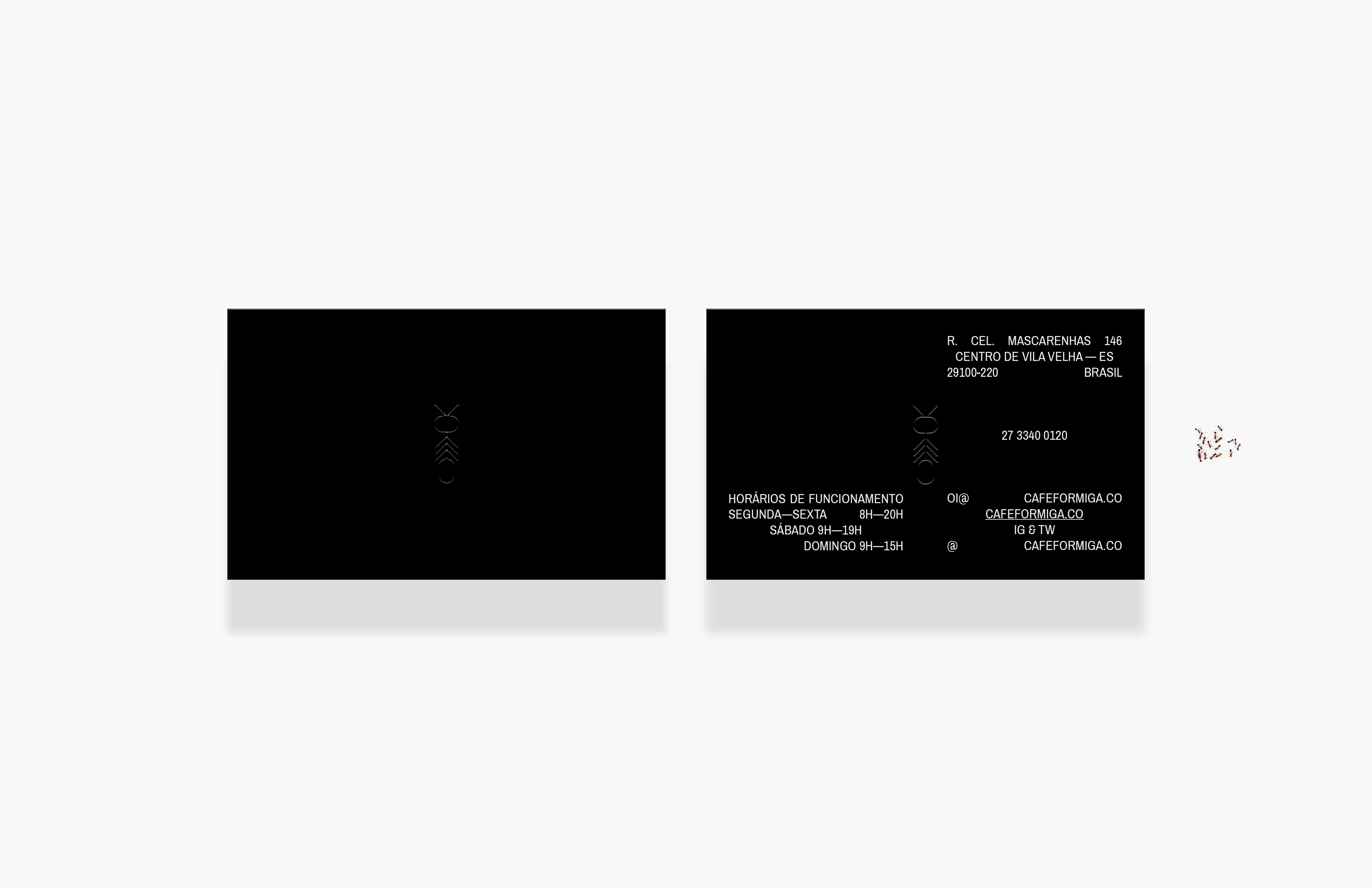
Café Formiga is named for the Portuguese word for ant, a pun on the joke that ants are good for sight.
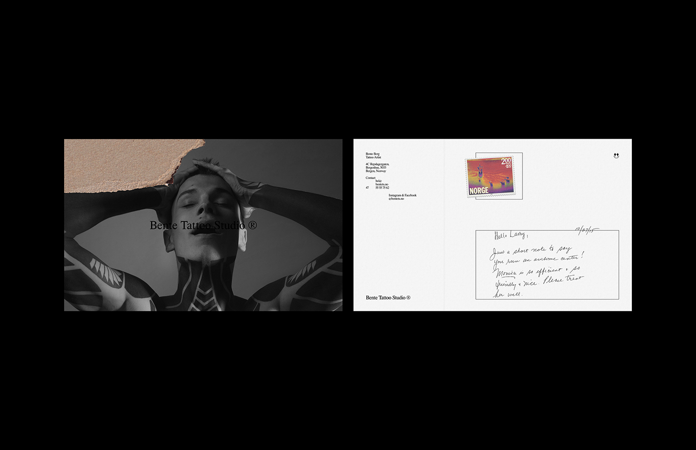
Bente Tattoo Studio ® was founded in July 2018 by tattoo artist Bente Berg, with identity work by Matheus Gomes.
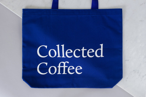
Fivethousand Fingers designed the Collected Coffee identity, a white and navy system that names a single farm.
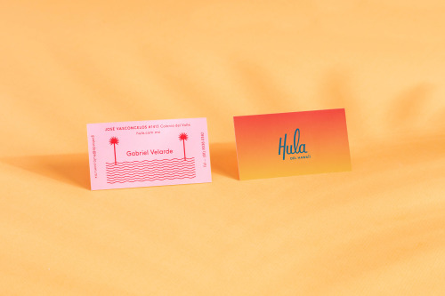
Parametro Studio's HULA branding puts a script wordmark and palm tree motif on matchboxes in pink and yellow.

Franklyn is a creative studio applying a boutique approach to branding and swag for global brands and startups.

Pop & Pac built The Penny Drop's café identity from a single pun: pennies falling from the tax office above.
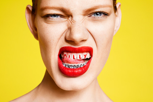
Sagmeister & Walsh rebranded MILLY's advertising with a campaign built on stark typography and saturated colour.
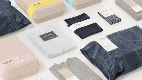
Socio Design built STÓR a grid-based labelling system, printed on unbleached recycled card and shared across every menswear staple.
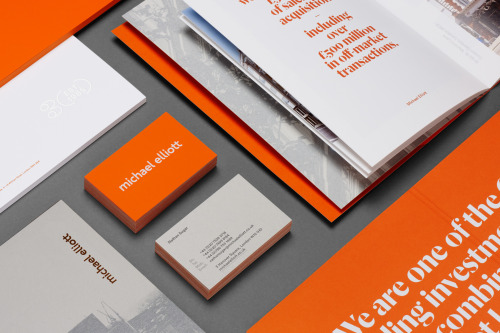
Six sets Michael Elliott's name in lowercase orange and carries the palette through cards, brochures and posters.
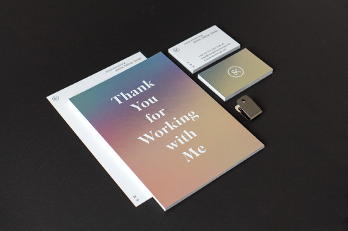
Sascha Bente's identity for Sonja Kreuzburg: a teal-to-peach gradient, a serif, and her initials worked into a pair of scissors.
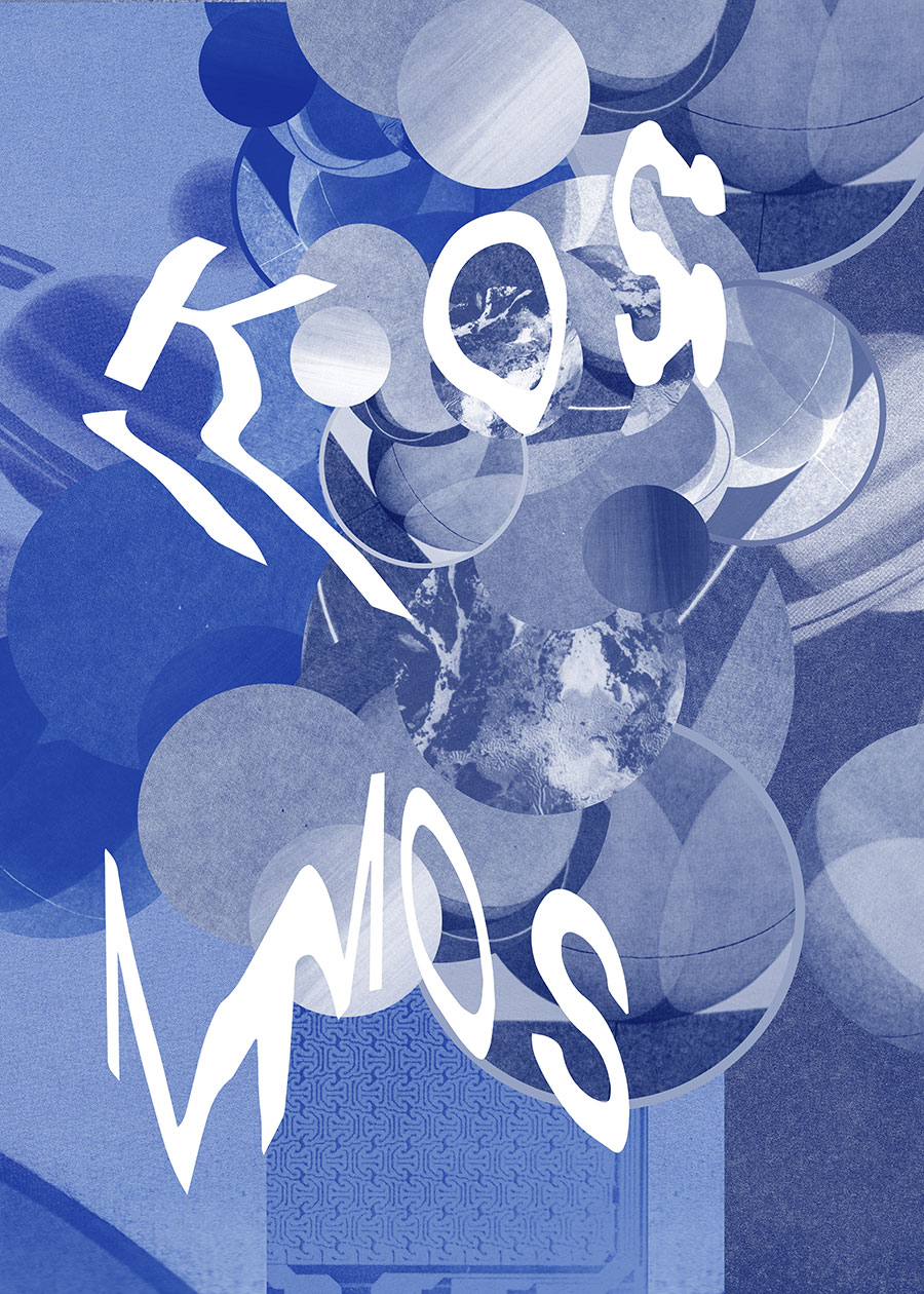
Pineum's Warsaw posters play with photographic imagery, type and colour, sitting between the gallery and the street.
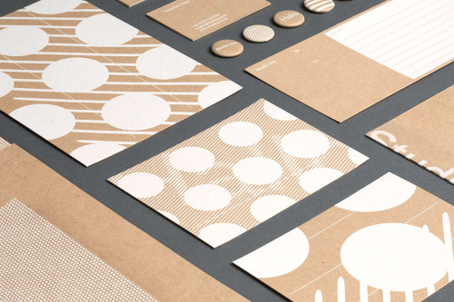
Studio Una, based in Germany, aimed for flexible, high-quality stationery with a pleasant touch, in various printed materials.
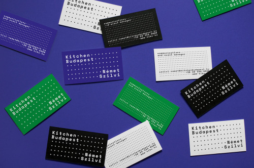
Eniko Deri and Nora Demeczky run de_form, a Budapest studio known for art direction, branding and editorial design.

Ortolan refined rather than replaced Kennedy Nolan's identity, contrasting a bold mark with delicate typography.
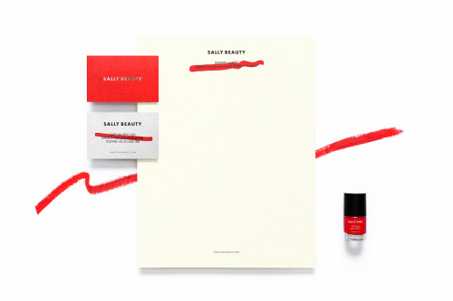
Anagrama rebuilds Sally Beauty in one colour at a time: red bags, red and white cards, a silver name and a dry brushstroke across the small print.
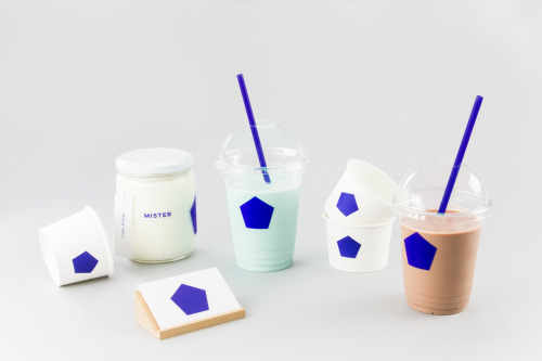
Brief gives Mister a blue pentagon on white cups, jars and a coaster, plus a pair of cards in blue and white.
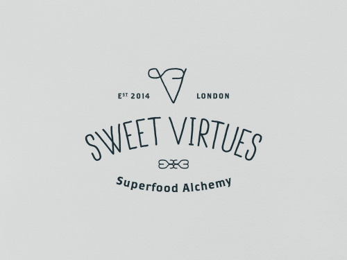
IWANT pushed Nutritious Delicious, later Sweet Virtues, to rethink the whole brand; a year later it was winning awards.
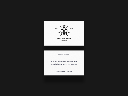
ONNO centres Sugar Ants on a line-drawn ant and prints a hamster in a wheel across a white t-shirt.
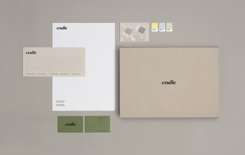
Matthew Hancock marks Cradle with a lowercase wordmark and carries it across letterheads, sage cards and colour chips.

Akatre built Lancôme's 'Énergie de Vie' press kit around their own typeface Marie Louise — a box, a book, and no safe choices.
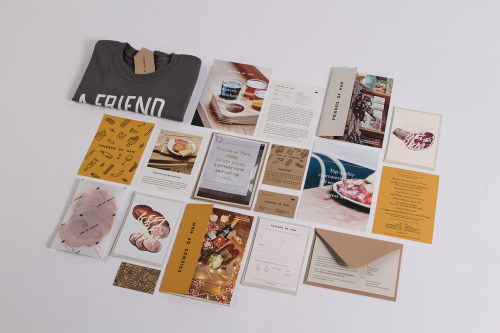
Passport's identity for Friends of Ham pairs kraft stationery and hand-drawn charcuterie illustrations with menus, postcards and a grey t-shirt.

Yi-Hsuan Li used illustration to make Su Beng's 'First Class of Taiwan History' a book people would actually pick up.
Loading