
creanet
creanet is Jose Moreno's multidisciplinary design studio in Málaga, Spain, taking on assignments worldwide.
28 editorial projects from Spain.
creanet is Jose Moreno's multidisciplinary design studio in Málaga, Spain, taking on assignments worldwide.

Spanish sci-fi artist Cristian Eres draws on 1970s European fantasy art for his alternative movie posters.
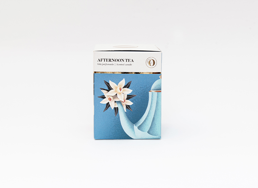
The TSO candle collection has stayed a core product for the brand since its earliest days.
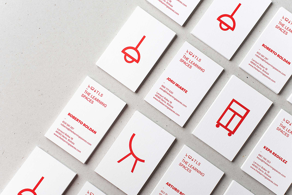
The Learning Spaces shapes rooms around teaching methods, and needed an identity that could carry across its materials.

Selected illustration work from Madrid's Ana Galvañ.
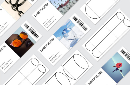
Eva and Marta Yarza imagined the identity Vigo's ruined Panificadora might carry if it were reborn as a centre for arts, culture and youth.
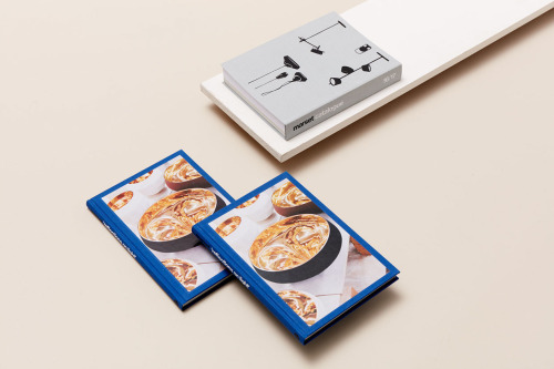
Folch's publication for Reflections on Light pairs deep blue covers with a grey volume drawn in black line.
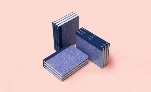
Querida, the Barcelona studio, designed a compact first-year book for Paloma Wool that treats the label's first twelve months as worth archiving.
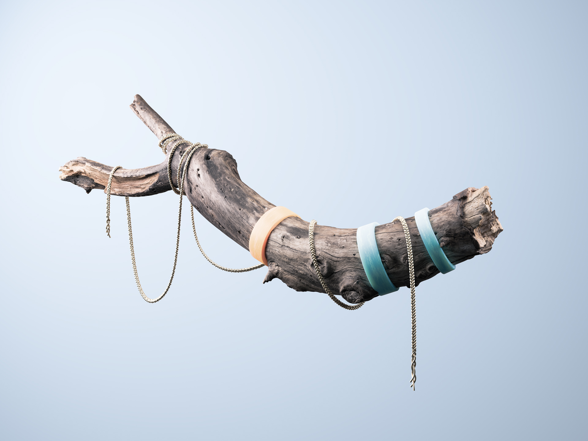
Driftwood, gold chains and a soap bubble, staged as still lifes by Madrid art director Juanma Mota.

Barcelona-born illustrator Magoz develops conceptual illustration while working without a fixed studio.

Recent illustration work from Madrid's Elena Éper.

New editorial illustration from Madrid's Studio Patten.

Barcelona illustrator Diego Marmolejo draws in flat coral red and black, ringing heavy shapes with dense black doodles of planets, rockets and comets.
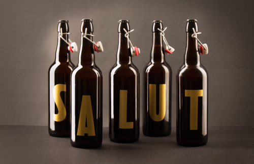
Walabi designed a Christmas typeface for Salut beer: one gold glyph per 75cl bottle, five spell the name and four spell 2016.
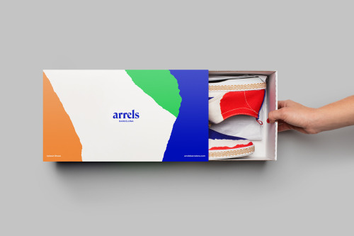
Hey Studio's identity for Arrels, a Barcelona footwear brand, splits each box into colour blocks with a rough edge between them.
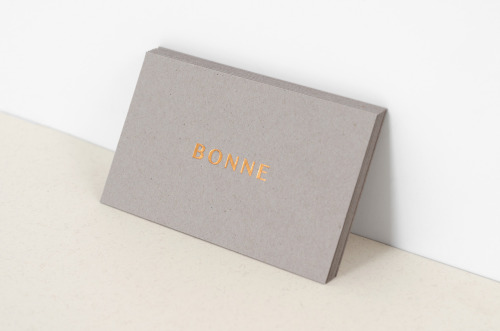
Studio XL built B O N N E from letterspaced copper capitals on warm grey stock, carried through letterhead, envelopes and cards.

So Blue is Pablo Abad's biannual magazine on fashion, beauty and healthy living: a white cover, a blue serif masthead and yellow page edges.

New illustration work from Spain-based Manu Callejón.
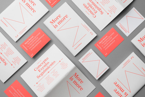
Andrés Requena builds the Maria Moreso identity around one word: white and coral cards, the phrase 'More is more', a coral line drawn into an M.

A selection of illustration from Spanish illustrator Sergio Membrillas.
Querida Studio's identity for Ölend, a Barcelona brand making handmade backpacks, pairs a navy serif wordmark with bare, shadow-led product shots.

Recent work from Madrid illustrator Antonio Uve.
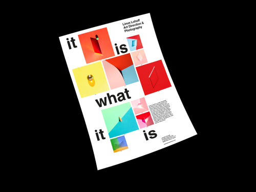
Linus Lohoff's It is what it is posters use form, colour, material and light as photo illustration, numbered and stripped of context.

Barcelona digital artist and illustrator Christian Haag works across digital art, retouching and illustration.
Loading