
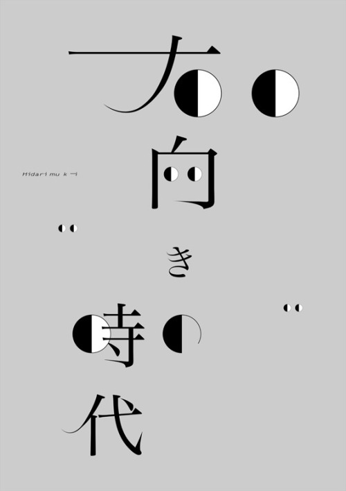
Gengo Yamaguchi’s ‘Hidarimuki no Jidai’ Poster
Gengo Yamaguchi's 2014 poster 'Hidarimuki no Jidai' — Japanese poster design at its most decisive.
Archive / 03
83 curated projects in graphic design.
Gengo Yamaguchi's 2014 poster 'Hidarimuki no Jidai' — Japanese poster design at its most decisive.
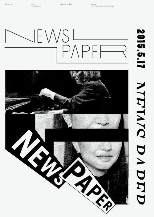
Seita Kobayashi's 2015 poster 'News Paper' — typography doing the work of a headline.
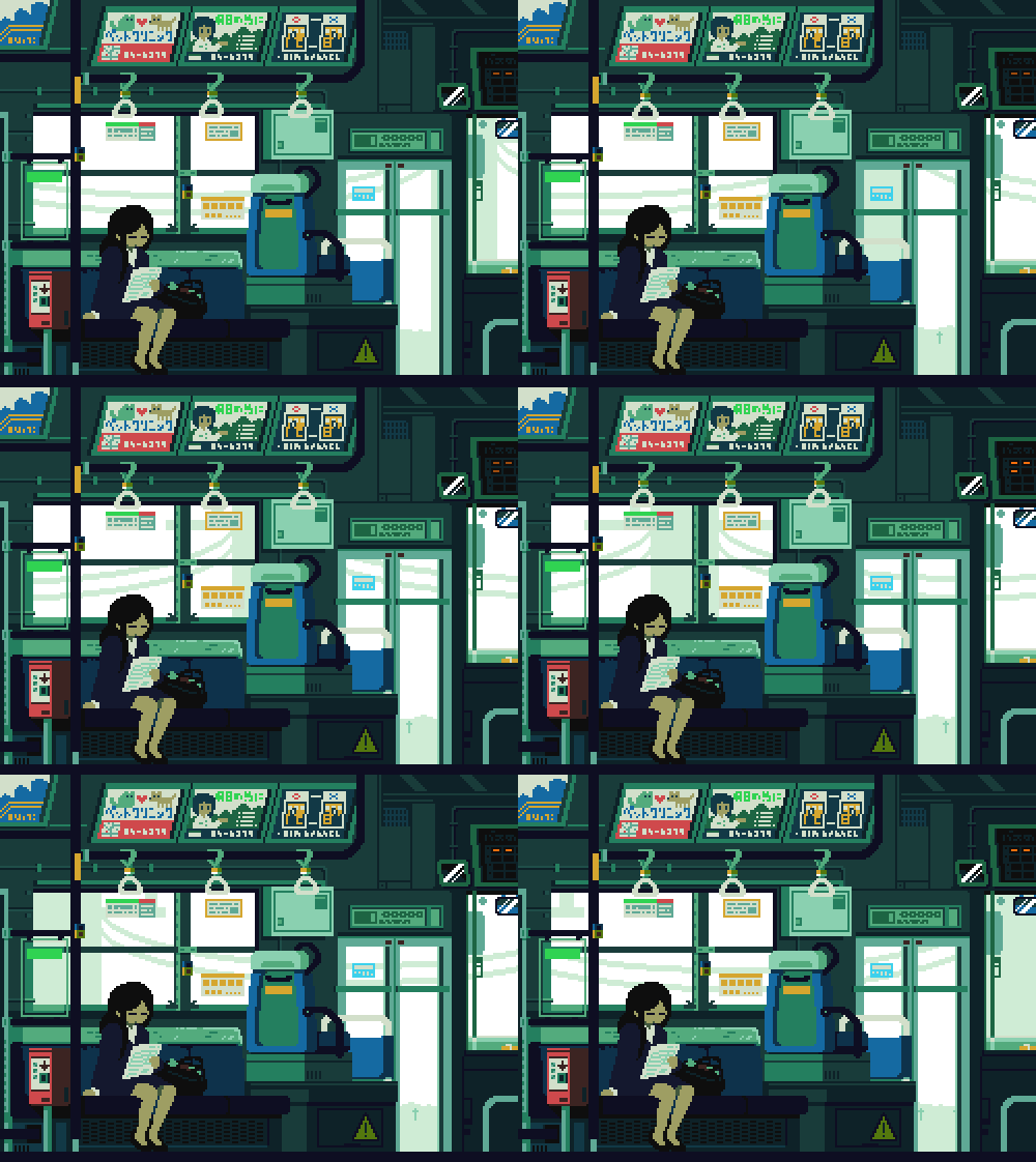
Tumblr user 1041uuu turns everyday Japanese scenes into looping GIFs with a soft, nostalgic palette.
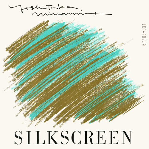
Teruhisa Tajima's 1981 silkscreen cover for Yoshitaka Minami.
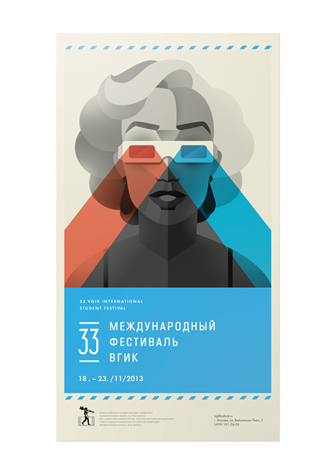
Russian designers Dock 57 work in flat geometry: a festival poster split red and cyan, and a full corporate stationery system.
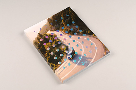
Warsaw creative studio Super Super connects ideas with design and technology.

Yoshikazu Ebisu's 1981 Japanese book cover turns its subject's back to the reader and fills the sky with spilling objects.
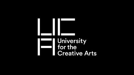
Spin's identity for the University for the Creative Arts is a block-built UCA monogram that turns from letterform into pattern.
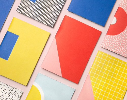
Officemilano's Write Sketch & Super! notebooks come in four sets of two A6 books, pairing a plain colour cover with a geometric one.
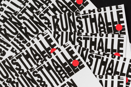
Studio Mut builds the Kunsthalle Bozen identity from stacked condensed capitals, one red disc, and a wordmark that doubles as pattern.
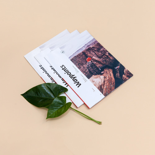
Sean O'Connor's Waypoints keeps one cover template across issues: the title set large, a figure in a red hat on rock, a red band down the spine.
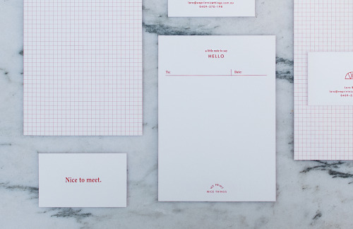
Noemie Le Coz's identity for the small press runs on stationery, a wordmark and a web presence that let the covers do the talking.
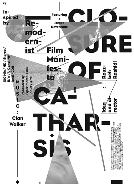
Graphic design work from Pouya Ahmadi.
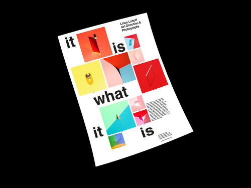
Linus Lohoff's It is what it is posters use form, colour, material and light as photo illustration, numbered and stripped of context.

Warsaw studio Dmowski & Co. built Blanca Tea from a wide-spaced wordmark and a diamond B monogram set over a drawn tea branch on cobalt.

A logarithmic map flattens the entire known universe into one image, putting the sun and the observable edge at opposite ends.
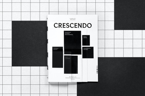
Fabian Fohrer sets Crescendo in black, white and one photograph: bold sans-serif, solid text panels and a strict grid on cover and spread.
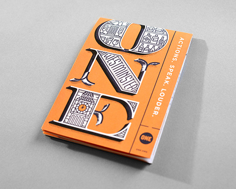
UK designer and illustrator Daniele Simonelli builds his imagery from texture and colour.
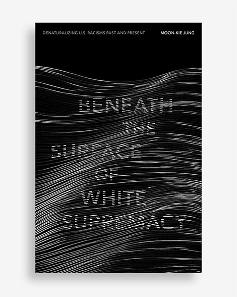
Two book covers set dense black-and-white pattern against densely set type, in a selection shared with designer Mitch Goldstein.
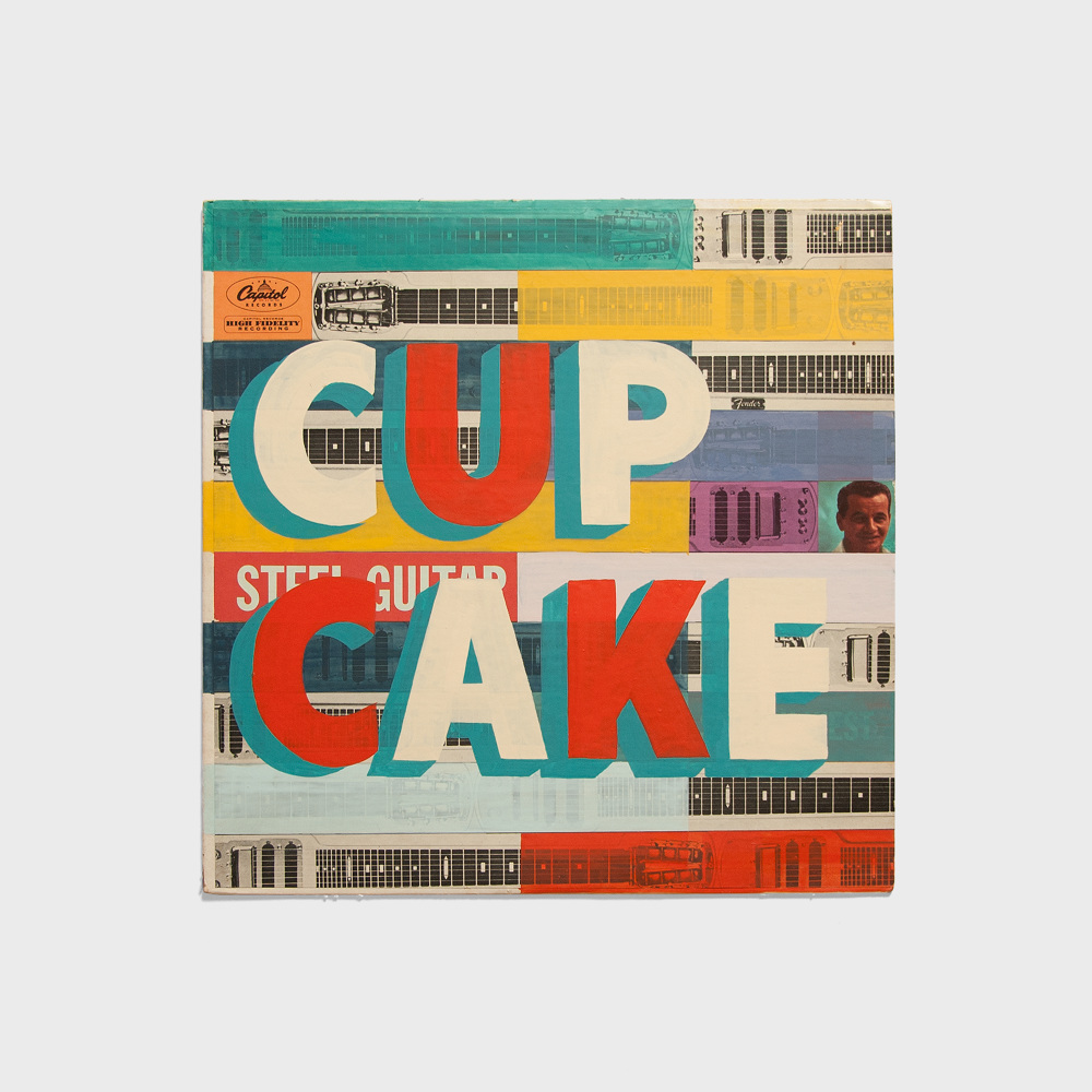
Graphic designer Keith Scharwath also paints signs by hand — design with a brush behind it.

A Chrome extension by Emilie Pillet records browsing activity and turns the data into a folded printed object.
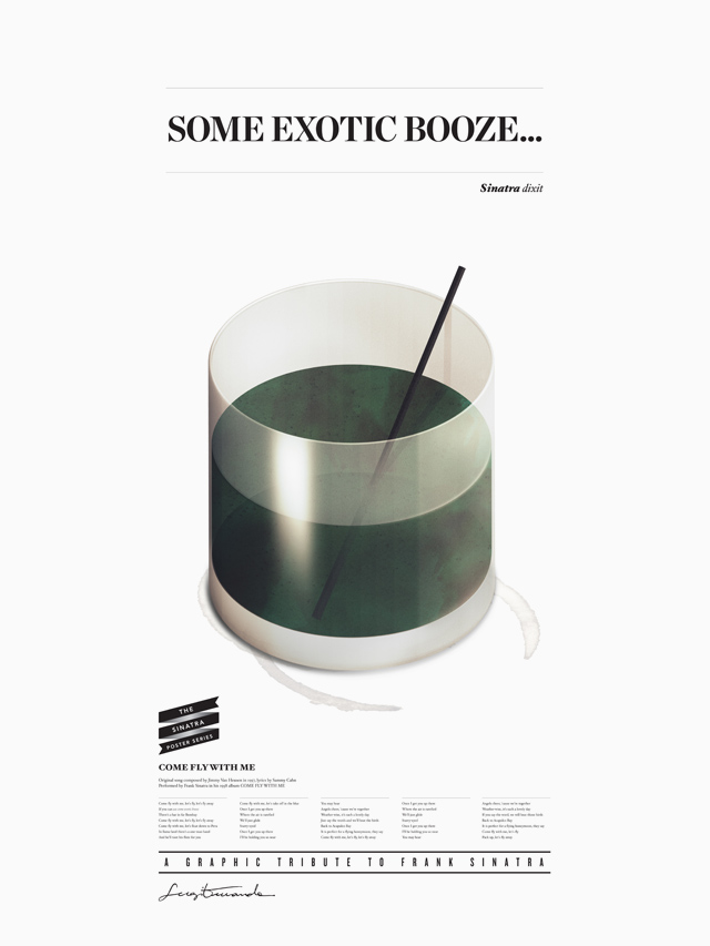
Barcelona art director, graphic designer and illustrator Sergi Ferrando moves between the three disciplines.
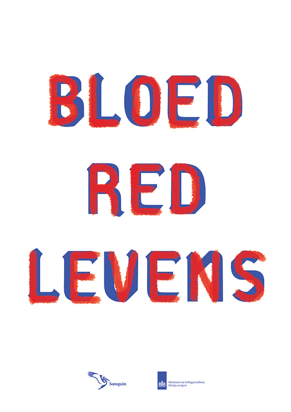
Multidisciplinary designer Jaimy van den Hoof works from Waalwijk in the Netherlands.

Valencia graphic designer Cristian Eres works in a clean, considered register.
Loading