New identity for Mercer Supply Co by Peck & Company
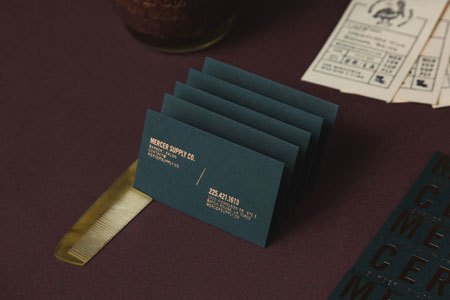
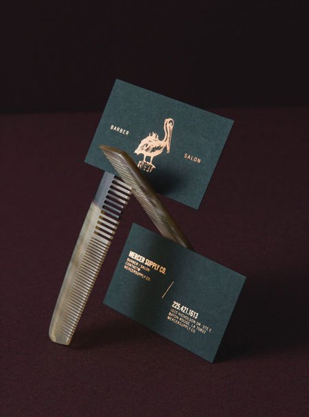
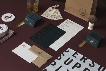
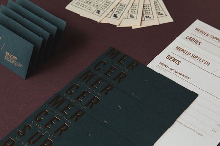
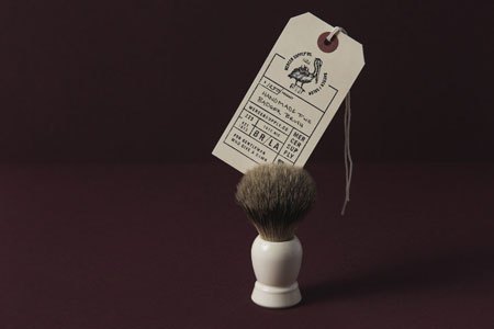
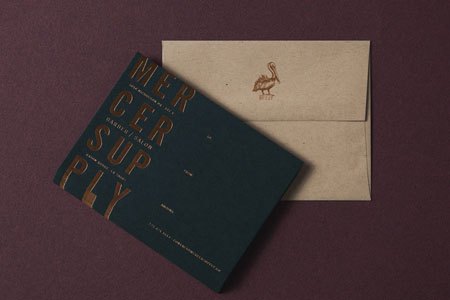
A barber shop lives or dies on its atmosphere, and Mercer Supply Co. clearly understood that a good chair means nothing if the brand around it looks like every other grooming cliché of the past decade. So they handed the job to Peck & Company, and got back a typographic identity that leans hard on its letterforms rather than on the usual barber tropes.
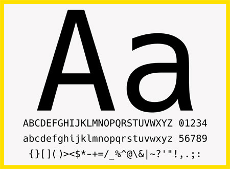
The system is all type — a wordmark and supporting marks that feel printed rather than designed in a hurry, closer to a risograph poster than a startup logo. In a trade that has been having a moment for years now, that restraint is the point: it reads as a shop with a point of view, not a shop with a mood board.
More: mercersupply.co · the full case study at Peck & Company.