Whole Foods Visual Identity System by Moniker: The Kitchen
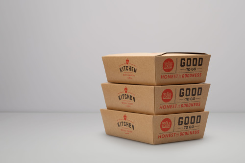
The Kitchen is Whole Foods Market’s prepared-foods division, and its identity is built on a mark: a small apple with ‘the’ set inside it, the word KITCHEN below in white capitals, and wavy teal strokes running under both.
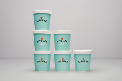
On packaging the mark carries straight onto mint tubs. Six of them stack in a pyramid, white lids on pale turquoise, the logo printed dead centre on every face.
Moniker worked with Rubber Design on the system, which reaches from identity and packaging to illustration and signage.