
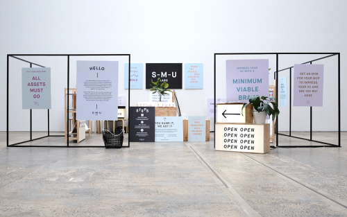
For The People: Branding for Start-Me-Up Labs
For The People branded Start-Me-Up Labs with light boxes, steel frames and posters for a start-up with no brand budget.
Archive
19 curated projects tagged in thedsgnblog.
For The People branded Start-Me-Up Labs with light boxes, steel frames and posters for a start-up with no brand budget.

Pop & Pac built The Penny Drop's café identity from a single pun: pennies falling from the tax office above.

Ortolan refined rather than replaced Kennedy Nolan's identity, contrasting a bold mark with delicate typography.

Akatre built Lancôme's 'Énergie de Vie' press kit around their own typeface Marie Louise — a box, a book, and no safe choices.

Yi-Hsuan Li used illustration to make Su Beng's 'First Class of Taiwan History' a book people would actually pick up.
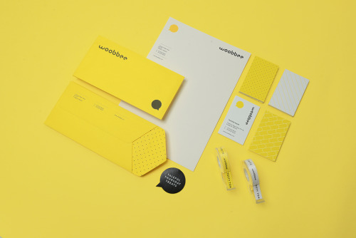
Sciencewerk's rebrand for Woobbee sets a lowercase wordmark and yellow bubble on off-white cards, patterned stationery and bright envelopes.

Aloof's book for Gloria Cortina refuses the design monograph as brand exercise — circling the work rather than illustrating it.

Jukebox Print builds its reputation on materials rather than price: recycled stocks, wooden cards, letterpress and coloured edges.

La Tortillería and sister agency Curioso built the identity for Seven Point, a Chicago medical-cannabis dispensary where regulation shapes design.

Bruch—Idee & Form put the content at the centre of Quer Kommuniziert's identity, letting arranged and emphasised text become the visual style.

Mariano Fiore's identity for Lumar in A Coruña leans on the name's history — the original coffee shop held the same corner from 1959 to 1993.

SP-GD built Catseye Bay a flexible identity for a Sydney spatial design studio, drawn loosely from the action of floating.

David Reca's self-branding project is an argument that design is a necessity rather than decoration — made on his own behalf.

Eskimo Design built Caffè Pagani's new logo on the observation that roasting coffee is a process of circles.

Hanna Sköld and Sara Knipström's self-initiated update to Dunkin' Donuts — geometric colour-blocking and a simplified wordmark for Scandinavia.

Seven Stills wanted to escape the traditional whiskey look — so Evan Tolleson bridged craft beer and quality spirits instead.

La Tortillería built Dentvelop's identity around evolution — the defining trait of an odontology clinic focused on dental-implant innovation.

F61, the St Petersburg print studio, built the identity for Mental Activity on minimalism and analogue printing rather than a logo.
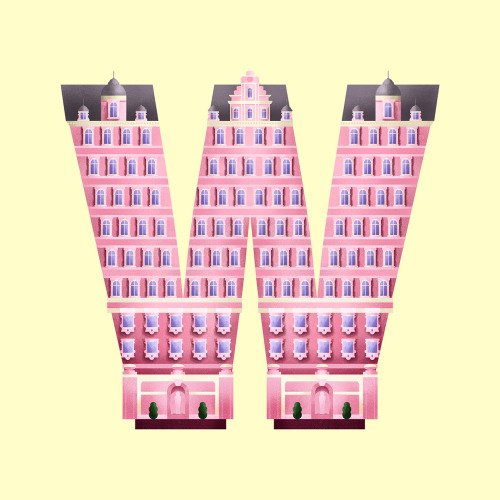
Madrid designer Sara Enríquez turns Wes Anderson's filmography into typographic illustration — letters built from the architecture of his films.