
AM Restaurant Branding by Avant Post
Avant Post's identity for AM is an orange circle around an A with an M beside it, set small on dark brown and white cards.
Archive
Avant Post's identity for AM is an orange circle around an A with an M beside it, set small on dark brown and white cards.

Makebardo's packaging for The Honest Drop stages five beer bottles on angled copper blocks, each label carrying the same badge.

Supero's La Chaux-de-Fonds posters set white capitals over yellow Le Corbusier portraits, and silver numerals tumble across black.

Doron Baduach packaged Maapilim's handmade products: white labels with Hebrew lettering on amber glass, and vials in a wooden rack.

Barcelona illustrator Diego Marmolejo draws in flat coral red and black, ringing heavy shapes with dense black doodles of planets, rockets and comets.

Bruch - Idee & Form's Armstark identity folds the planning-and-design tagline into a mark of two panels and a hidden letter A.

Six artists redesign the covers of their ten favourite albums — a project about taste as much as drawing.

Walabi designed a Christmas typeface for Salut beer: one gold glyph per 75cl bottle, five spell the name and four spell 2016.

Bienal Comunicación, founded in Merida in 2006, built the Marte Estudio cards from foil, coloured stock and printed texture.

Recent illustration work from London's Michael Driver.

Selected illustration work from Norwich's Adam Avery.

Alec Doherty, a London illustrator, draws Partizan Brewing's beer labels and editorial scenes of figures among plants.

Selected illustration work from London's Eleni Kalorkoti.

Two Times Elliott built the Even Odds identity around the name in a wide sans serif, carried onto pale grey business cards.

The Kitchen's identity puts a small apple over letterspaced capitals and wavy teal lines, then repeats the mark across mint tubs stacked in a pyramid.

Socio Design asked 50 creatives to interpret Money. Two Nifty—50 posters here take opposite routes: a gold egg on hot pink, and stacked numerals.

Selected illustration work from Seattle's Alexander Mostov.

Takeo Nakano's 2015 exhibition poster for 'Le Corbusier and Japan'.

Hey Studio's identity for Arrels, a Barcelona footwear brand, splits each box into colour blocks with a rough edge between them.

Mirko Camia's Alphamix turns letters into objects: a candle A with a lit wick, a glass B filled with faceted orange shapes.
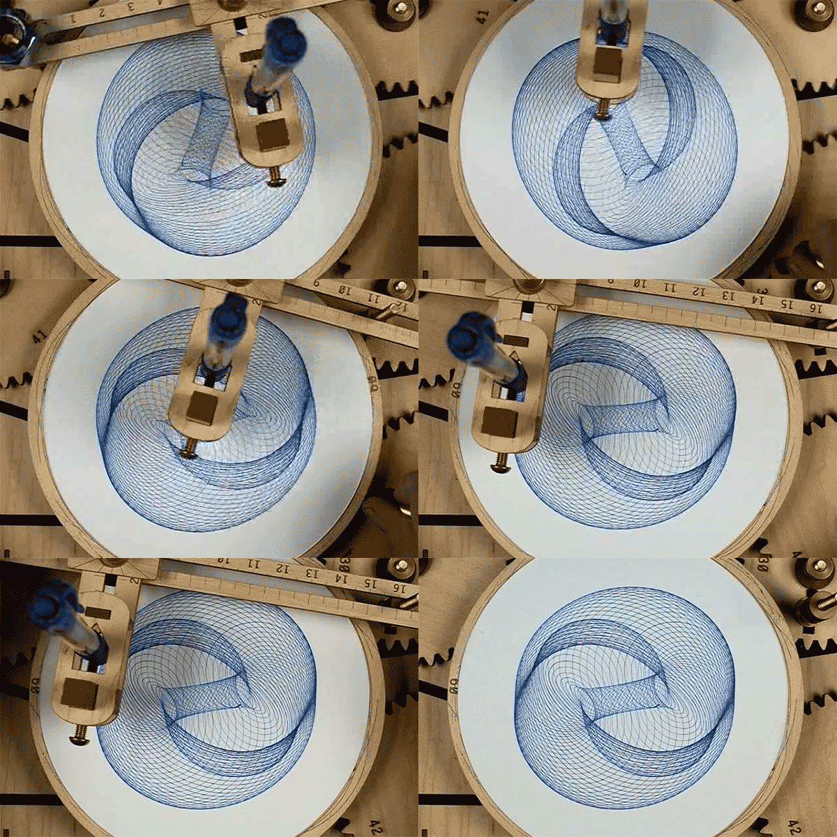
Joe Freedman's DuoGraph is a seven-gear drawing machine that turns a handful of adjustable parameters into endless geometric figures.

Peter Fischli and David Weiss's ten-point list stands fifty feet tall over Houston and Mott Streets, installed with the Public Art Fund.

Siggi Odds builds a bearded portrait from coloured strokes under gold capitals, and a symmetrical mask from repeated leaf forms in cream and red.

Elliot Kruszynski draws with one unvarying line — thin black outlines holding solid blocks of colour and characters in transit.