

Teruhisa Tajima’s Album Cover for Yoshitaka Minami
Teruhisa Tajima's 1981 silkscreen cover for Yoshitaka Minami.
Archive
Teruhisa Tajima's 1981 silkscreen cover for Yoshitaka Minami.

Bruch's identity splits into Idee and Form: a grey ground, a red rule and a dot, with the name set quietly in a serif.

Eric Nyffeler sets a family across four screens, then a R.I.P. OFF headstone among roses: flat shapes on coral and green grounds.
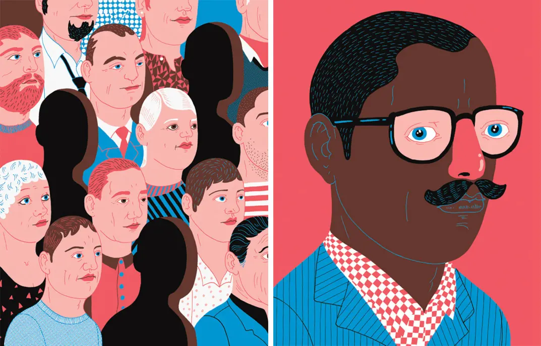
The work of Dutch illustrator Eline van Dam, who draws under the name Zeloot.

Marly Thalya Gallardo builds flat geometric figures — bathers on giant phone screens, workers carrying pencils — on saturated red.

Daniel Barkle's typography posters turn Arial, Bebas and other sans serifs into black sheets where each letter is drawn as wireframe structure.

Don't Try Studio's card set is five letterpress inks and white foil on triplex Colorplan, printed with loose line drawings.

Pop & Pac rebranded Melbourne cafe Operator 25 with typography drawn from telephone exchange cords and a round lightbox cup sign.

New illustration work from Spain-based Manu Callejón.

Striking minimalist illustration from graphic artist Timo Meyer.

Russian designers Dock 57 work in flat geometry: a festival poster split red and cyan, and a full corporate stationery system.

Warsaw creative studio Super Super connects ideas with design and technology.

Yoshikazu Ebisu's 1981 Japanese book cover turns its subject's back to the reader and fills the sky with spilling objects.

Moniker gives each Mita chocolate bar its own colour and its own white line pattern, with origin and cocoa percentage set small on top of both.

Laji's cards come in white, hot pink and fluorescent green, each with the same HAIR & MAKE wordmark and a name set in script.

Satoshi Araki's miniature dioramas build weathered urban scenes — a graffiti wall, litter, a black armoured vehicle — photographed through the case.

Augustine Kofie cuts file folders, index cards and steno pads from 50s-80s Los Angeles estate sales into dense diagonal geometry.

Recent work from New York illustrator and animator Jimmy Simpson.

Olssøn Barbieri designed No 52, a botanical aquavit for Jørgen B. Lysholm, in pale green glass with engraved cream labels.

Epiforma gives Get Set Festival a broken-letter identity: arcs and blocks in red, yellow and blue, reused across the posters and rebuilt into the title.

Recent illustration work from Seattle-based Pam Wishbow.

Andrés Requena builds the Maria Moreso identity around one word: white and coral cards, the phrase 'More is more', a coral line drawn into an M.

Work from Berlin-based illustrator Beth Walrond.

A selection of illustration from Spanish illustrator Sergio Membrillas.