

F61’s Mental Activity Visual Identity
F61, the St Petersburg print studio, built the identity for Mental Activity on minimalism and analogue printing rather than a logo.
Archive
F61, the St Petersburg print studio, built the identity for Mental Activity on minimalism and analogue printing rather than a logo.

So Blue is Pablo Abad's biannual magazine on fashion, beauty and healthy living: a white cover, a blue serif masthead and yellow page edges.

La Boca, a Notting Hill studio, makes film posters. Two Black Swan designs: a striped red and black profile, and a circle of wings around a ballerina.

Jaco Putker's solarplate etchings: a boy on a rope-lashed boulder in mid-air, and a girl facing a horned figure across an empty room.

Parámetro Studio sets Individual Union in white on black, then adds bright blue and magenta cards to carry the colour.

Shao Long Bald's Killexir Poison concept puts a red-and-white identity on a hand-blown black glass skull bottle in a white sleeve.

Recent illustration work from UK-based David Doran.

A 1970 Japanese theatre poster by Kouga Hirano, Oyobe Katsuhito and Mitsuhiro Kushida.

Selected illustration work from New York's Angelica Alzona.

Fallen Furniture turned a genuine Boeing 737 engine cowling into a chair: nearly 6.5 feet square, spun aluminium base, unapologetically industrial.

Madrid designer Sara Enríquez turns Wes Anderson's filmography into typographic illustration — letters built from the architecture of his films.

Max Pirsky's identity for Yitzhak Peretz: a seal drawn from the initials, olive-branch illustrations, and stationery in blind emboss and copper foil.

Dogma built Eleni Debo's identity around her grainy black-and-white drawings and a business card that is mostly white space.

A green poster builds a raised fist from black and red blocks and names Nelson Mandela, while a white sheet carries interlocking red loops.

Ten Japanese posters, from a blurred white glow for a theatre season to a single brush-stroke ring on black.

Six Japanese food photographers whose work runs from playful miniature worlds to documentary portraits of the people behind the plate.

Gengo Yamaguchi's 2014 poster 'Hidarimuki no Jidai' — Japanese poster design at its most decisive.

Blu's Italian mural spirals from hunter-gatherers and dinosaurs down to a single white cell, under a scroll of pyramids, factories and falling ruins.

A typeface cut from stacked paper sheets by Japan's Daikoku Design Institute.
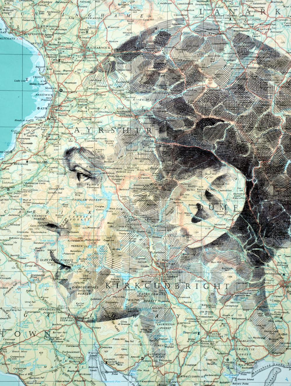
Ed Fairburn cross-hatches portraits directly onto vintage road maps and star charts, letting forest, border and constellation become the face.

Claudio Parentela cuts photographs of faces into collages, covering them with patterned paper, black wheels, leopard spots and pink scribbles.

Seita Kobayashi's 2015 poster 'News Paper' — typography doing the work of a headline.
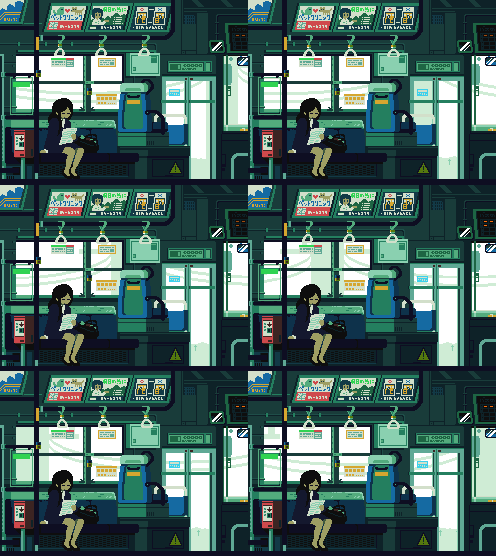
Tumblr user 1041uuu turns everyday Japanese scenes into looping GIFs with a soft, nostalgic palette.

Nils Völker hung 108 toy Hoberman spheres in a Berlin gallery and wired them to move in coordinated, organism-like rhythms.