
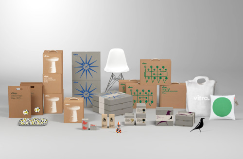
Vitra packaging design by BVD
BVD's packaging for Vitra: kraft cartons with drawn product outlines, the wordmark kept small, and a blue starburst or green pattern.
Archive / 02
126 curated projects in branding/identity.
BVD's packaging for Vitra: kraft cartons with drawn product outlines, the wordmark kept small, and a blue starburst or green pattern.
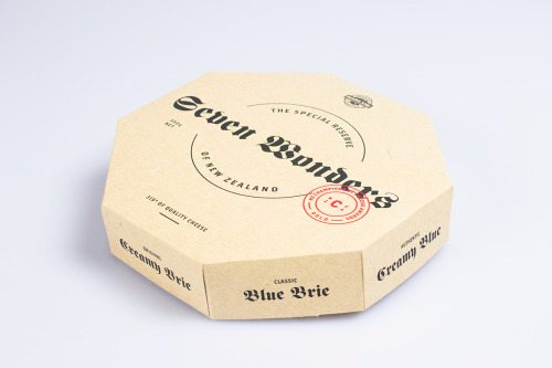
An octagonal box of Seven Wonders cheese opens into eight individually printed wedges.
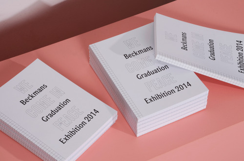
Lina Forsgren alternates outlined and solid black type on the Beckmans Graduation Catalogue, and rules the inner pages as pale blue graph paper.
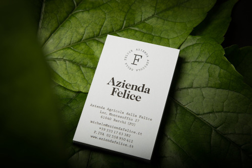
Paul Leichtfried branded Azienda Felice, an organic vineyard in the Marches, with two hand-drawn characters on a white label.
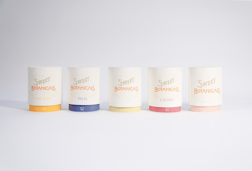
Sweet Botanicals is Patrick Chen's packaging project: five tins, hand-drawn lettering, Victorian florals and one colour per flavour.
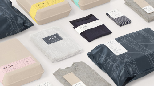
Socio Design built STÓR a grid-based labelling system, printed on unbleached recycled card and shared across every menswear staple.
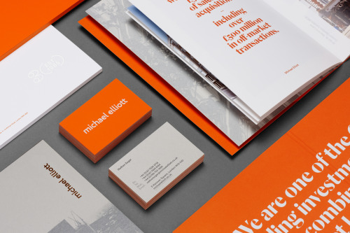
Six sets Michael Elliott's name in lowercase orange and carries the palette through cards, brochures and posters.
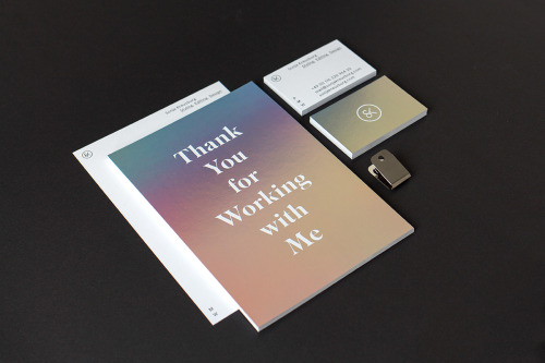
Sascha Bente's identity for Sonja Kreuzburg: a teal-to-peach gradient, a serif, and her initials worked into a pair of scissors.
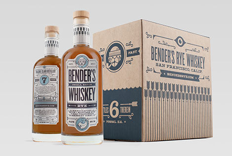
Carl Bender's studio Okay builds distinct brands from client stories, including packaging for Bender's Whiskey Co. on Treasure Island.
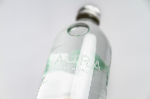
Yvonne Moser's AURA water packaging suspends a different gemstone in each bottle and prints the label directly onto the glass.
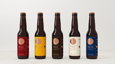
makebardo gives five beer bottles one label structure, five colours and a copper medallion on each.
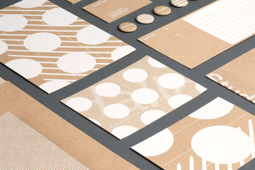
Studio Una, based in Germany, aimed for flexible, high-quality stationery with a pleasant touch, in various printed materials.
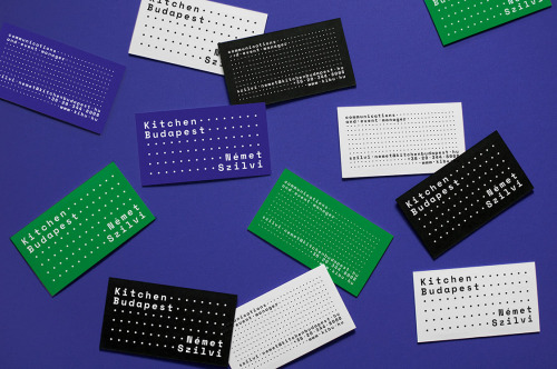
Eniko Deri and Nora Demeczky run de_form, a Budapest studio known for art direction, branding and editorial design.

Ortolan refined rather than replaced Kennedy Nolan's identity, contrasting a bold mark with delicate typography.
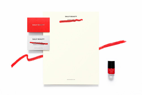
Anagrama rebuilds Sally Beauty in one colour at a time: red bags, red and white cards, a silver name and a dry brushstroke across the small print.
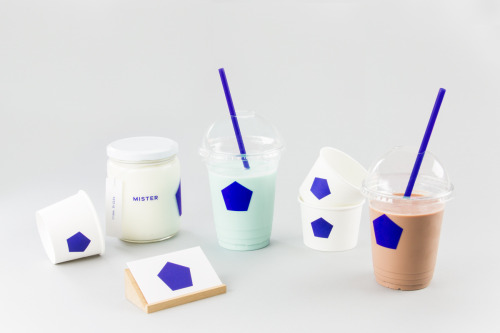
Brief gives Mister a blue pentagon on white cups, jars and a coaster, plus a pair of cards in blue and white.
IWANT pushed Nutritious Delicious, later Sweet Virtues, to rethink the whole brand; a year later it was winning awards.
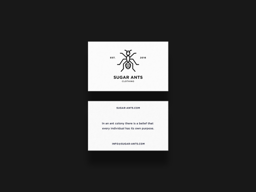
ONNO centres Sugar Ants on a line-drawn ant and prints a hamster in a wheel across a white t-shirt.

Stuart Tolley’s MIN surveys the return of simplicity to graphic design, from its pale blue cover to the work inside.
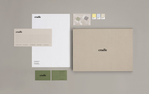
Matthew Hancock marks Cradle with a lowercase wordmark and carries it across letterheads, sage cards and colour chips.
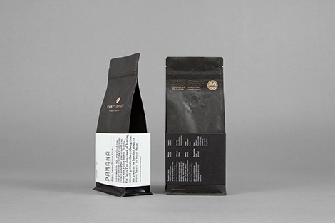
Australian agency Maud's packaging: matte black coffee bags with a white text label, and wine bottles in white and grey diagonals.

Akatre built Lancôme's 'Énergie de Vie' press kit around their own typeface Marie Louise — a box, a book, and no safe choices.
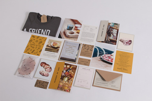
Passport's identity for Friends of Ham pairs kraft stationery and hand-drawn charcuterie illustrations with menus, postcards and a grey t-shirt.

Yi-Hsuan Li used illustration to make Su Beng's 'First Class of Taiwan History' a book people would actually pick up.
Loading