Gojo Branding by STUDIOYONIS
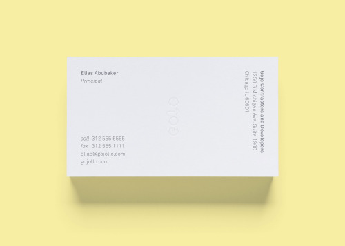
STUDIOYONIS gives Gojo a white card on a yellow field. Elias Abubeker, Principal, sits at the top left. The company name and Chicago address stack vertically up the right edge, and a ghosted gojo wordmark holds the centre.
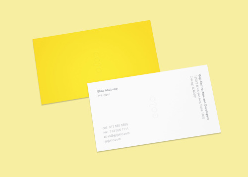
The second card reverses it: a solid yellow face carrying the same wordmark, laid behind the white one. The type is light, widely spaced, and does very little. That restraint is the identity.