
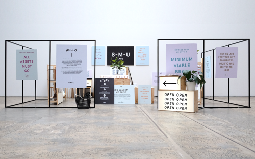
For The People: Branding for Start-Me-Up Labs
For The People branded Start-Me-Up Labs with light boxes, steel frames and posters for a start-up with no brand budget.
Archive
44 curated projects tagged in stationery.
For The People branded Start-Me-Up Labs with light boxes, steel frames and posters for a start-up with no brand budget.
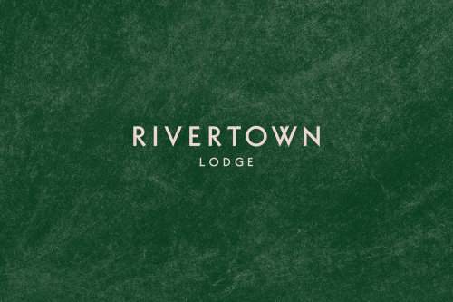
Rivertown Lodge's identity by Ro&Co skips hotel clichés and builds from classic camping textures — tent canvas, enamel dishware, woodland patterns.
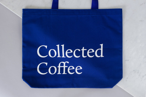
Fivethousand Fingers designed the Collected Coffee identity, a white and navy system that names a single farm.
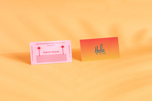
Parametro Studio's HULA branding puts a script wordmark and palm tree motif on matchboxes in pink and yellow.

Pop & Pac built The Penny Drop's café identity from a single pun: pennies falling from the tax office above.
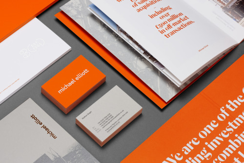
Six sets Michael Elliott's name in lowercase orange and carries the palette through cards, brochures and posters.
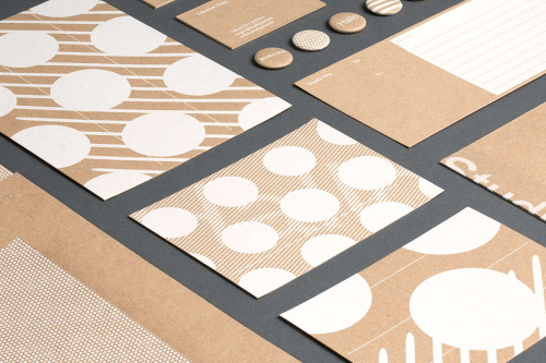
Studio Una, based in Germany, aimed for flexible, high-quality stationery with a pleasant touch, in various printed materials.

Ortolan refined rather than replaced Kennedy Nolan's identity, contrasting a bold mark with delicate typography.
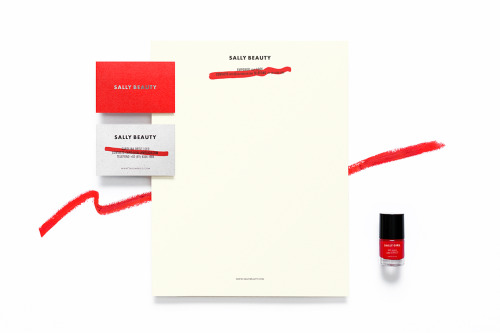
Anagrama rebuilds Sally Beauty in one colour at a time: red bags, red and white cards, a silver name and a dry brushstroke across the small print.
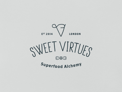
IWANT pushed Nutritious Delicious, later Sweet Virtues, to rethink the whole brand; a year later it was winning awards.
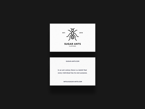
ONNO centres Sugar Ants on a line-drawn ant and prints a hamster in a wheel across a white t-shirt.
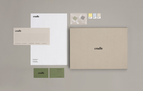
Matthew Hancock marks Cradle with a lowercase wordmark and carries it across letterheads, sage cards and colour chips.

Akatre built Lancôme's 'Énergie de Vie' press kit around their own typeface Marie Louise — a box, a book, and no safe choices.
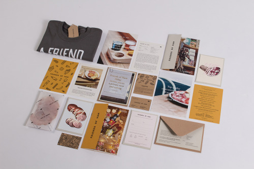
Passport's identity for Friends of Ham pairs kraft stationery and hand-drawn charcuterie illustrations with menus, postcards and a grey t-shirt.
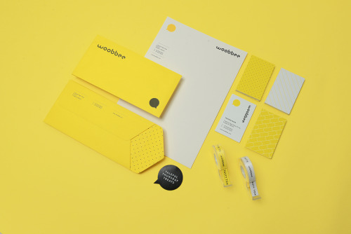
Sciencewerk's rebrand for Woobbee sets a lowercase wordmark and yellow bubble on off-white cards, patterned stationery and bright envelopes.
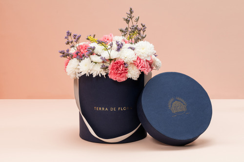
Parámetro Studio wraps Terra de Flora in a navy hat box with gold foil lettering, cream ribbon and cut flowers, plus sage green and navy cards.
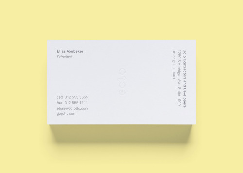
STUDIOYONIS brands Gojo with white and yellow business cards, a ghosted wordmark and type that stays quietly out of the way.

Jukebox Print builds its reputation on materials rather than price: recycled stocks, wooden cards, letterpress and coloured edges.

La Tortillería and sister agency Curioso built the identity for Seven Point, a Chicago medical-cannabis dispensary where regulation shapes design.

Bruch—Idee & Form put the content at the centre of Quer Kommuniziert's identity, letting arranged and emphasised text become the visual style.

Mariano Fiore's identity for Lumar in A Coruña leans on the name's history — the original coffee shop held the same corner from 1959 to 1993.

SP-GD built Catseye Bay a flexible identity for a Sydney spatial design studio, drawn loosely from the action of floating.

David Reca's self-branding project is an argument that design is a necessity rather than decoration — made on his own behalf.

Eskimo Design built Caffè Pagani's new logo on the observation that roasting coffee is a process of circles.
Loading