
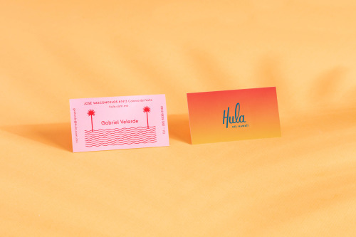
HULA Branding by Parametro Studio
Parametro Studio's HULA branding puts a script wordmark and palm tree motif on matchboxes in pink and yellow.
Archive
26 curated projects tagged in visual.
Parametro Studio's HULA branding puts a script wordmark and palm tree motif on matchboxes in pink and yellow.

Pop & Pac built The Penny Drop's café identity from a single pun: pennies falling from the tax office above.
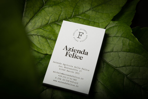
Paul Leichtfried branded Azienda Felice, an organic vineyard in the Marches, with two hand-drawn characters on a white label.
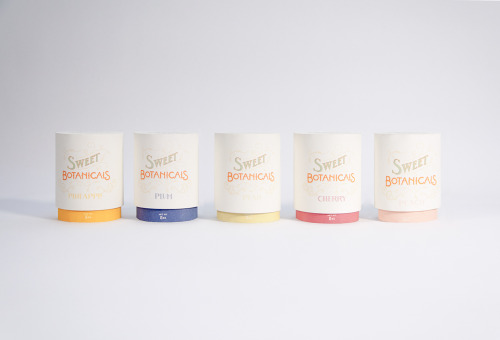
Sweet Botanicals is Patrick Chen's packaging project: five tins, hand-drawn lettering, Victorian florals and one colour per flavour.
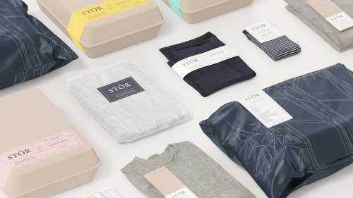
Socio Design built STÓR a grid-based labelling system, printed on unbleached recycled card and shared across every menswear staple.
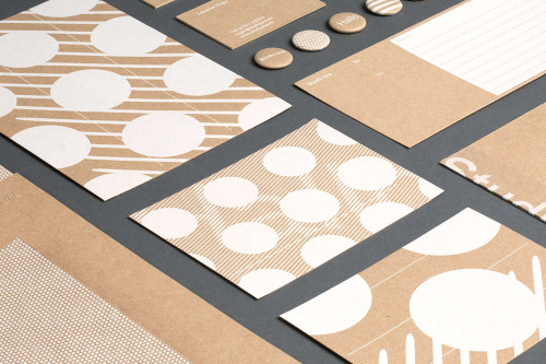
Studio Una, based in Germany, aimed for flexible, high-quality stationery with a pleasant touch, in various printed materials.

Akatre built Lancôme's 'Énergie de Vie' press kit around their own typeface Marie Louise — a box, a book, and no safe choices.

Yi-Hsuan Li used illustration to make Su Beng's 'First Class of Taiwan History' a book people would actually pick up.
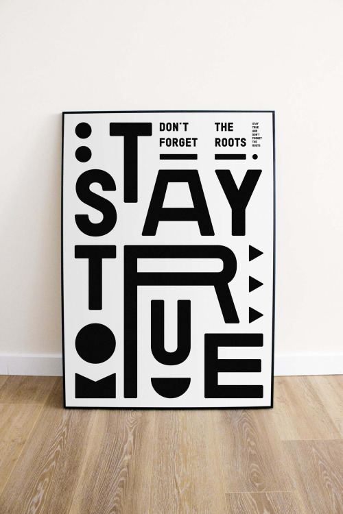
Marco Oggian's Quote(s) of the week: STAY TRUE stacked in black glyphs on white, and ALWAYS REMEMBER THAT YOU ARE SPECIAL in white on black.
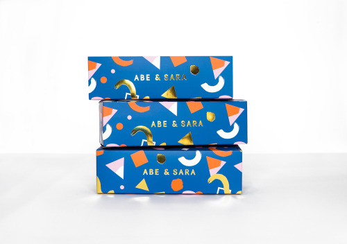
Faber & Lo gives Abe & Sara's sunglasses blue boxes with gold foil lettering and a pattern of triangles, circles and crescents.
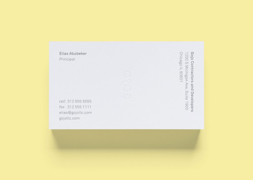
STUDIOYONIS brands Gojo with white and yellow business cards, a ghosted wordmark and type that stays quietly out of the way.

Jukebox Print builds its reputation on materials rather than price: recycled stocks, wooden cards, letterpress and coloured edges.

David Reca's self-branding project is an argument that design is a necessity rather than decoration — made on his own behalf.

Hanna Sköld and Sara Knipström's self-initiated update to Dunkin' Donuts — geometric colour-blocking and a simplified wordmark for Scandinavia.
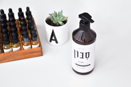
Doron Baduach packaged Maapilim's handmade products: white labels with Hebrew lettering on amber glass, and vials in a wooden rack.
Bunch gives Globetouch a rounded sans-serif wordmark, set white on blue and, on the black card, white over a grid of white dots.

Mark Richardson of Superfried made a poster series of single uppercase letters, each manipulated with modern shapes and blackletter traces.
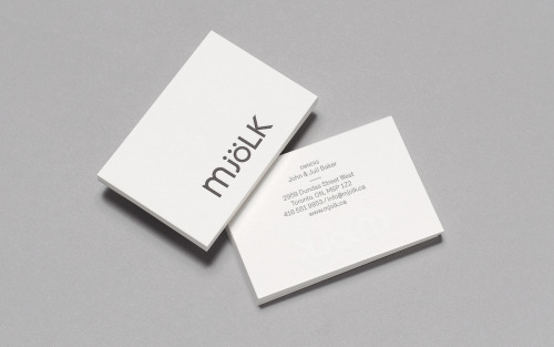
Tung keeps Mjölk's mixed-case wordmark and reshapes it — lowercase m, j and ö against capital L and K, set charcoal on white card.
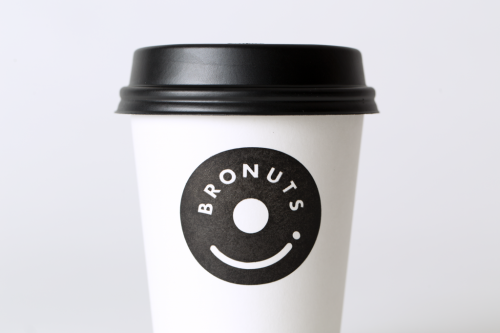
One Plus One's Bronuts mark reads as a doughnut and a takeaway coffee cup at once, printed black on white cups.
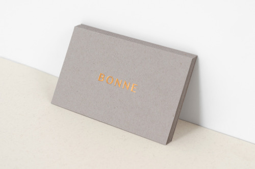
Studio XL built B O N N E from letterspaced copper capitals on warm grey stock, carried through letterhead, envelopes and cards.

Recent work from French illustrator Nicolas Dehghani.

F61, the St Petersburg print studio, built the identity for Mental Activity on minimalism and analogue printing rather than a logo.

La Boca, a Notting Hill studio, makes film posters. Two Black Swan designs: a striped red and black profile, and a circle of wings around a ballerina.
Parámetro Studio sets Individual Union in white on black, then adds bright blue and magenta cards to carry the colour.
Loading