

Studio Brave: Branding for CNK Catering
Studio Brave repositioned CNK Catering around three words, "Creating memorable moments", carried through the photography, stationery and print.
Archive
12 curated projects tagged in logo design.
Studio Brave repositioned CNK Catering around three words, "Creating memorable moments", carried through the photography, stationery and print.

The Practical Man arrived as the antidote: a curated destination for men's clothing and goods, branded by Garbett.
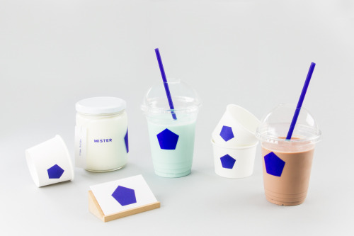
Brief gives Mister a blue pentagon on white cups, jars and a coaster, plus a pair of cards in blue and white.
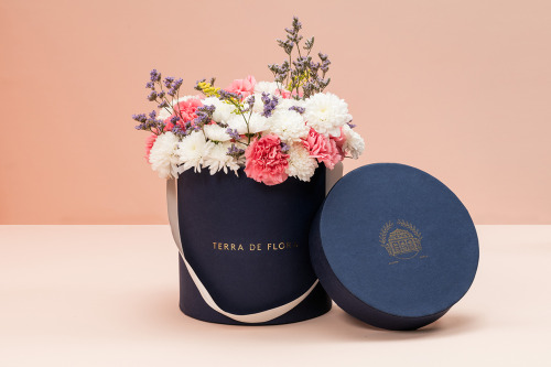
Parámetro Studio wraps Terra de Flora in a navy hat box with gold foil lettering, cream ribbon and cut flowers, plus sage green and navy cards.

Eskimo Design built Caffè Pagani's new logo on the observation that roasting coffee is a process of circles.
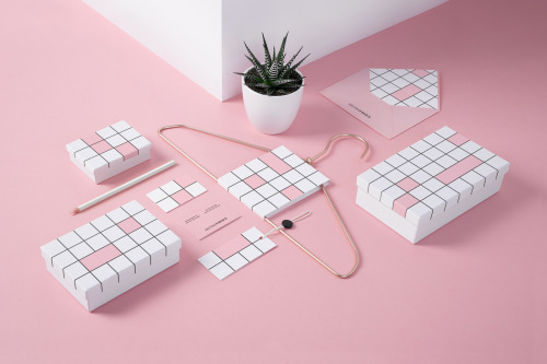
Noeeko's Second Choice identity draws a black-line grid of squares on white boxes and cards, some cells filled pink.
Weidemüller's Piàno Piàno identity stacks the name twice in heavy uppercase sans, black on grey, from print down to business cards.
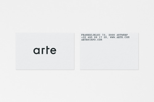
Vrints-Kolsteren sets 'arte' in lowercase black geometric type on white cards, with the Antwerp address block set uppercase on the reverse.
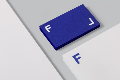
Mucho builds Frameline's identity from two white letterforms on blue, animated on screen and printed on a thick blue card.
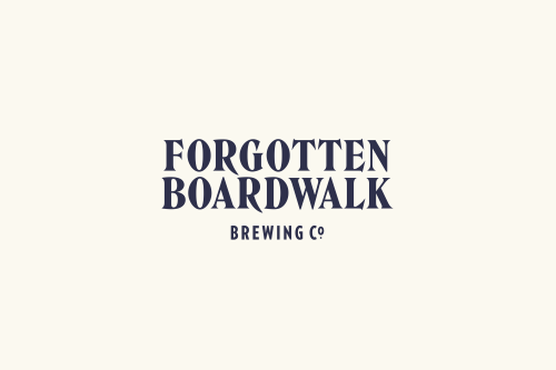
Perky Bros gives Forgotten Boardwalk a Victorian wordmark and pink-on-metal cans, each carrying a single illustration.
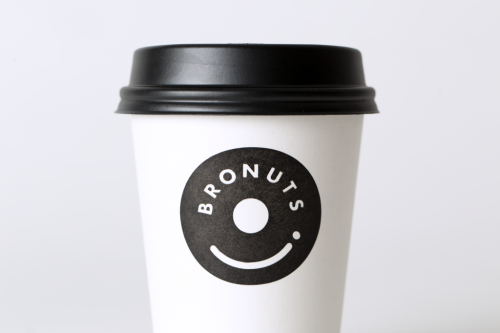
One Plus One's Bronuts mark reads as a doughnut and a takeaway coffee cup at once, printed black on white cups.
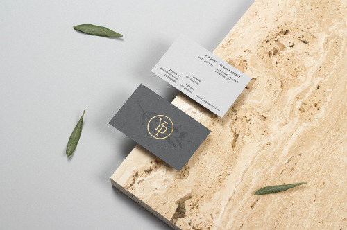
Max Pirsky's identity for Yitzhak Peretz: a seal drawn from the initials, olive-branch illustrations, and stationery in blind emboss and copper foil.