
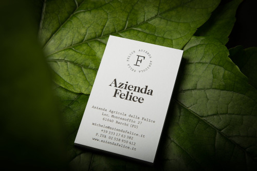
Branding for Azienda Felice by Paul Leichtfried
Paul Leichtfried branded Azienda Felice, an organic vineyard in the Marches, with two hand-drawn characters on a white label.
Archive
18 curated projects tagged in package design.
Paul Leichtfried branded Azienda Felice, an organic vineyard in the Marches, with two hand-drawn characters on a white label.
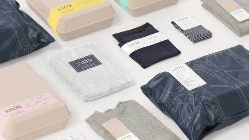
Socio Design built STÓR a grid-based labelling system, printed on unbleached recycled card and shared across every menswear staple.
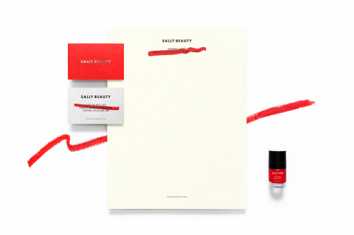
Anagrama rebuilds Sally Beauty in one colour at a time: red bags, red and white cards, a silver name and a dry brushstroke across the small print.
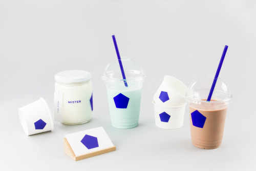
Brief gives Mister a blue pentagon on white cups, jars and a coaster, plus a pair of cards in blue and white.
IWANT pushed Nutritious Delicious, later Sweet Virtues, to rethink the whole brand; a year later it was winning awards.
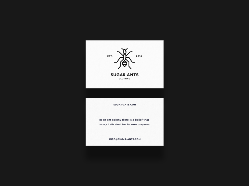
ONNO centres Sugar Ants on a line-drawn ant and prints a hamster in a wheel across a white t-shirt.
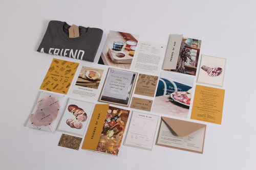
Passport's identity for Friends of Ham pairs kraft stationery and hand-drawn charcuterie illustrations with menus, postcards and a grey t-shirt.
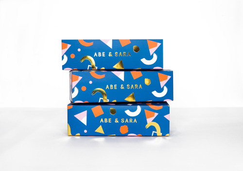
Faber & Lo gives Abe & Sara's sunglasses blue boxes with gold foil lettering and a pattern of triangles, circles and crescents.

La Tortillería and sister agency Curioso built the identity for Seven Point, a Chicago medical-cannabis dispensary where regulation shapes design.

Eskimo Design built Caffè Pagani's new logo on the observation that roasting coffee is a process of circles.

Hanna Sköld and Sara Knipström's self-initiated update to Dunkin' Donuts — geometric colour-blocking and a simplified wordmark for Scandinavia.
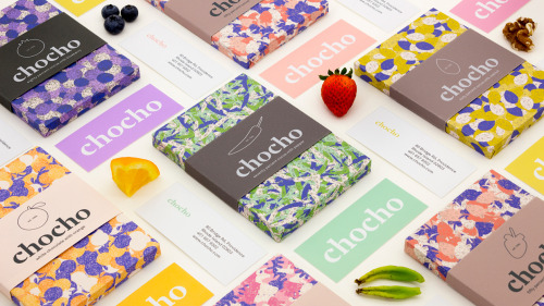
Hee Jae Kim's Chocho chocolate bars are wrapped in fruit-print paper and banded with a lowercase wordmark over solid colour.

Seven Stills wanted to escape the traditional whiskey look — so Evan Tolleson bridged craft beer and quality spirits instead.
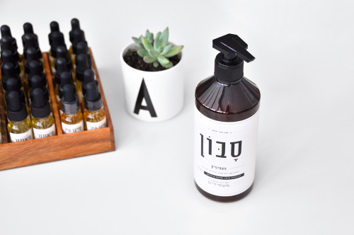
Doron Baduach packaged Maapilim's handmade products: white labels with Hebrew lettering on amber glass, and vials in a wooden rack.
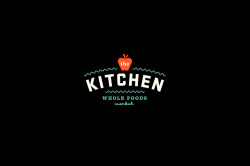
The Kitchen's identity puts a small apple over letterspaced capitals and wavy teal lines, then repeats the mark across mint tubs stacked in a pyramid.
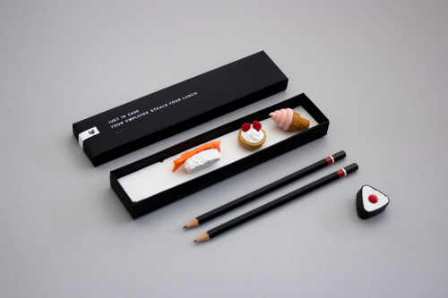
Helen Vo's self-promotional mailer pairs miniature food models and black pencils with a box printed 'JUST IN CASE YOUR EMPLOYEE STEALS YOUR LUNCH'.
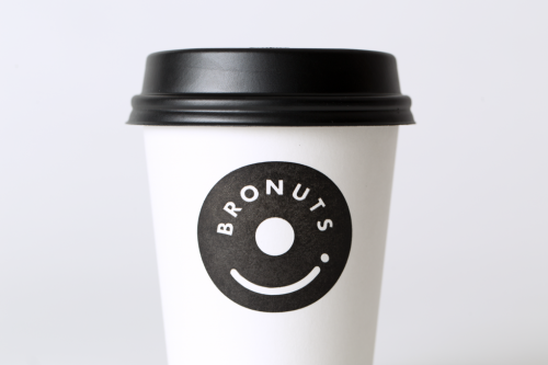
One Plus One's Bronuts mark reads as a doughnut and a takeaway coffee cup at once, printed black on white cups.
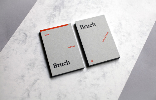
Bruch's identity splits into Idee and Form: a grey ground, a red rule and a dot, with the name set quietly in a serif.