Sara Enríquez’s Typographic Wes Anderson Project
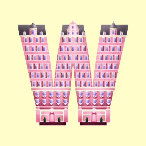
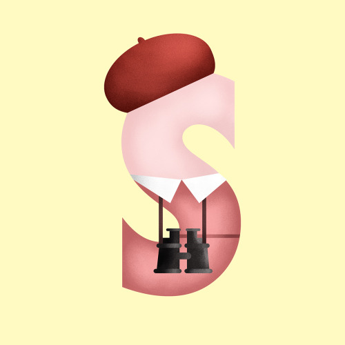
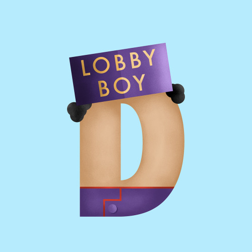
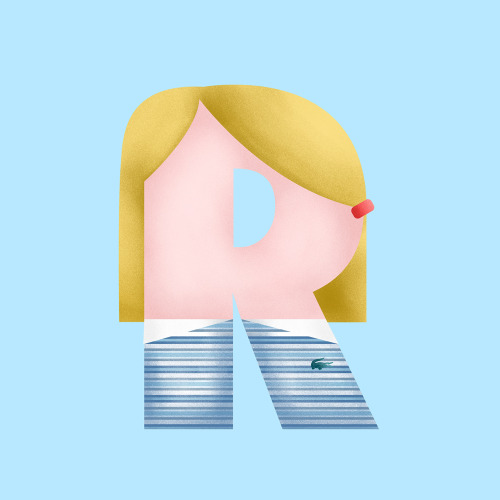
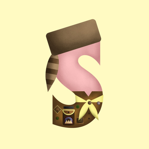
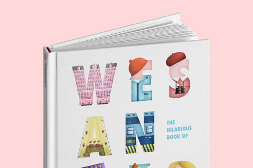
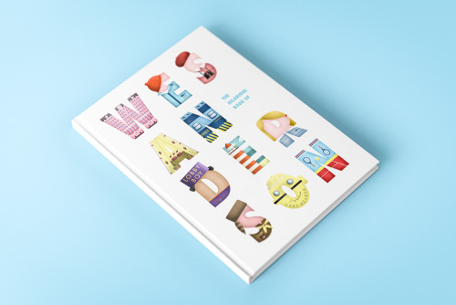
Sara Enríquez works across branding, art direction, typography and illustration from Madrid, and her Wes Anderson project is the kind of fan work that quietly embarrasses most commissioned homage. The premise is simple and well executed: letterforms built out of the films’ architecture, so a W becomes the pink facade of the Grand Budapest — turrets, gables, blue windows and all.
What lifts it above pastiche is the restraint. Anderson’s world is dangerously easy to parody — the symmetry, the pastels, the deadpan framing — but Enríquez borrows the buildings rather than the jokes, and lets the architecture carry the reference on its own. It reads as a designer’s tribute: precise, affectionate, and made with real typographic care.
See the project: Behance.