
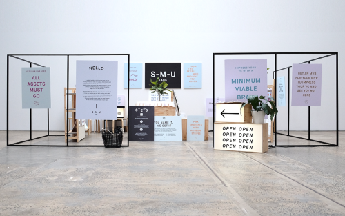
For The People: Branding for Start-Me-Up Labs
For The People branded Start-Me-Up Labs with light boxes, steel frames and posters for a start-up with no brand budget.
Archive
37 curated projects tagged in design.
For The People branded Start-Me-Up Labs with light boxes, steel frames and posters for a start-up with no brand budget.
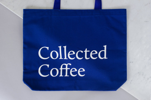
Fivethousand Fingers designed the Collected Coffee identity, a white and navy system that names a single farm.

Pop & Pac built The Penny Drop's café identity from a single pun: pennies falling from the tax office above.
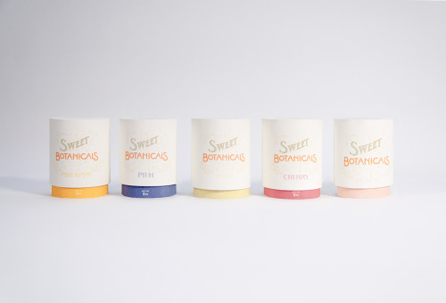
Sweet Botanicals is Patrick Chen's packaging project: five tins, hand-drawn lettering, Victorian florals and one colour per flavour.

Ortolan refined rather than replaced Kennedy Nolan's identity, contrasting a bold mark with delicate typography.
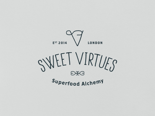
IWANT pushed Nutritious Delicious, later Sweet Virtues, to rethink the whole brand; a year later it was winning awards.

Stuart Tolley’s MIN surveys the return of simplicity to graphic design, from its pale blue cover to the work inside.

Akatre built Lancôme's 'Énergie de Vie' press kit around their own typeface Marie Louise — a box, a book, and no safe choices.

Yi-Hsuan Li used illustration to make Su Beng's 'First Class of Taiwan History' a book people would actually pick up.
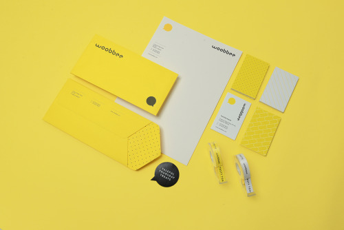
Sciencewerk's rebrand for Woobbee sets a lowercase wordmark and yellow bubble on off-white cards, patterned stationery and bright envelopes.
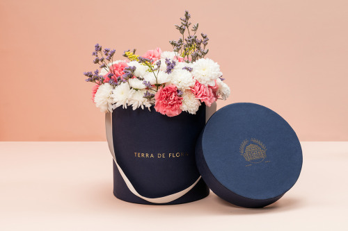
Parámetro Studio wraps Terra de Flora in a navy hat box with gold foil lettering, cream ribbon and cut flowers, plus sage green and navy cards.

Aloof's book for Gloria Cortina refuses the design monograph as brand exercise — circling the work rather than illustrating it.
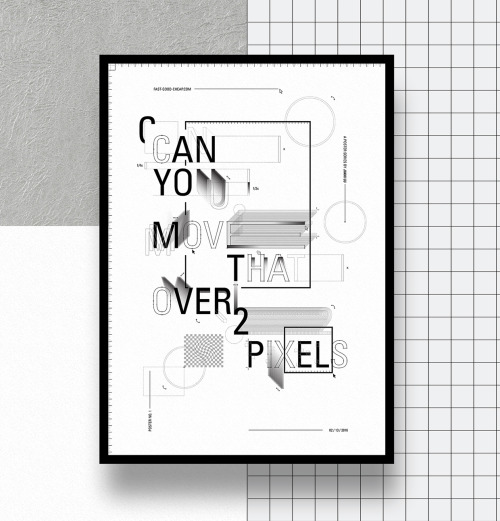
Jiani Lu's typographic series turns design frustrations into framed prints, from stacked capitals to A S A P against halftone dots and rules.

Jukebox Print builds its reputation on materials rather than price: recycled stocks, wooden cards, letterpress and coloured edges.

La Tortillería and sister agency Curioso built the identity for Seven Point, a Chicago medical-cannabis dispensary where regulation shapes design.

Bruch—Idee & Form put the content at the centre of Quer Kommuniziert's identity, letting arranged and emphasised text become the visual style.

Mariano Fiore's identity for Lumar in A Coruña leans on the name's history — the original coffee shop held the same corner from 1959 to 1993.

SP-GD built Catseye Bay a flexible identity for a Sydney spatial design studio, drawn loosely from the action of floating.

David Reca's self-branding project is an argument that design is a necessity rather than decoration — made on his own behalf.

Eskimo Design built Caffè Pagani's new logo on the observation that roasting coffee is a process of circles.

Hanna Sköld and Sara Knipström's self-initiated update to Dunkin' Donuts — geometric colour-blocking and a simplified wordmark for Scandinavia.
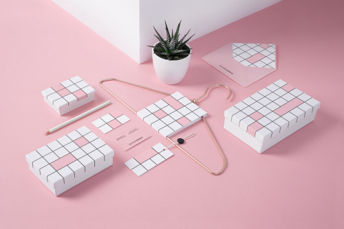
Noeeko's Second Choice identity draws a black-line grid of squares on white boxes and cards, some cells filled pink.

Seven Stills wanted to escape the traditional whiskey look — so Evan Tolleson bridged craft beer and quality spirits instead.
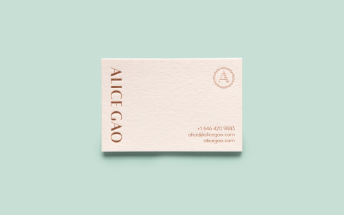
Tung sets Alice Gao's name vertically in copper foil on a blush card, with a dotted ring around her initial and contact lines in the corner.
Loading