
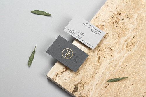
Max Pirsky’s Branding for Yitzhak Peretz
Max Pirsky's identity for Yitzhak Peretz: a seal drawn from the initials, olive-branch illustrations, and stationery in blind emboss and copper foil.
Archive / 05
126 curated projects in branding/identity.
Max Pirsky's identity for Yitzhak Peretz: a seal drawn from the initials, olive-branch illustrations, and stationery in blind emboss and copper foil.
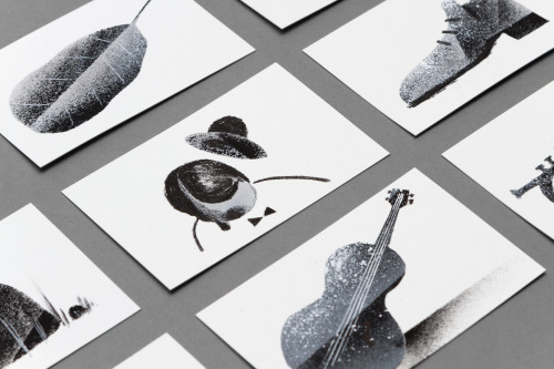
Dogma built Eleni Debo's identity around her grainy black-and-white drawings and a business card that is mostly white space.
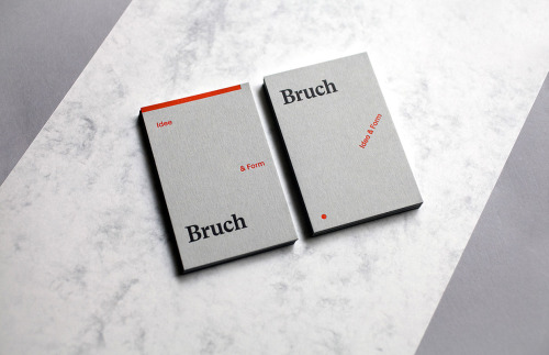
Bruch's identity splits into Idee and Form: a grey ground, a red rule and a dot, with the name set quietly in a serif.
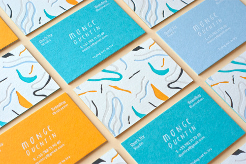
Don't Try Studio's card set is five letterpress inks and white foil on triplex Colorplan, printed with loose line drawings.
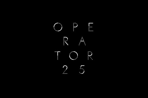
Pop & Pac rebranded Melbourne cafe Operator 25 with typography drawn from telephone exchange cords and a round lightbox cup sign.
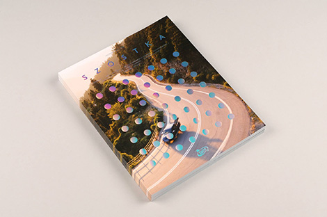
Warsaw creative studio Super Super connects ideas with design and technology.
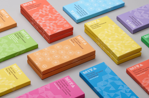
Moniker gives each Mita chocolate bar its own colour and its own white line pattern, with origin and cocoa percentage set small on top of both.
Laji's cards come in white, hot pink and fluorescent green, each with the same HAIR & MAKE wordmark and a name set in script.
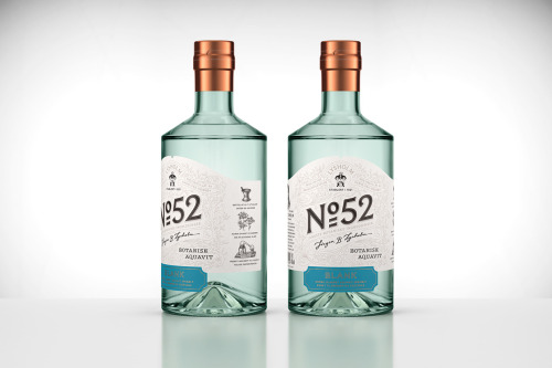
Olssøn Barbieri designed No 52, a botanical aquavit for Jørgen B. Lysholm, in pale green glass with engraved cream labels.
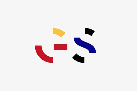
Epiforma gives Get Set Festival a broken-letter identity: arcs and blocks in red, yellow and blue, reused across the posters and rebuilt into the title.
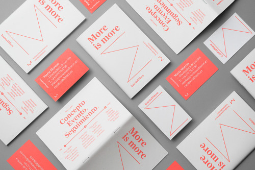
Andrés Requena builds the Maria Moreso identity around one word: white and coral cards, the phrase 'More is more', a coral line drawn into an M.
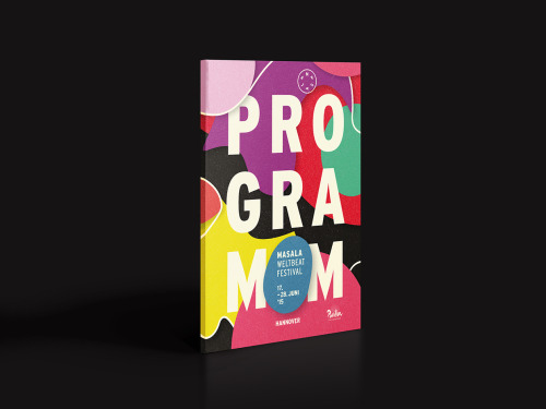
Hardy Seiler's cover for the Masala Weltbeat Festival stacks PROGRAMM in white caps over colour, the dates on a blue roundel.
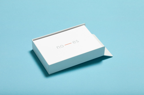
White Studios sets Noes around a dash — grey letters, an orange rule, and the same card shot against cold blue and warm orange.
Bunch gives Johnny Roxburgh a bold two-line wordmark on mint and a white book whose cover type sits in a square turned 45 degrees.
Querida Studio's identity for Ölend, a Barcelona brand making handmade backpacks, pairs a navy serif wordmark with bare, shadow-led product shots.

Underline Studio gave Toronto still life photographer Jodi Pudge a wordmark, a circle-held monogram and a black and orange stationery system.
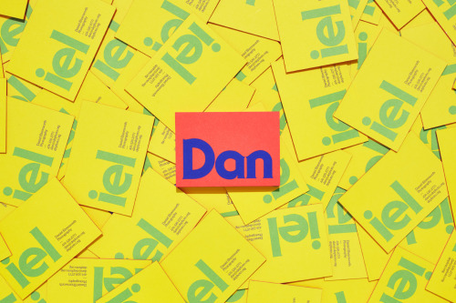
Underline Studio's identity for Daniel Ehrenworth splits his name across yellow cards and one coral card, in a loud 1970s palette.
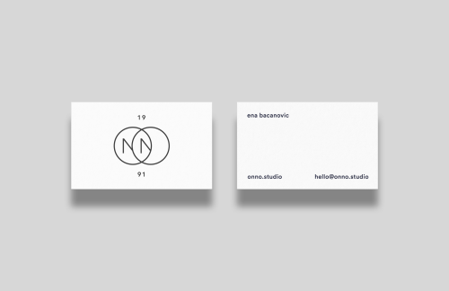
Ena Bacanovic's identity for ONNO is two overlapping circles with an N in the overlap, 19 and 91 above and below, on plain white cards.
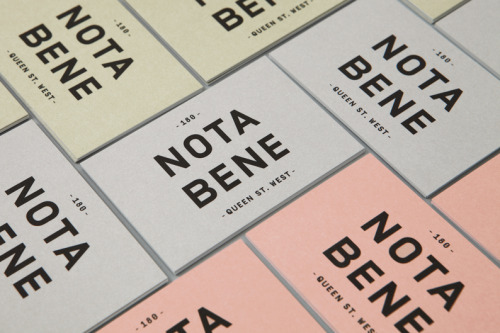
Blok sets Nota Bene in heavy black caps on yellow, grey and pink menus, and angles the name across a white brush mark on cream.

Upton's white belt boxes carry the name small and a black diagonal strip, with the same black-and-white restraint repeated on a folded band.
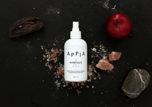
Appia's white bottles carry one coral line triangle each, with pink salt, a stone and a red apple staged around the tonic mist.

Manual gives Fort Point Beer Company a modular can range: every can ruled into a grid, one drawn image inside, the arched logotype unchanged.
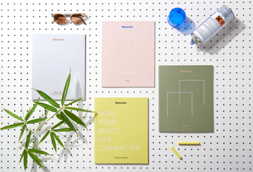
La Tigre's four Manerba office system catalogues: one colour, paper and finishing per system, staged as objects on a white pegboard.
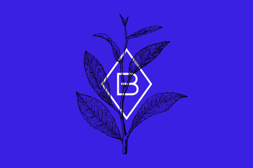
Warsaw studio Dmowski & Co. built Blanca Tea from a wide-spaced wordmark and a diamond B monogram set over a drawn tea branch on cobalt.
Loading