
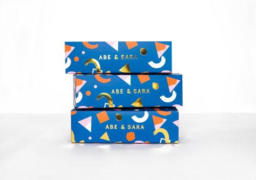
Abe & Sara Sunglass Packaging by Faber & Lo
Faber & Lo gives Abe & Sara's sunglasses blue boxes with gold foil lettering and a pattern of triangles, circles and crescents.
Archive / 03
126 curated projects in branding/identity.
Faber & Lo gives Abe & Sara's sunglasses blue boxes with gold foil lettering and a pattern of triangles, circles and crescents.
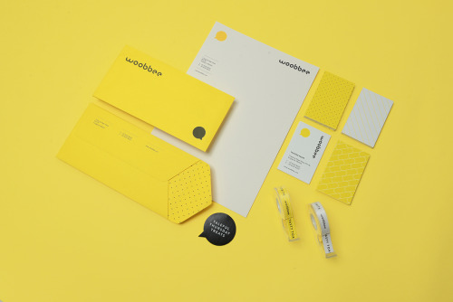
Sciencewerk's rebrand for Woobbee sets a lowercase wordmark and yellow bubble on off-white cards, patterned stationery and bright envelopes.
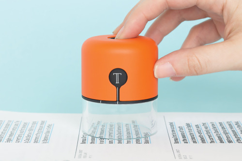
Fiona O'Leary's Spector is a hand-held orange device with a white T emblem and a clear base, lowered onto printed columns of type.
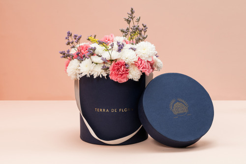
Parámetro Studio wraps Terra de Flora in a navy hat box with gold foil lettering, cream ribbon and cut flowers, plus sage green and navy cards.

Aloof's book for Gloria Cortina refuses the design monograph as brand exercise — circling the work rather than illustrating it.
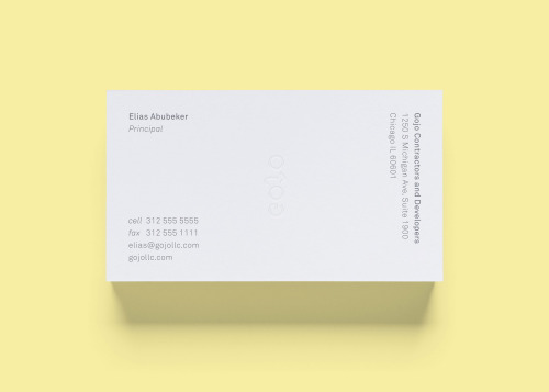
STUDIOYONIS brands Gojo with white and yellow business cards, a ghosted wordmark and type that stays quietly out of the way.
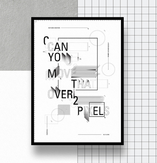
Jiani Lu's typographic series turns design frustrations into framed prints, from stacked capitals to A S A P against halftone dots and rules.

Jukebox Print builds its reputation on materials rather than price: recycled stocks, wooden cards, letterpress and coloured edges.

La Tortillería and sister agency Curioso built the identity for Seven Point, a Chicago medical-cannabis dispensary where regulation shapes design.

Bruch—Idee & Form put the content at the centre of Quer Kommuniziert's identity, letting arranged and emphasised text become the visual style.

Mariano Fiore's identity for Lumar in A Coruña leans on the name's history — the original coffee shop held the same corner from 1959 to 1993.

SP-GD built Catseye Bay a flexible identity for a Sydney spatial design studio, drawn loosely from the action of floating.

David Reca's self-branding project is an argument that design is a necessity rather than decoration — made on his own behalf.

Eskimo Design built Caffè Pagani's new logo on the observation that roasting coffee is a process of circles.

Hanna Sköld and Sara Knipström's self-initiated update to Dunkin' Donuts — geometric colour-blocking and a simplified wordmark for Scandinavia.
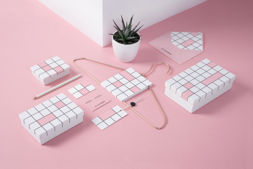
Noeeko's Second Choice identity draws a black-line grid of squares on white boxes and cards, some cells filled pink.
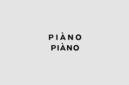
Weidemüller's Piàno Piàno identity stacks the name twice in heavy uppercase sans, black on grey, from print down to business cards.
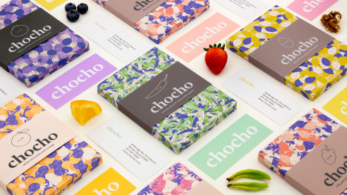
Hee Jae Kim's Chocho chocolate bars are wrapped in fruit-print paper and banded with a lowercase wordmark over solid colour.

Seven Stills wanted to escape the traditional whiskey look — so Evan Tolleson bridged craft beer and quality spirits instead.
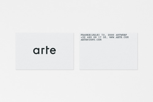
Vrints-Kolsteren sets 'arte' in lowercase black geometric type on white cards, with the Antwerp address block set uppercase on the reverse.
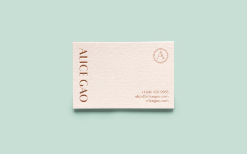
Tung sets Alice Gao's name vertically in copper foil on a blush card, with a dotted ring around her initial and contact lines in the corner.
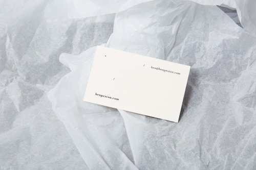
Lauren Barber sets Benjamin Pexton's name small on off-white cards, leaving the rest of the face blank against folded white tissue.
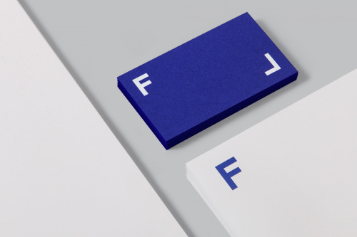
Mucho builds Frameline's identity from two white letterforms on blue, animated on screen and printed on a thick blue card.
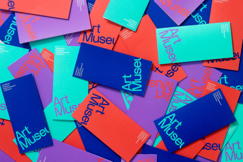
Underline Studio's identity for the Art Museum in Toronto: cropped type on cards in orange, teal, purple and blue.
Loading