

Branding & Packaging for Sugar Ants by ONNO
ONNO centres Sugar Ants on a line-drawn ant and prints a hamster in a wheel across a white t-shirt.
Archive
ONNO centres Sugar Ants on a line-drawn ant and prints a hamster in a wheel across a white t-shirt.

Stuart Tolley’s MIN surveys the return of simplicity to graphic design, from its pale blue cover to the work inside.

An artist residency in Eden, Utah let Matt W. Moore rebuild his mandala motif from wood and river stones gathered on the mountain.

Bocas Sucias prints street expressions as posters and releases them across society, leaving intention and interpretation to speakers and receivers.

Peter Tarka, AKA Grate Studio, sets AURORA in white capitals inside a gold wireframe form and packs a neon letter with green spheres.

Matthew Hancock marks Cradle with a lowercase wordmark and carries it across letterheads, sage cards and colour chips.

Australian agency Maud's packaging: matte black coffee bags with a white text label, and wine bottles in white and grey diagonals.

Mateo Pizarro's Micro-Barroque drawings: a dense crowd ringing rising dust, and a galaxy, each no bigger than a match.

Frank Gonzales paints birds resting on cactus against flat blue and turquoise grounds, cut by thin vertical strokes of pink, orange and green.

Mike McQuade's collages: a portrait stacked in nested red rectangles, and a profile built from grid blocks and video-player icons.

Akatre built Lancôme's 'Énergie de Vie' press kit around their own typeface Marie Louise — a box, a book, and no safe choices.

Tattoo artist Pis Saro reproduces botanical specimens found on her travels directly onto her clients' skin.

Gary Hustwit's documentary on Dieter Rams: the designer at his desk with a pen and drawings, and a film funded on Kickstarter.

Takahiro Kondo's black ceramic heads are crusted in glassy beads and metallic drips, finished with his gintekisai overglaze.

Damien Poulain's LOVE cover cuts white letters and red marks into black slabs, and his paper work builds characters from flat blue shapes.

Passport's identity for Friends of Ham pairs kraft stationery and hand-drawn charcuterie illustrations with menus, postcards and a grey t-shirt.

Mikko Lagerstedt photographs still water and winter: a jetty and rowboat at dusk, and a star-filled sky over snow-covered ice and open water.

Yi-Hsuan Li used illustration to make Su Beng's 'First Class of Taiwan History' a book people would actually pick up.

Marco Oggian's Quote(s) of the week: STAY TRUE stacked in black glyphs on white, and ALWAYS REMEMBER THAT YOU ARE SPECIAL in white on black.

Faber & Lo gives Abe & Sara's sunglasses blue boxes with gold foil lettering and a pattern of triangles, circles and crescents.

Work from London illustrator Dale Edwin Murray.

Sciencewerk's rebrand for Woobbee sets a lowercase wordmark and yellow bubble on off-white cards, patterned stationery and bright envelopes.
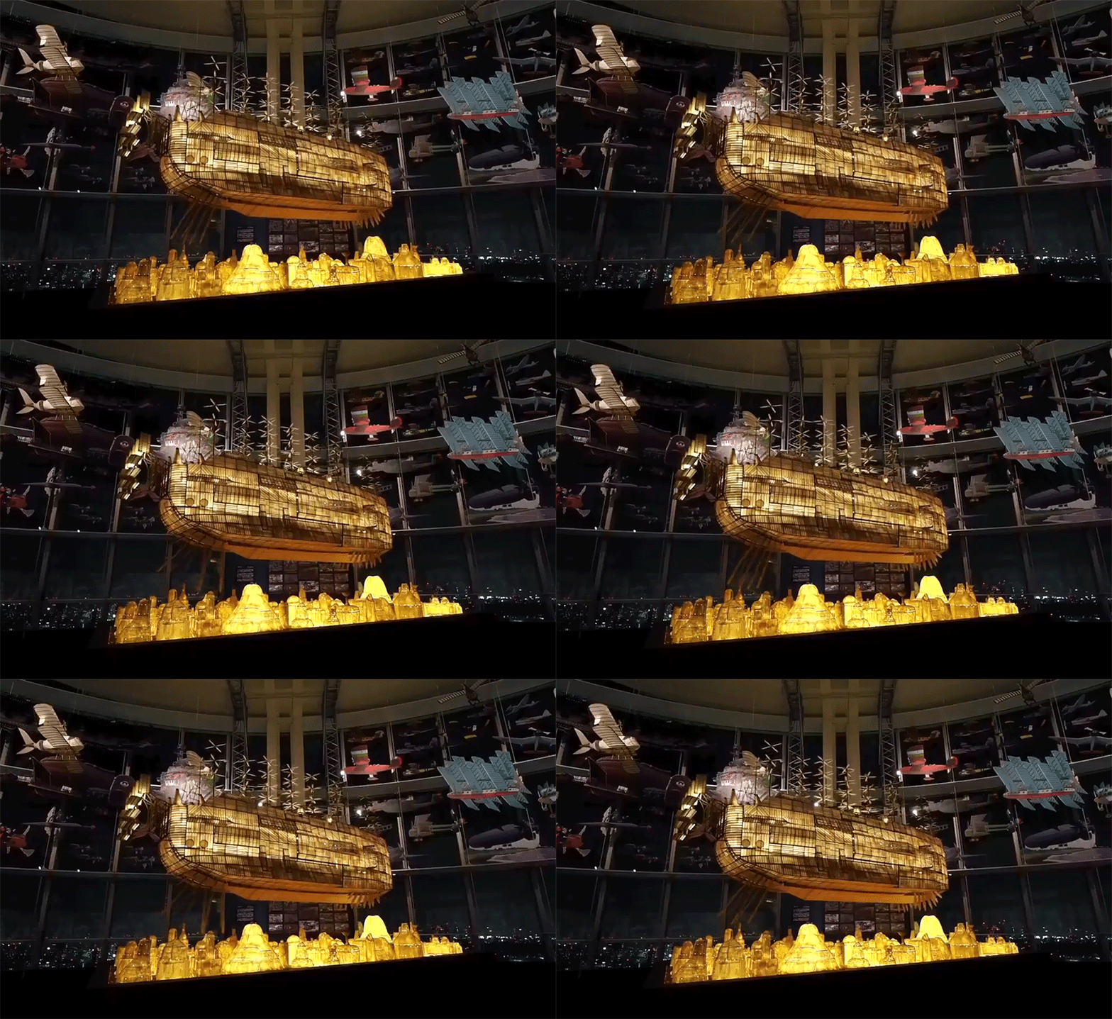
Fifty-two storeys above Tokyo, the Studio Ghibli Expo centres on a room of airships and an illuminated replica from 'Castle in the Sky'.

Balland's Basel studio makes typographic compositions and identities for cultural institutions, and holds Switzerland's Jan Tschichold Award.