

La Tortillería’s Identity for Dentvelop
La Tortillería built Dentvelop's identity around evolution — the defining trait of an odontology clinic focused on dental-implant innovation.
Archive / 04
126 curated projects in branding/identity.
La Tortillería built Dentvelop's identity around evolution — the defining trait of an odontology clinic focused on dental-implant innovation.
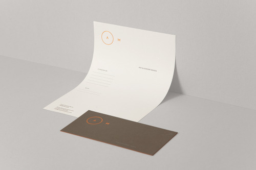
Avant Post's identity for AM is an orange circle around an A with an M beside it, set small on dark brown and white cards.
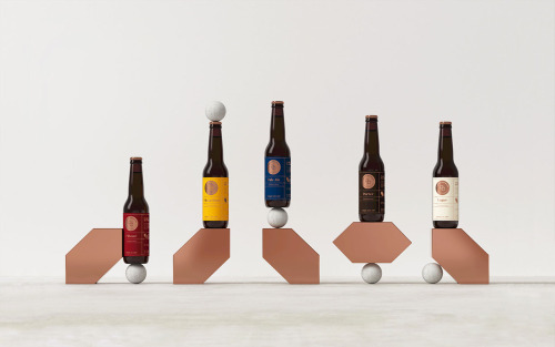
Makebardo's packaging for The Honest Drop stages five beer bottles on angled copper blocks, each label carrying the same badge.
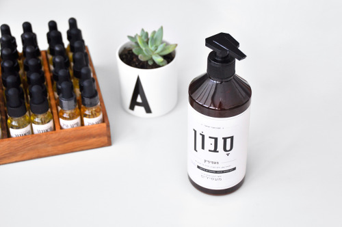
Doron Baduach packaged Maapilim's handmade products: white labels with Hebrew lettering on amber glass, and vials in a wooden rack.
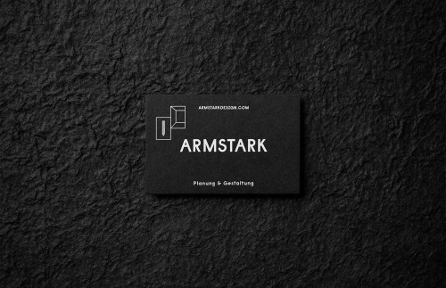
Bruch - Idee & Form's Armstark identity folds the planning-and-design tagline into a mark of two panels and a hidden letter A.
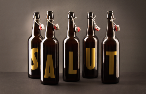
Walabi designed a Christmas typeface for Salut beer: one gold glyph per 75cl bottle, five spell the name and four spell 2016.
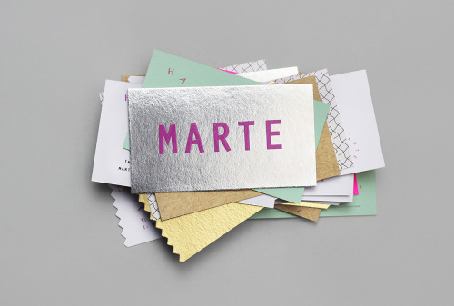
Bienal Comunicación, founded in Merida in 2006, built the Marte Estudio cards from foil, coloured stock and printed texture.
Two Times Elliott built the Even Odds identity around the name in a wide sans serif, carried onto pale grey business cards.
The Kitchen's identity puts a small apple over letterspaced capitals and wavy teal lines, then repeats the mark across mint tubs stacked in a pyramid.
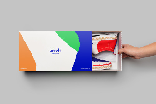
Hey Studio's identity for Arrels, a Barcelona footwear brand, splits each box into colour blocks with a rough edge between them.
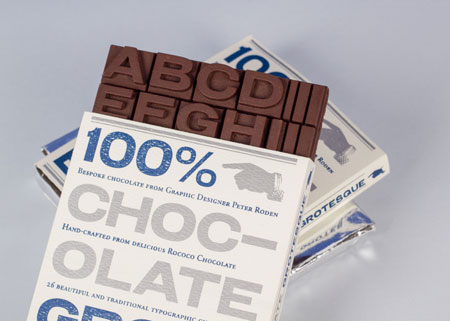
Peter Roden turned a typeface into chocolate: bars moulded as capital letters, in a pack that sets 100% CHOCOLATE GROTESQUE in blue.
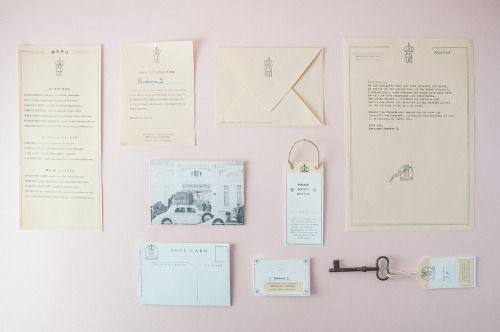
Andrea Bianchi designs the Grand Budapest Hotel's stationery as 1930s paperwork, in cream on pink.
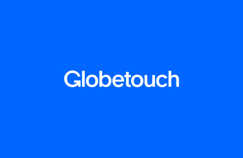
Bunch gives Globetouch a rounded sans-serif wordmark, set white on blue and, on the black card, white over a grid of white dots.
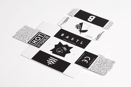
Anymade Studio's identity for Bastl Instruments is black type on white labels, each instrument given its own lockup.
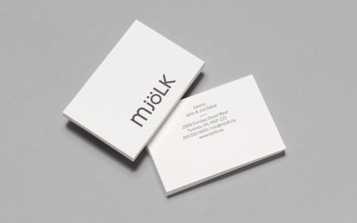
Tung keeps Mjölk's mixed-case wordmark and reshapes it — lowercase m, j and ö against capital L and K, set charcoal on white card.
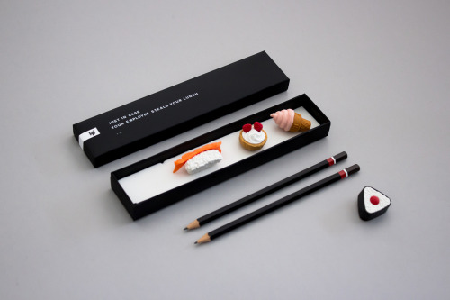
Helen Vo's self-promotional mailer pairs miniature food models and black pencils with a box printed 'JUST IN CASE YOUR EMPLOYEE STEALS YOUR LUNCH'.
Perky Bros gives Forgotten Boardwalk a Victorian wordmark and pink-on-metal cans, each carrying a single illustration.
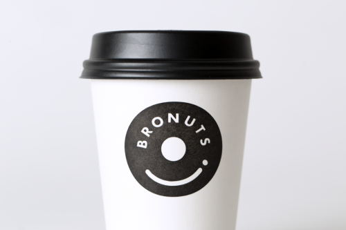
One Plus One's Bronuts mark reads as a doughnut and a takeaway coffee cup at once, printed black on white cups.
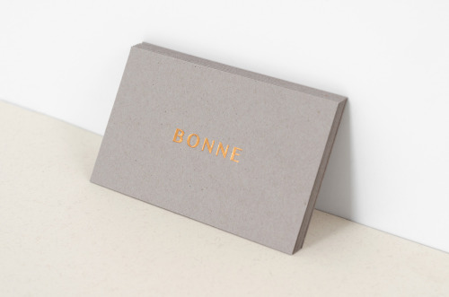
Studio XL built B O N N E from letterspaced copper capitals on warm grey stock, carried through letterhead, envelopes and cards.
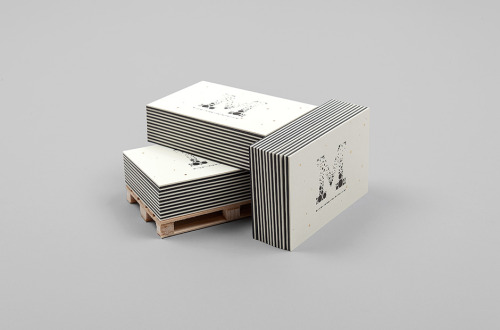
Murmure's business card carries its own argument: good design is for good clients, set in heavy lowercase on thick charcoal stock.

F61, the St Petersburg print studio, built the identity for Mental Activity on minimalism and analogue printing rather than a logo.
Parámetro Studio sets Individual Union in white on black, then adds bright blue and magenta cards to carry the colour.
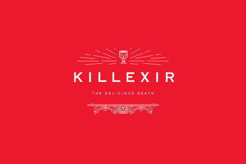
Shao Long Bald's Killexir Poison concept puts a red-and-white identity on a hand-blown black glass skull bottle in a white sleeve.
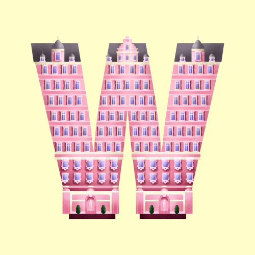
Madrid designer Sara Enríquez turns Wes Anderson's filmography into typographic illustration — letters built from the architecture of his films.
Loading